Elithia
Making motherhood a soothing, joyful experience.
- Branding & Design
- Growth & Content
- Product Design
Toskani MED
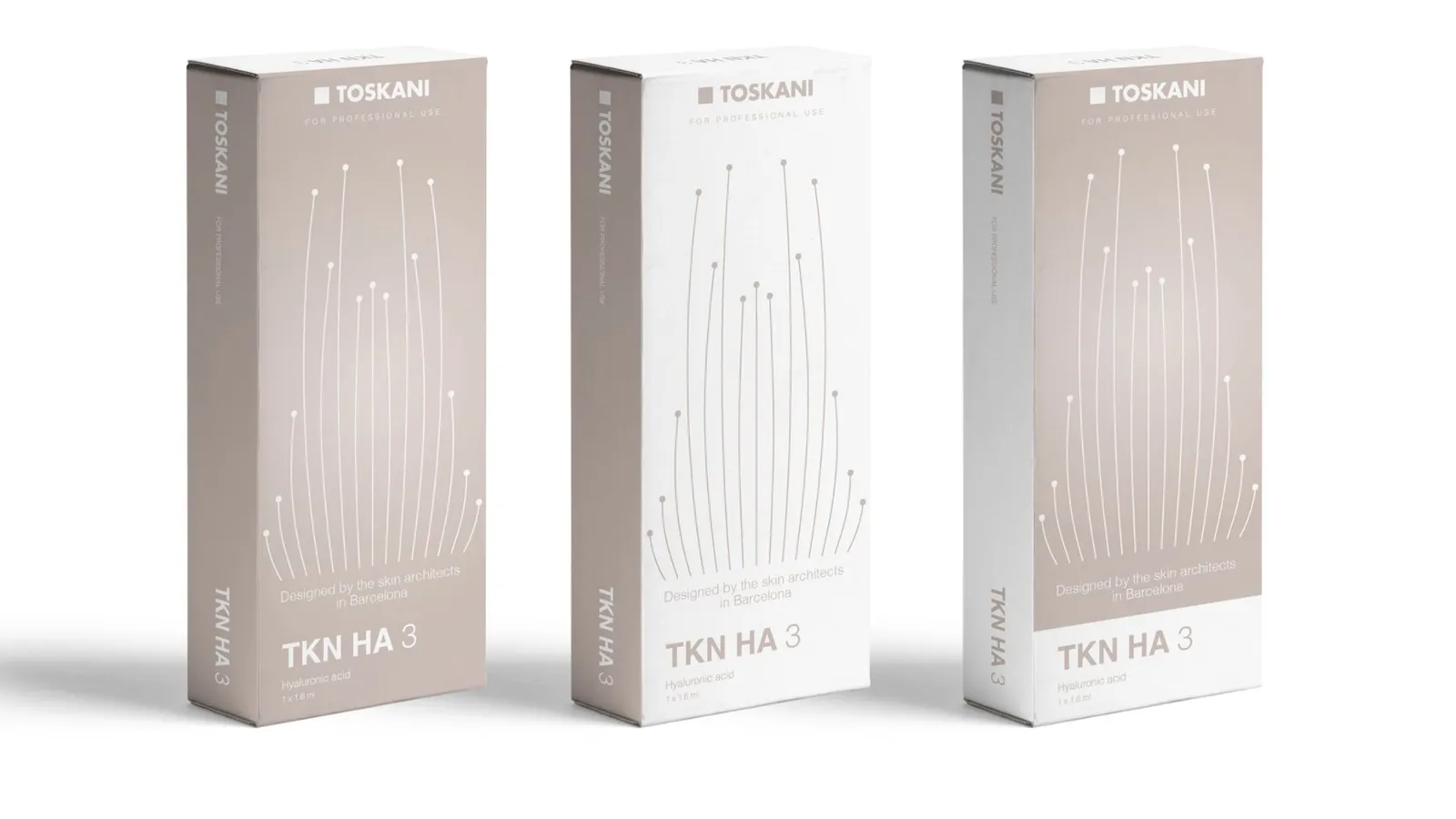
Toskani MED is a Barcelona-based aesthetic medicine company. It offers non-invasive treatments to doctors, and its products are for professional use only.
New product ranges were on the way. The team needed to decide the image of Toskani MED, find the difference between Toskani and Toskani MED, and bring every product under one look.
We started where we always start, from the Core: positioning and strategy first, then the visual language built on top of it.
“Toskani MED offers aesthetic non-invasive solutions to caring doctors in a family environment with an expert voice. Giving them efficacy and making them feel close to us.”
The Core, the unique value proposition
In the workshop, closeness, expertise and efficacy collected the most votes. They set the archetype: a Caregiver for the relationship and the voice, and a Sage for the medical workshops and the scientific reasoning.
One sentence for the value proposition and an archetype mix: a Caregiver for the relationship, a Sage for the science. And one line that every box should carry, the X factor from the workshop.
Designed by the skin architects in Barcelona.
The X factor from the workshop, written to go on the pack.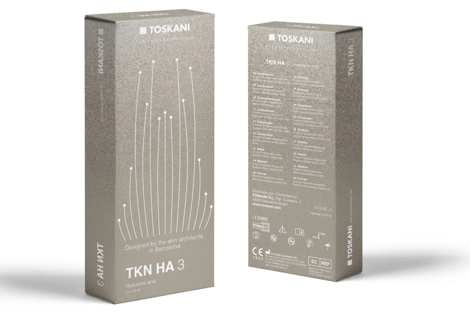
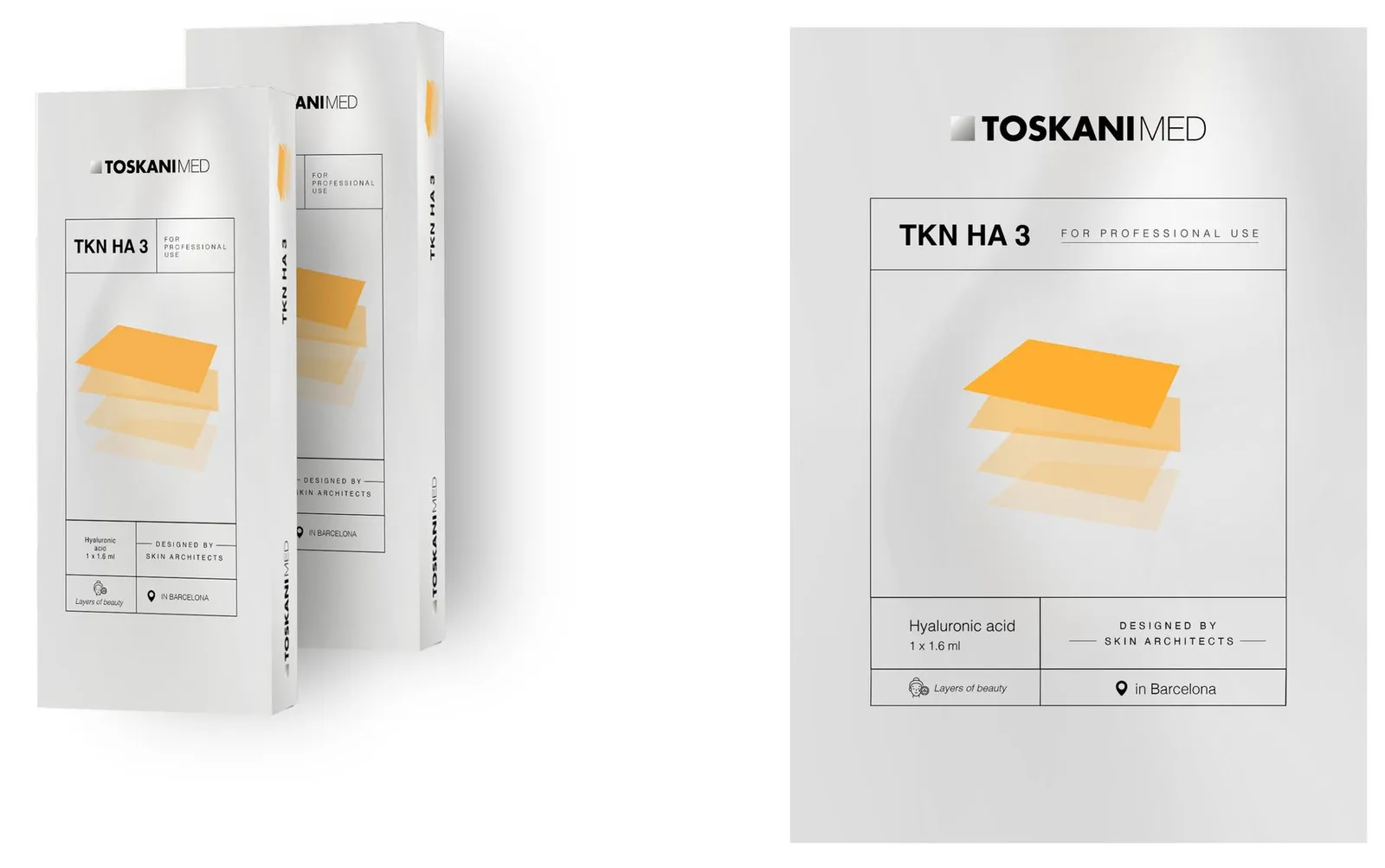
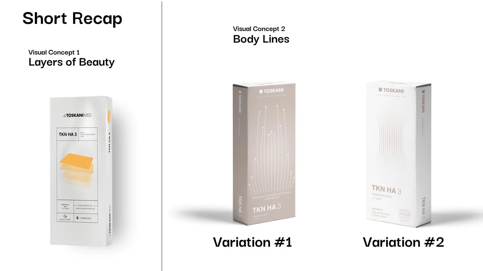
Visual concept 1 starts from the layers of the skin and from trencadís, Gaudí's broken-tile craft. Customised tiling becomes customised aesthetics, fitted to each specific need. On paper that means a grid, geometry, transparency, warm colours and natural light photography.
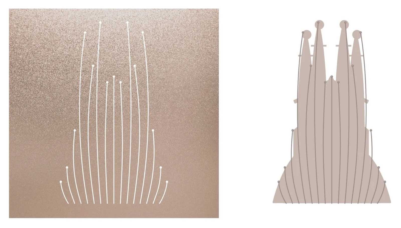
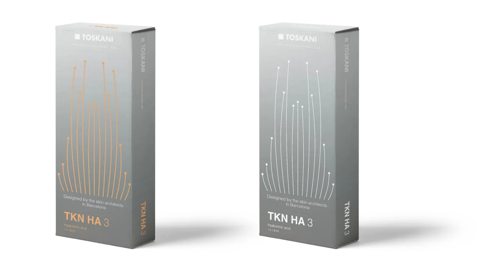
Visual concept 2 follows lines: of the body and face, of what the product does, and of Barcelona. Traced over the Sagrada Família, the same fine lines rise like its towers.
Body Lines in two variations for TKN HA 3. Variation #1 draws the lines as fine stems on taupe, white or silver grey, in white or orange. Variation #2 softens them into a waist of thin strokes on white, with a small skin-layer icon. Every box carries the same line: designed by the skin architects in Barcelona.
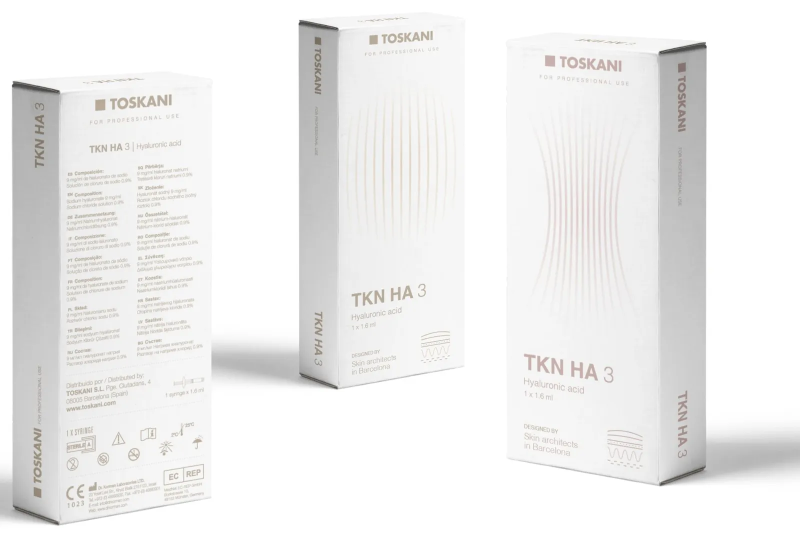
A Core to build on: a caring, expert voice for doctors, and two ways to put it on a box, layers of skin or lines of the body, both signed by the skin architects in Barcelona.
Making motherhood a soothing, joyful experience.
Making in Romania a brand that can win in Paris.
Consolidating the vet pharma leader's market position.