Vizimel
Five ingredients, one tablet a day.
- Eye supplement, Vizimel
- Romania · Zdrovit portfolio
- Product site, desktop and mobile
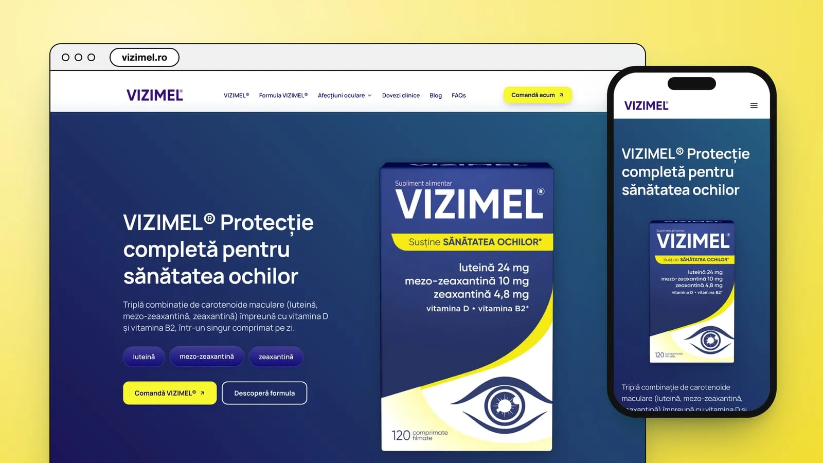
A formula with long names
Vizimel is a food supplement from Zdrovit, for the eyes. Its box prints the formula on the front: luteină 24 mg, mezo-zeaxantină 10 mg, zeaxantină 4,8 mg, vitamina D, vitamina B2.
Three of those names are carotenoids few people could explain.
The site has to make the formula readable: what each ingredient is, what it is for, how to take the tablet and who it is for.
Navy and yellow, in cards
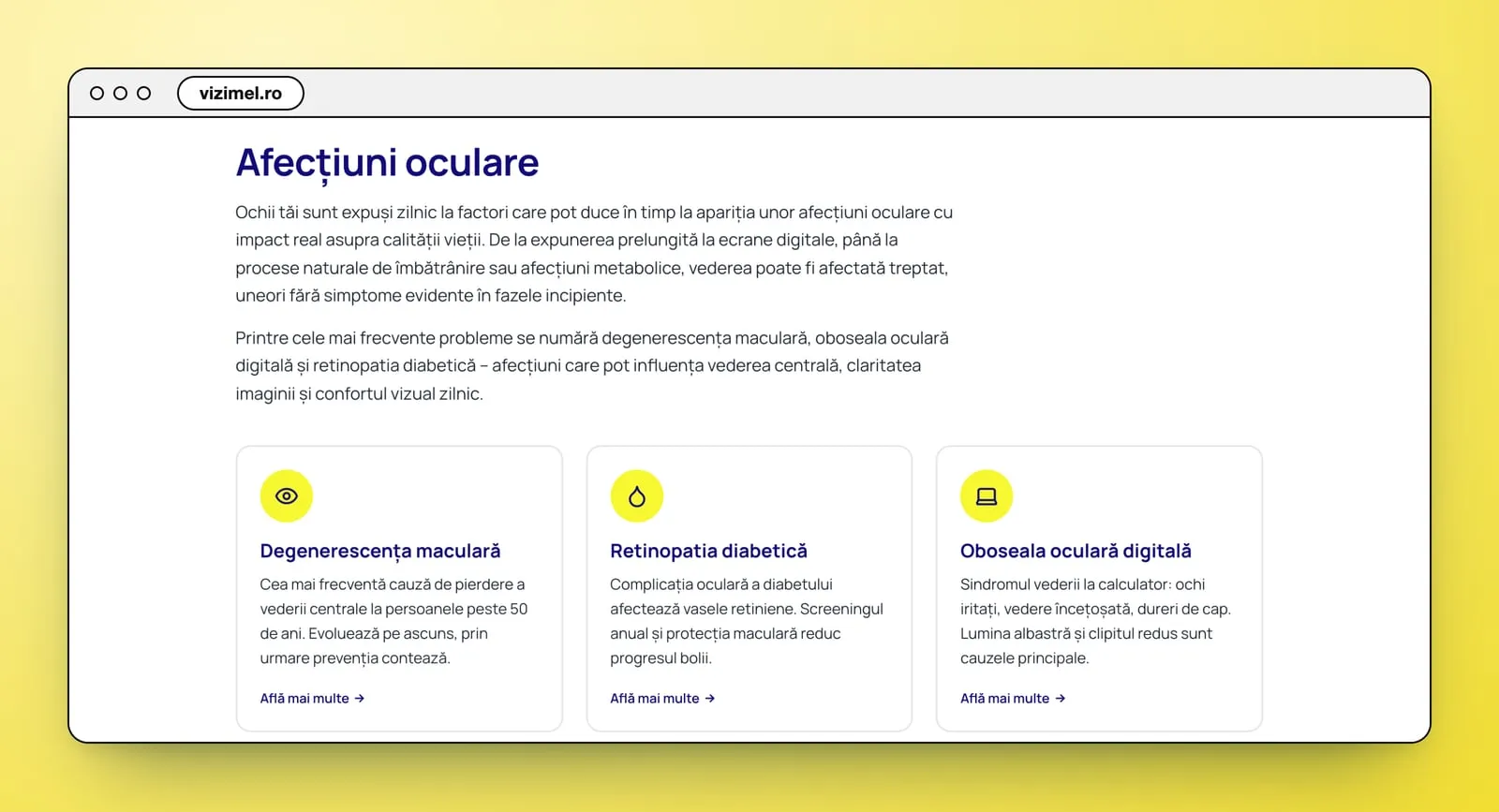
The page takes the box's colours: a navy hero with the box at full height, yellow for the buttons and the highlights. Everything after it is cut into cards, each saying one thing: four for the ways the site says the formula works, five for the ingredients, six for who it is for, three for the eye conditions.
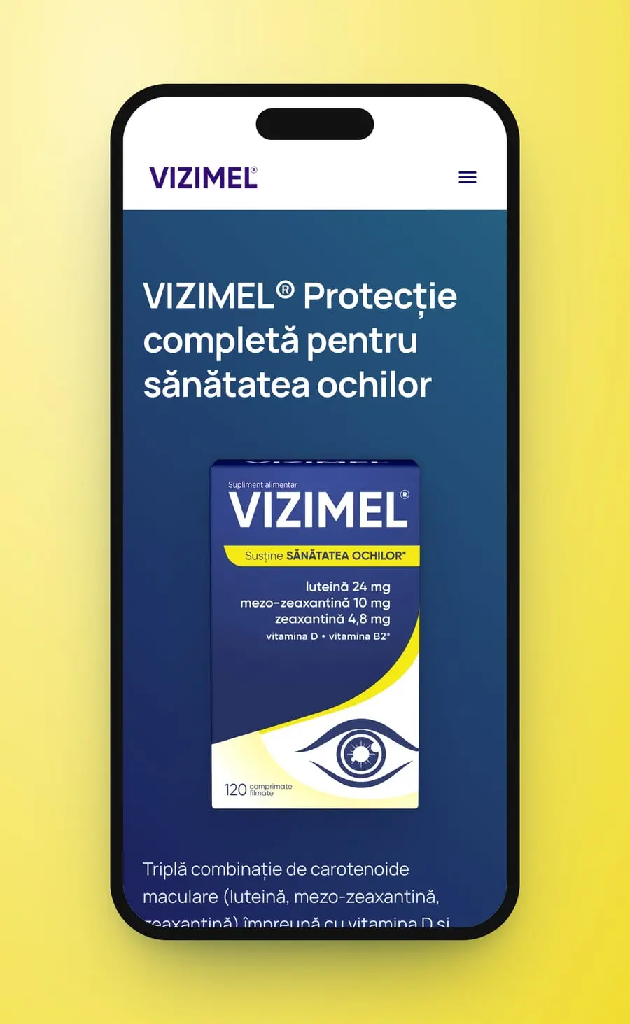
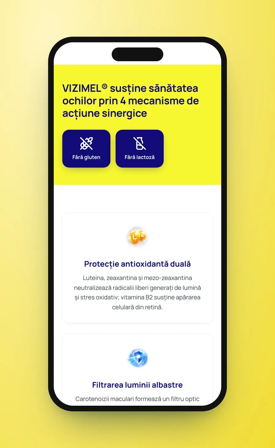
The menu runs VIZIMEL®, Formula VIZIMEL®, Afecțiuni oculare, Dovezi clinice, Blog, FAQs, with a yellow “Comandă acum” at the end. The hero sets the line “VIZIMEL® Protecție completă pentru sănătatea ochilor” beside the 120-tablet box, with three pills for the carotenoids and two buttons, “Comandă VIZIMEL®” and “Descoperă formula”. A yellow band opens the cards, with “Fără gluten” and “Fără lactoză” in two navy tiles. After the formula and the people it is for, three cards name eye conditions, a navy band repeats the order button, and the contact cards close the page.
- Product site
- UX/UI design
- Desktop and mobile
- Cards
Theproduct site


Section bysection
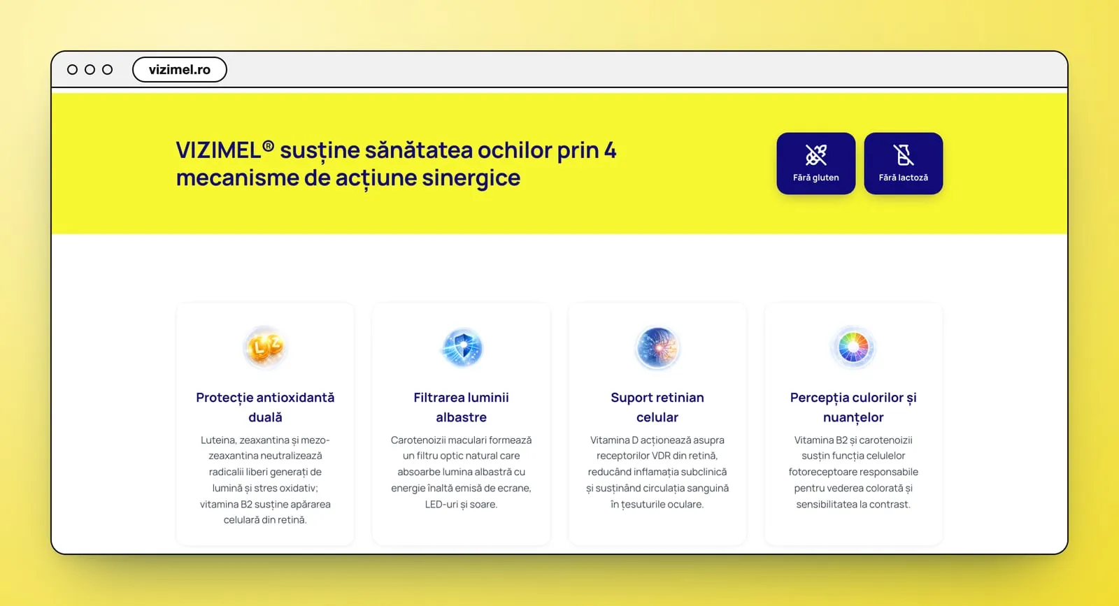
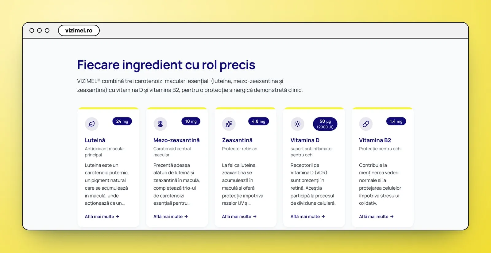
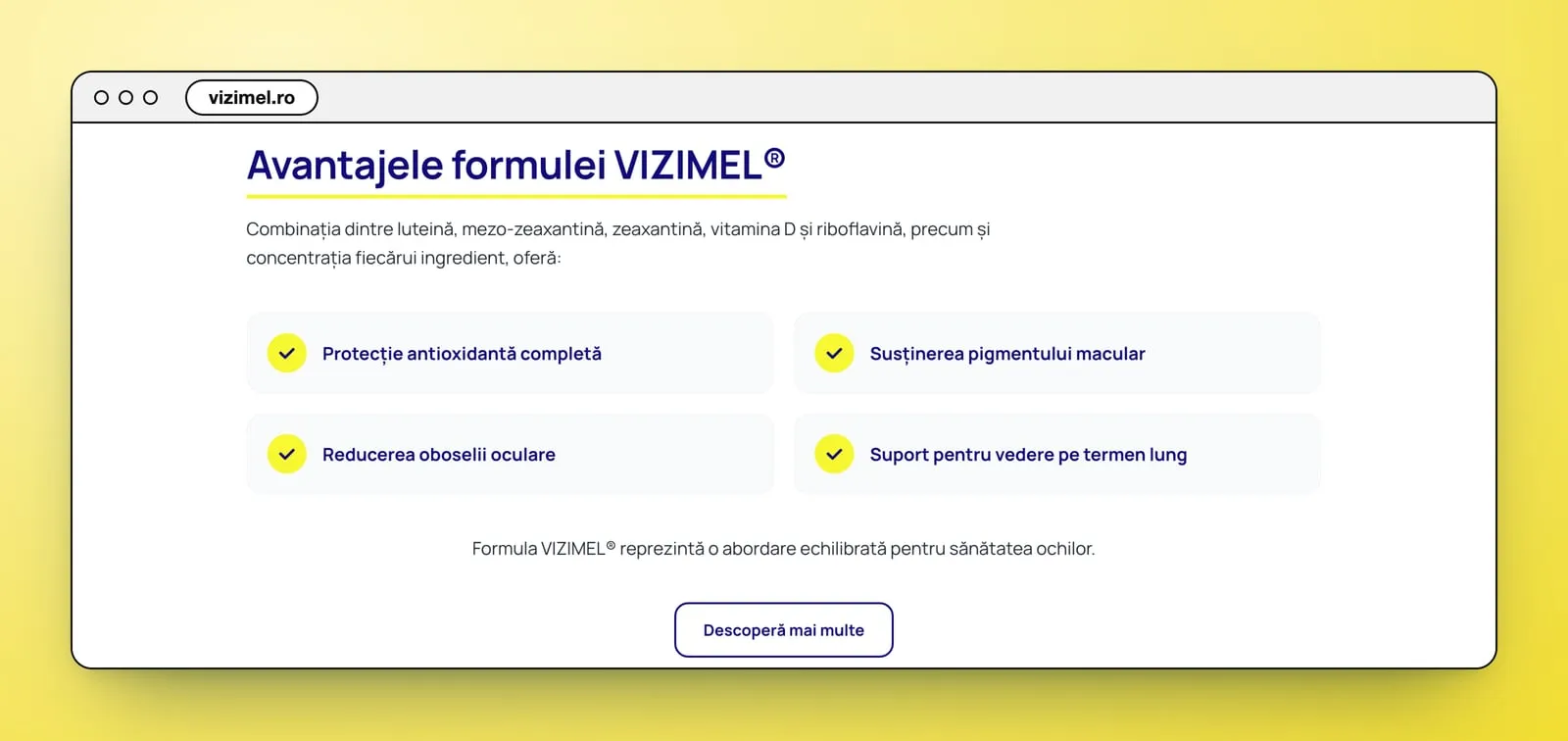
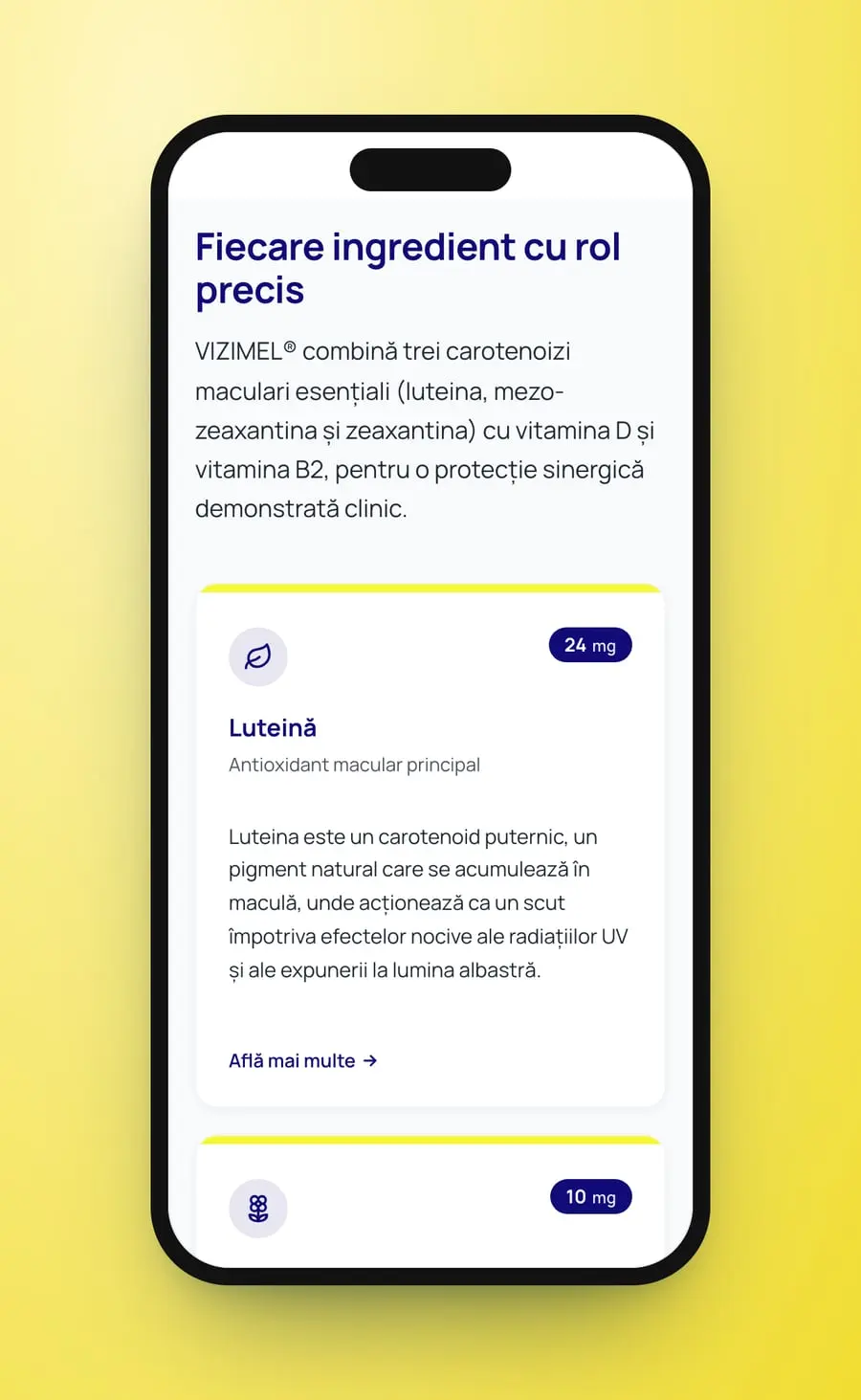
The formula, the way the site lays it out. “Fiecare ingredient cu rol precis” puts five cards in a row, each with a small icon, its dose in a navy pill, the name, its role in a word or two, a short paragraph and an “Află mai multe” link. “Mod de utilizare” gives the dose in one line beside a drawn tablet: “1 comprimat pe zi, preferabil în timpul mesei”. “Avantajele formulei VIZIMEL®” follows in four tiles, each with a yellow tick.
- Ingredient cards
- Usage
- Benefit tiles
On a phone the hero stacks the line, the box, the paragraph, the pills and both buttons. The cards fall into one column, the ingredient cards keep their dose pills top right, and the benefit tiles stack under a yellow underline.
- Mobile layout
- One column
Fourscreens
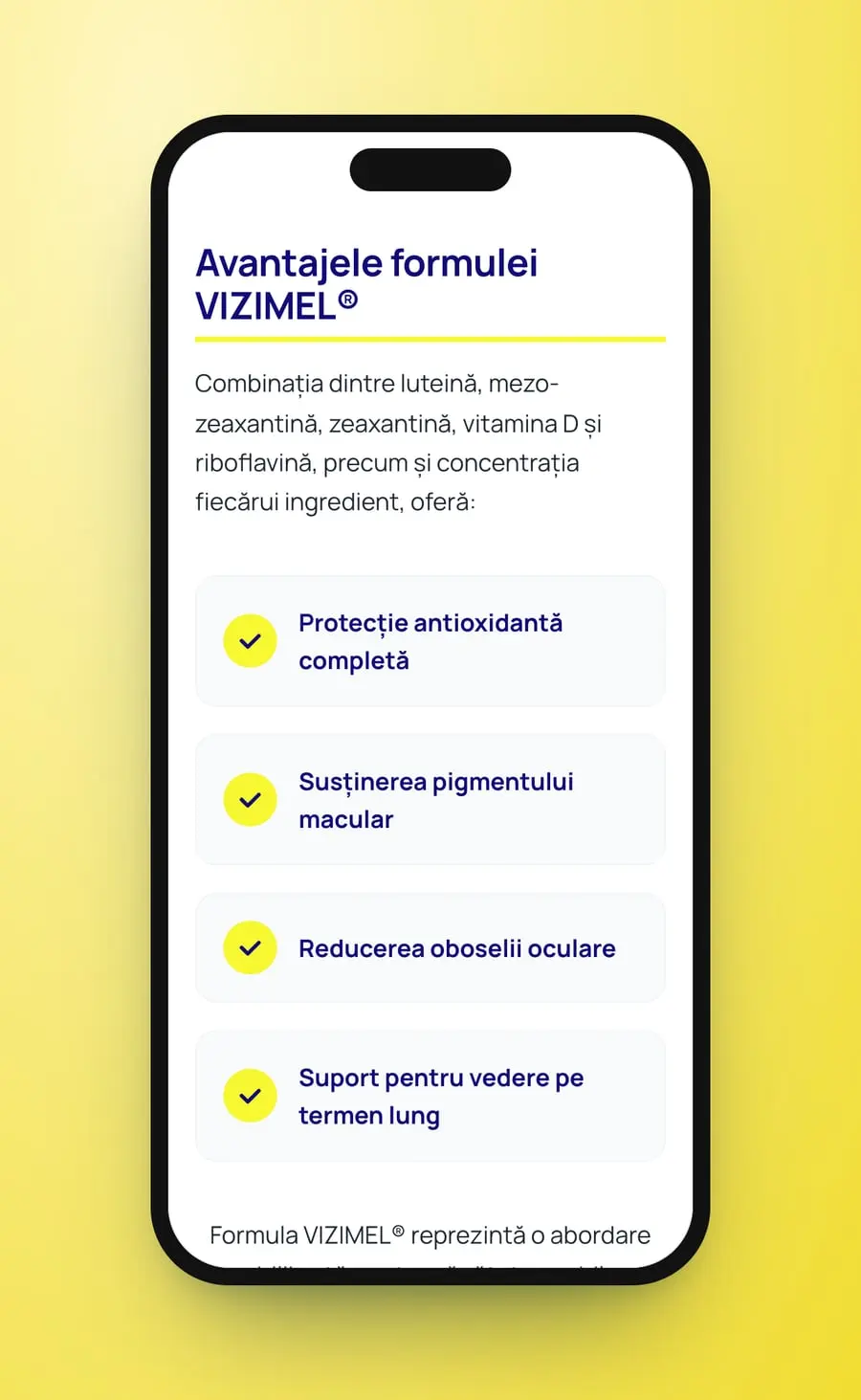
A formula with long names, made readable: one card per ingredient, in the navy and yellow of the box.
Medical Avenue
On the same street
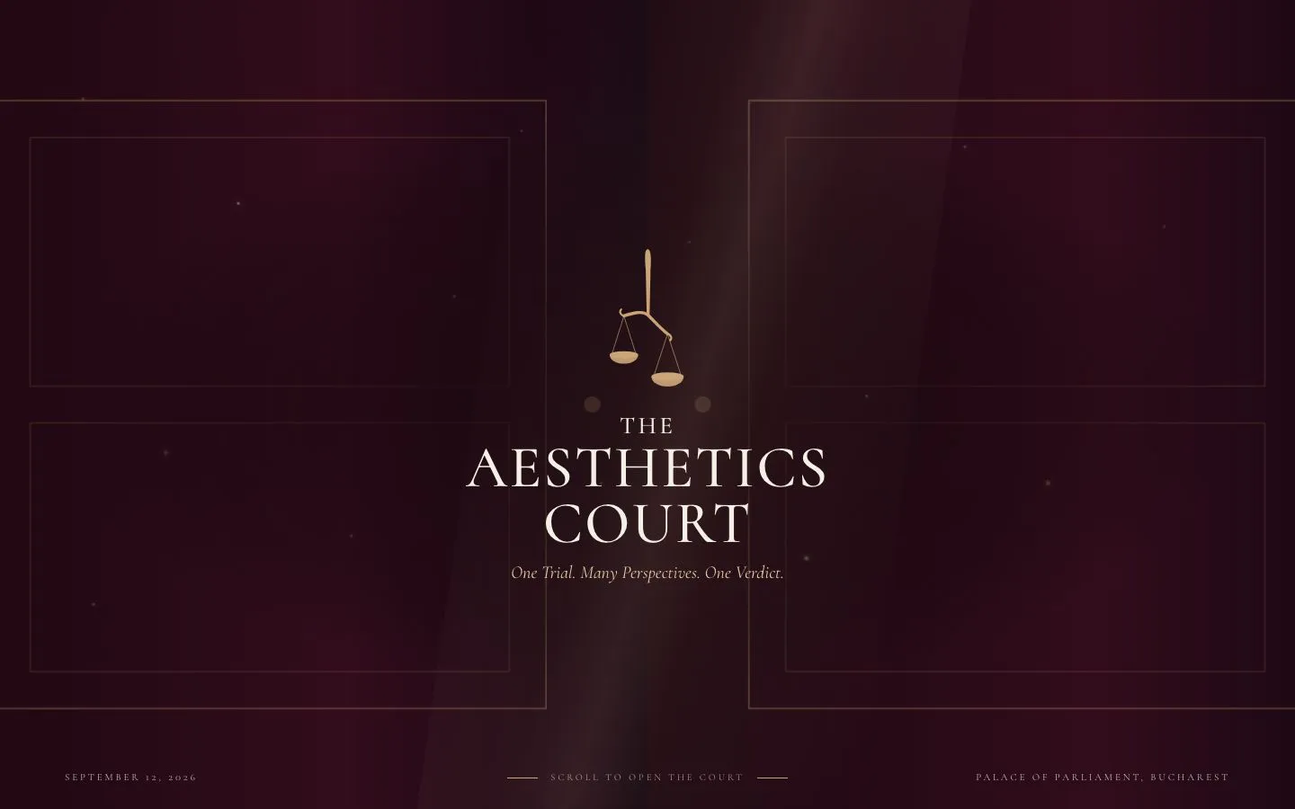 The Aesthetic CourtWebsite · UX · UI
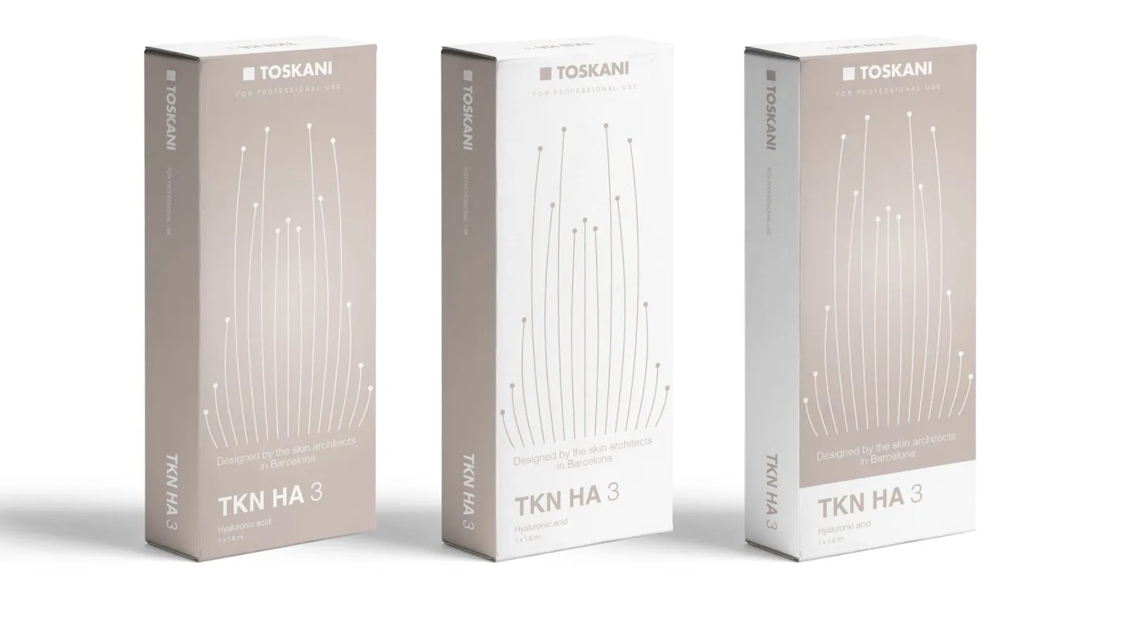 Toskani MEDBrand strategy · Packaging · Barcelona
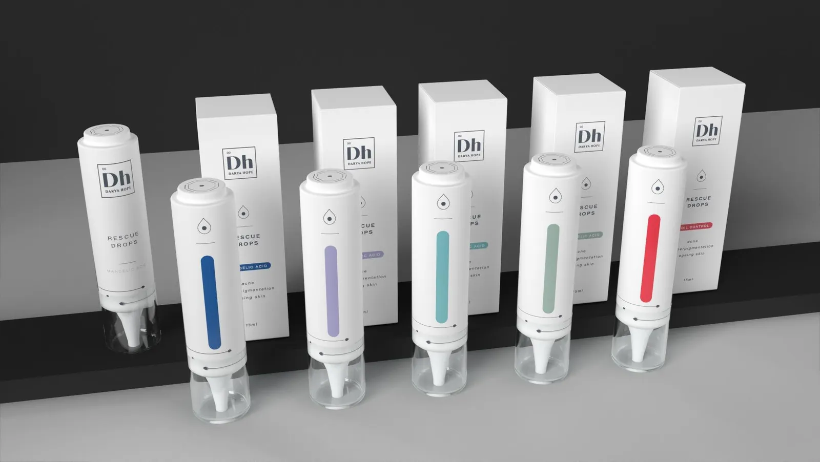 Darya HopeBrand strategy · Social media · Packaging
 Tracy JBrand strategy · Identity · Packaging
 Routine ParisBrand · Identity
Cromatic Air · Now boarding
Ready to fly, already?
Complete your boarding pass in a minute. We'll be in touch within a day.
Begin boarding