Slaboficat
The liver, lit up.
- Liver supplement, Slaboficat Slim
- Romania · Zdrovit portfolio
- Landing page, desktop and mobile
Two subjects, one box
Slaboficat Slim is a food supplement from Zdrovit, in capsules. The site puts its case as a question: “Vrei să ai grijă de ficat și în același timp să menții o greutate optimă a corpului?”
That is two subjects in one box. The liver, which you never see, and your figure, which you see every day.
The page has to show the first one before it can talk about the second.
Start with the organ
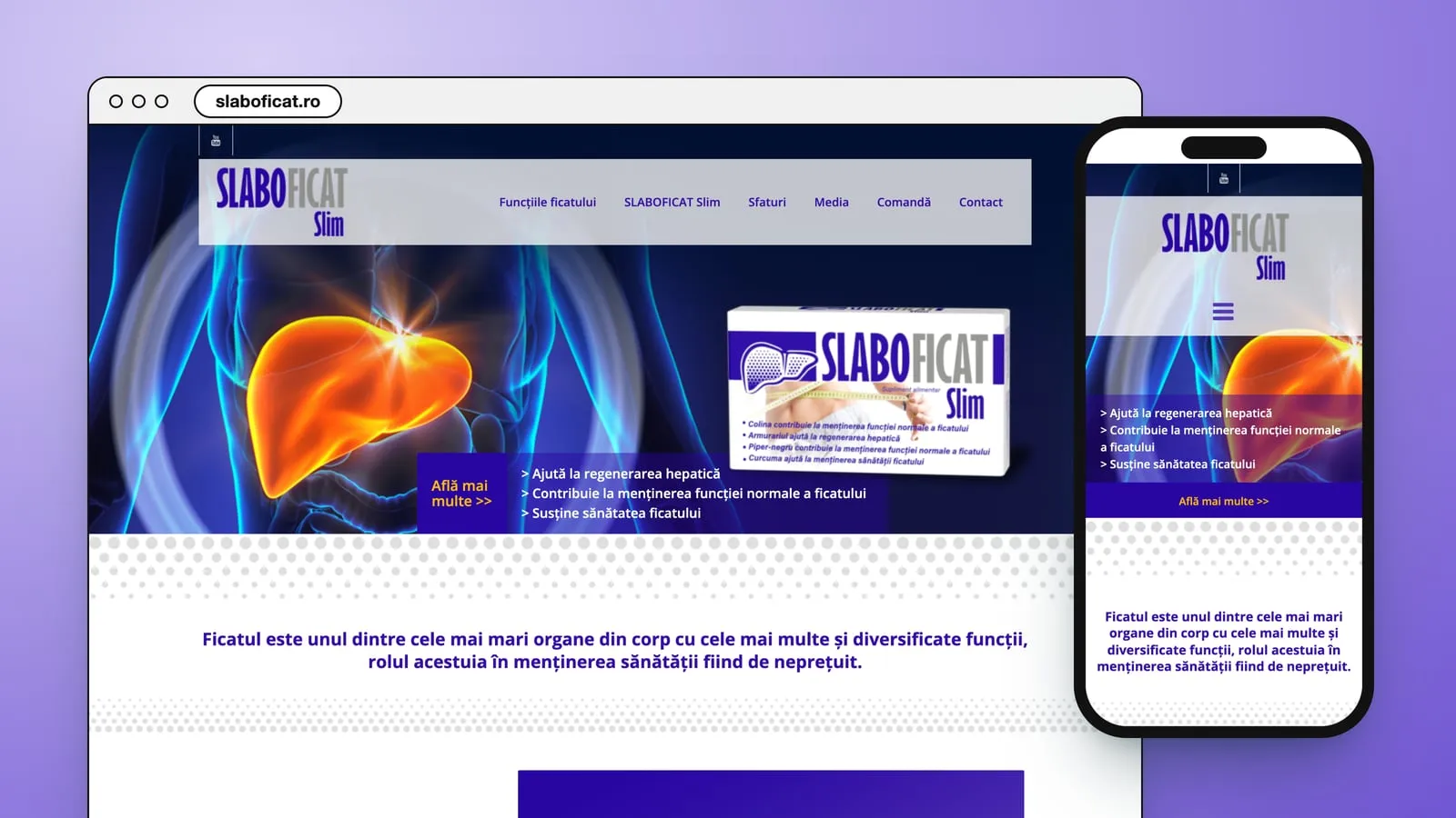
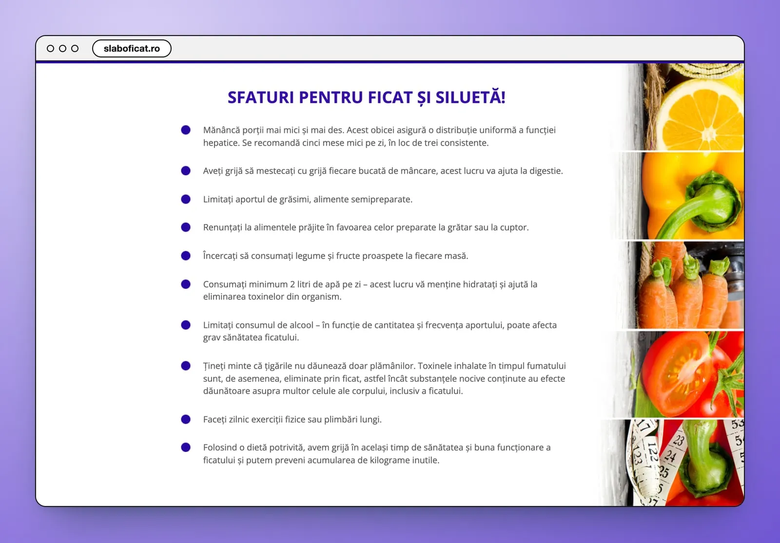
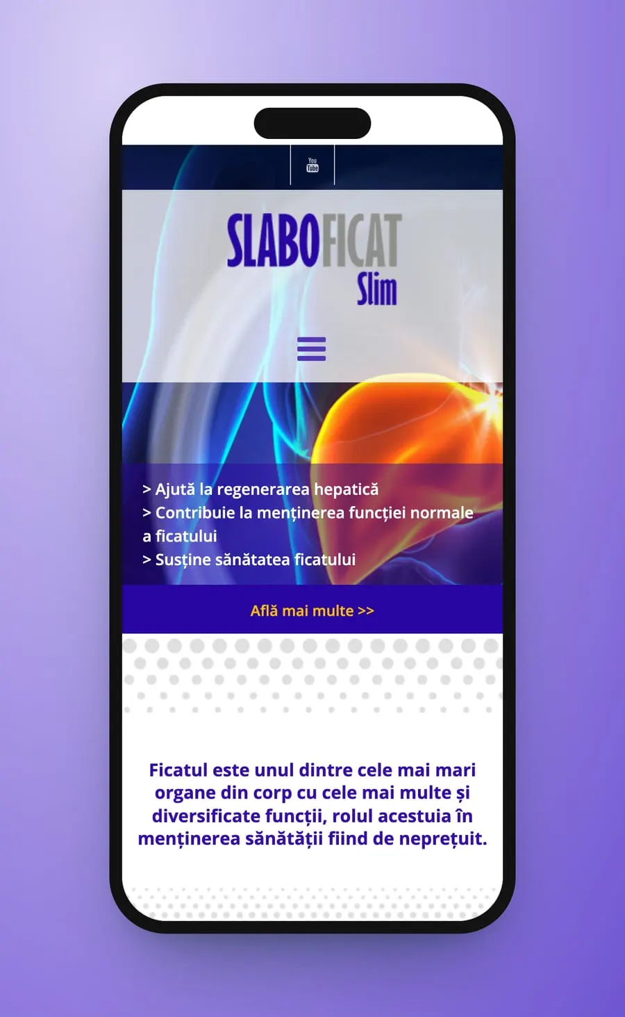
The page opens on the liver itself, glowing orange inside a blue body, with the box beside it and three lines on a violet band. Then it explains what the liver does, brings in the Slim formula, lists the ingredients one by one and ends with tips for the liver and the figure. Violet runs through all of it, from the menu to the order button.
The menu runs Funcțiile ficatului, SLABOFICAT Slim, Sfaturi, Media, Comandă, Contact. The hero puts the glowing liver on the left and the box on the right, over a violet band with three lines, from “Ajută la regenerarea hepatică” to “Susține sănătatea ficatului”, and an “Află mai multe >>” link. A sentence in bold violet follows, “Ficatul este unul dintre cele mai mari organe din corp…”. Below come the liver's functions, the Slim formula, the ingredients, how to take it, the tips and the order button, above the Zdrovit address.
- Landing page
- UX/UI design
- Desktop and mobile
- Navigation
Thelanding page
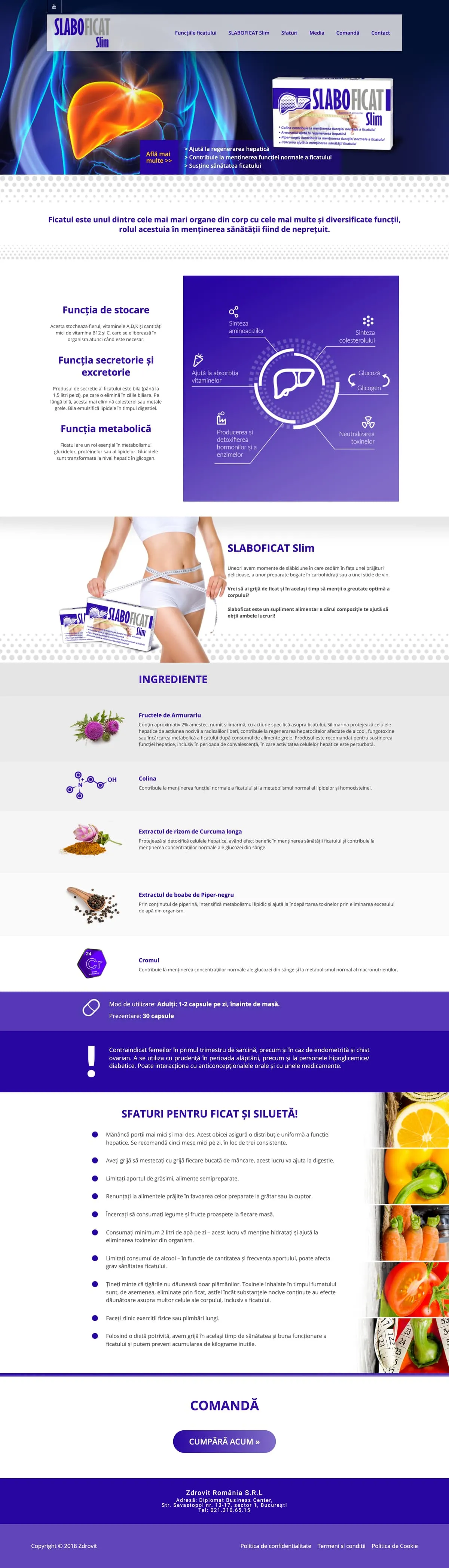

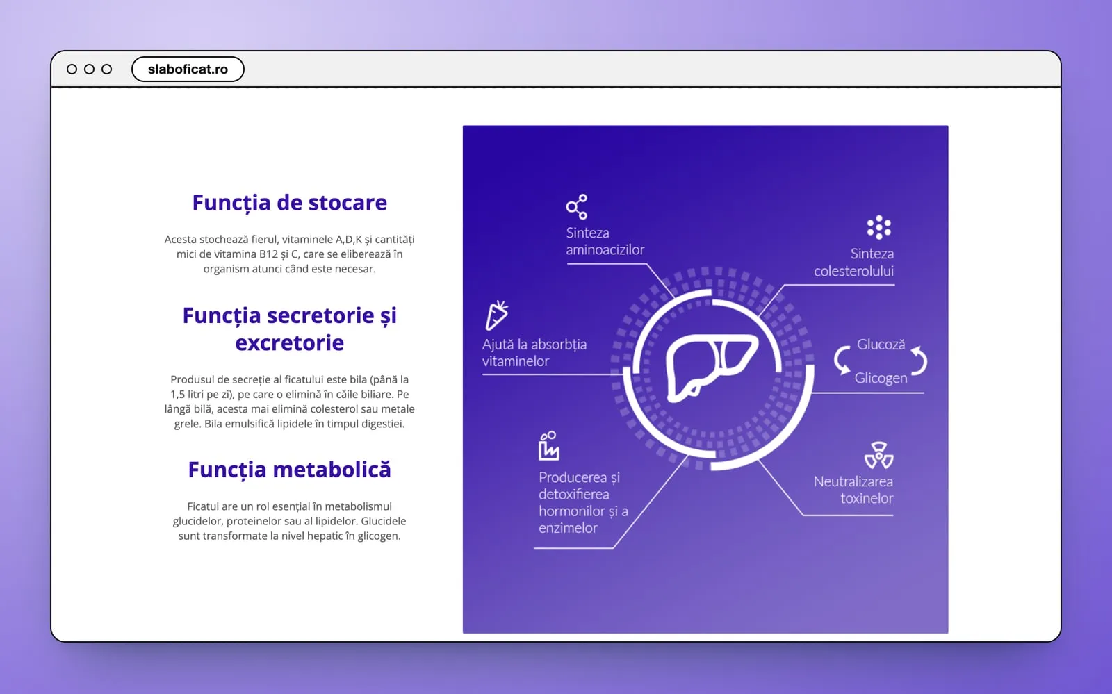
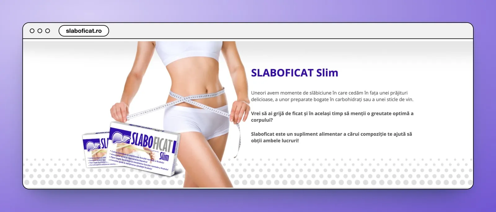
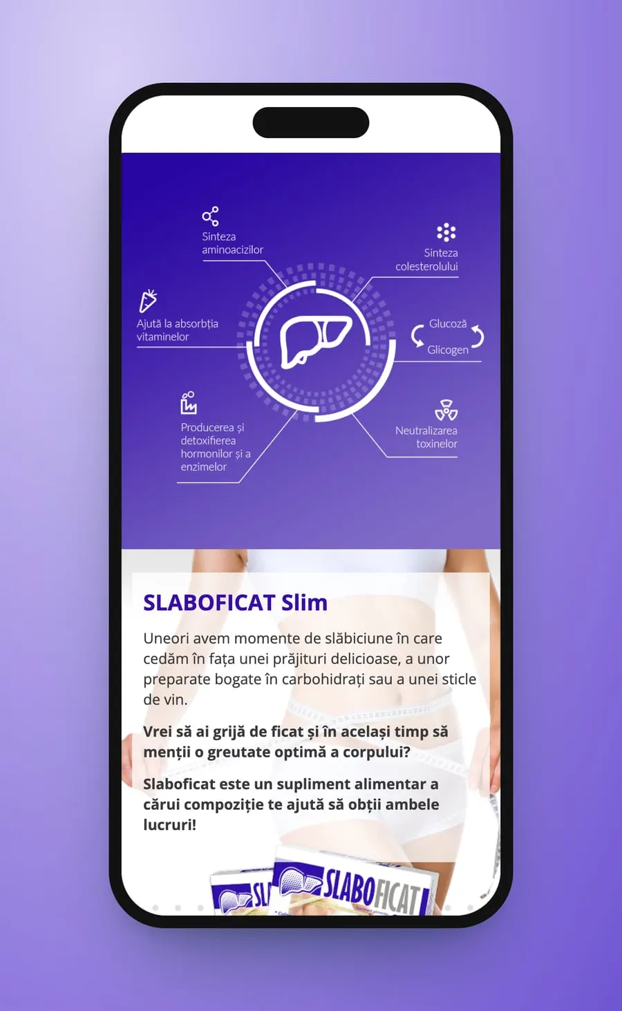
The product story, the way the site tells it. Three of the liver's functions get a heading each: stocare, secretorie și excretorie, metabolică. Beside them a violet panel draws the liver in a ring, with six lines out to what it does, from Sinteza aminoacizilor to Neutralizarea toxinelor. Then the turn to the figure: SLABOFICAT Slim, a woman with a tape measure round her waist, the box at her side and the site's question. The ingredients follow one per row, each with its picture: Fructele de Armurariu, Colina, Curcuma longa, Piper-negru and Cromul. A violet band gives the dose and the pack in the site's words, “Adulți: 1-2 capsule pe zi, înainte de masă” and “30 capsule”.
- Product story
- Infographic
- Ingredients
- Usage
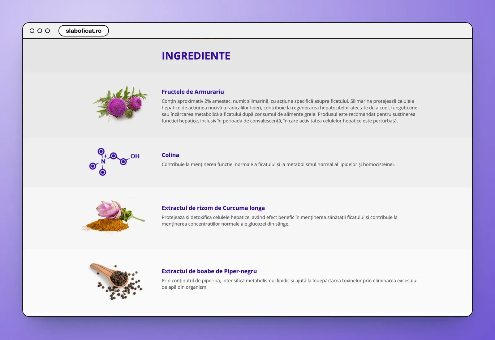
On a phone the logo moves to the centre with the menu icon under it, and the three lines sit under the liver, above “Află mai multe >>”. The violet panel of functions fills the width. Each ingredient gets a block of its own, picture first, and the tips keep their photos, faded behind the text.
- Mobile layout
- One column
Fourscreens
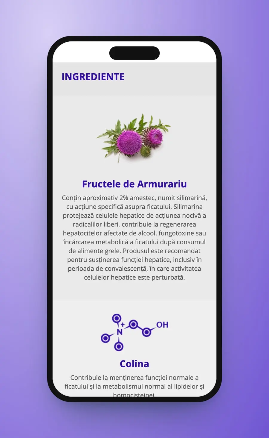
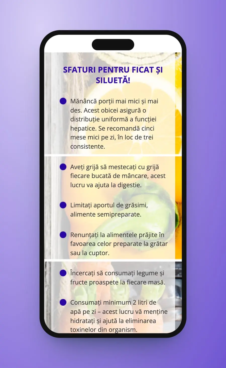
The organ first, then the box: a liver supplement's page, violet from the menu to the order button.
Medical Avenue
On the same street
 The Aesthetic CourtWebsite · UX · UI
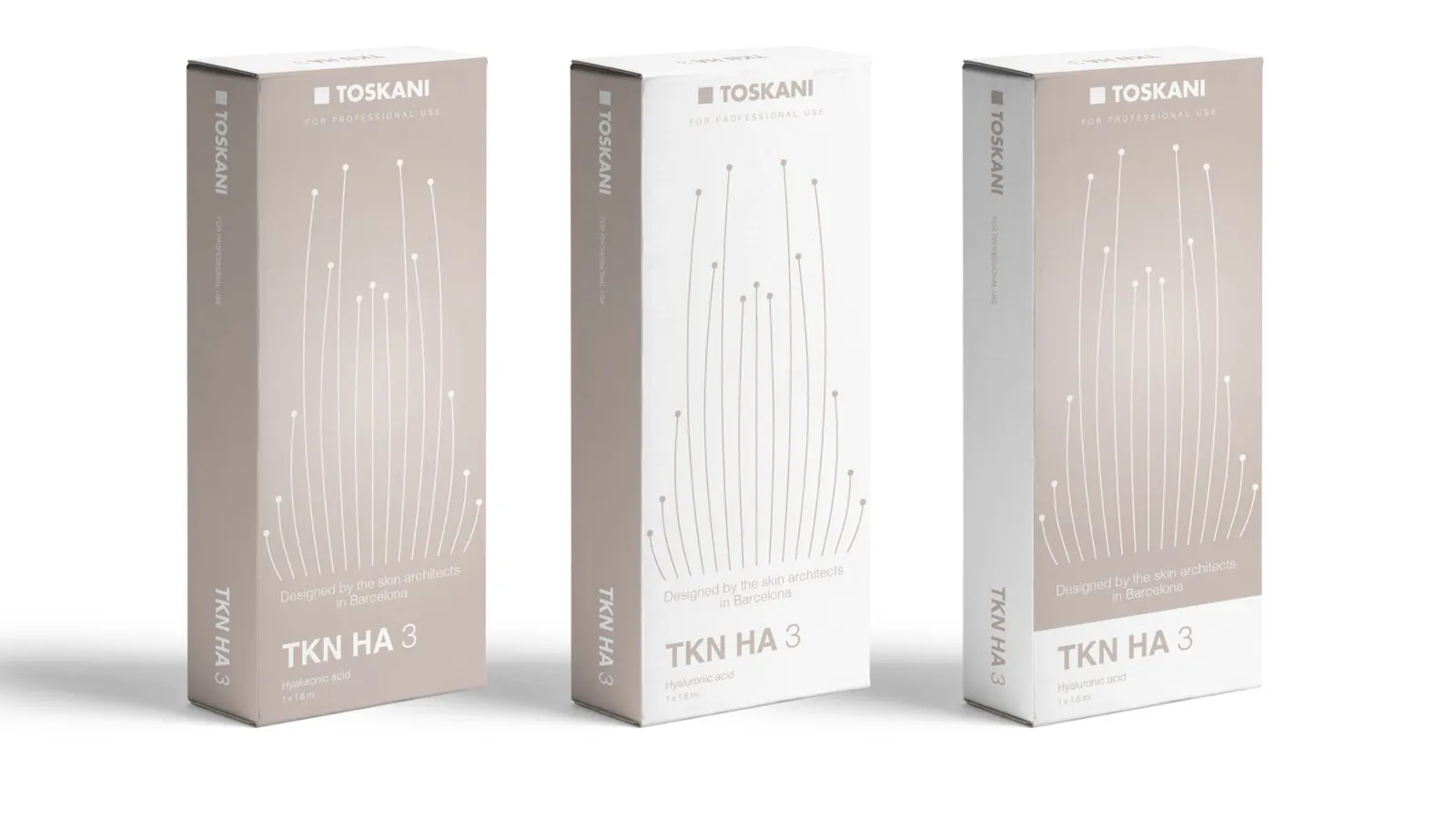 Toskani MEDBrand strategy · Packaging · Barcelona
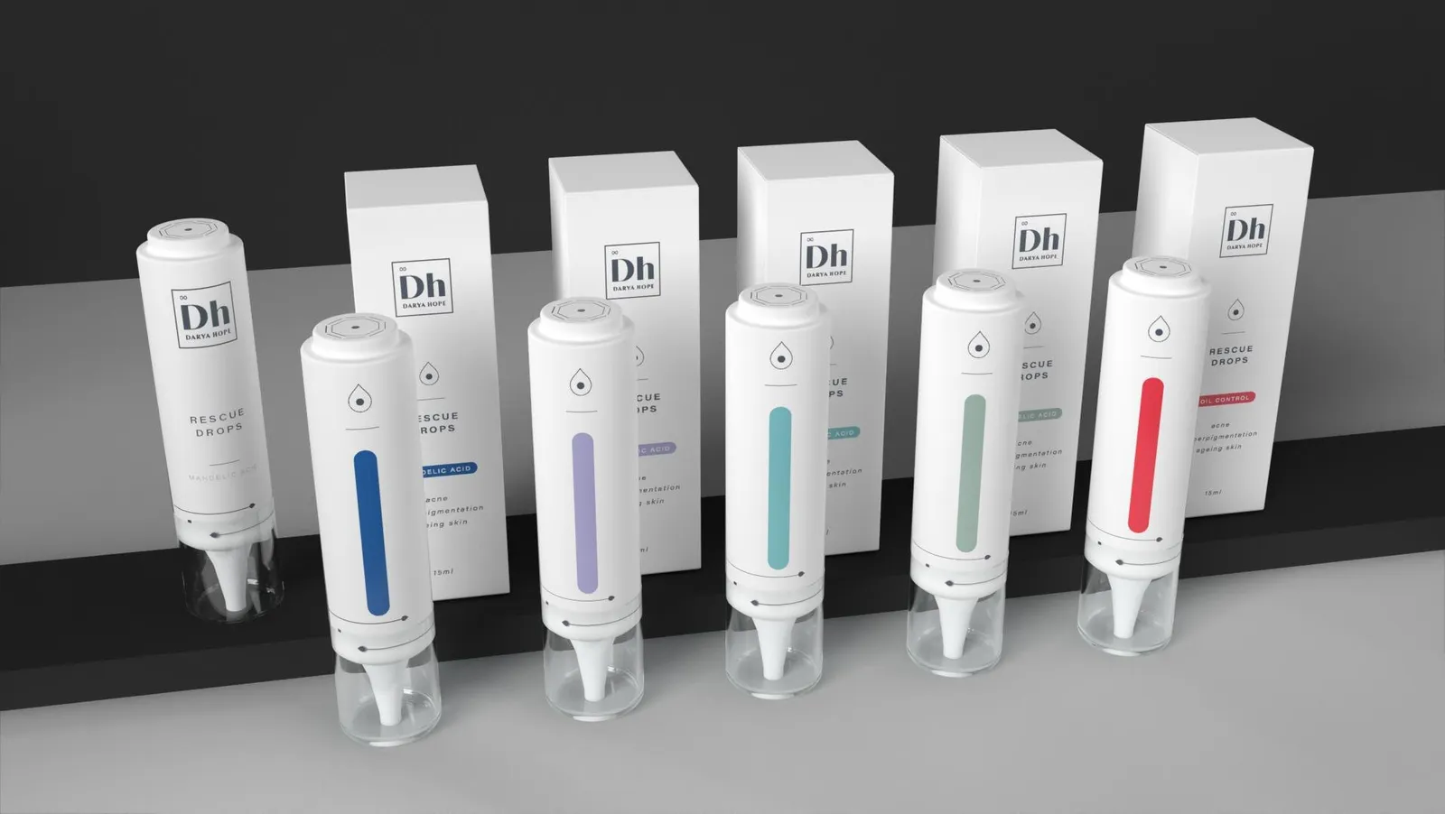 Darya HopeBrand strategy · Social media · Packaging
 Tracy JBrand strategy · Identity · Packaging
 Routine ParisBrand · Identity
Cromatic Air · Now boarding
Ready to fly, already?
Complete your boarding pass in a minute. We'll be in touch within a day.
Begin boarding