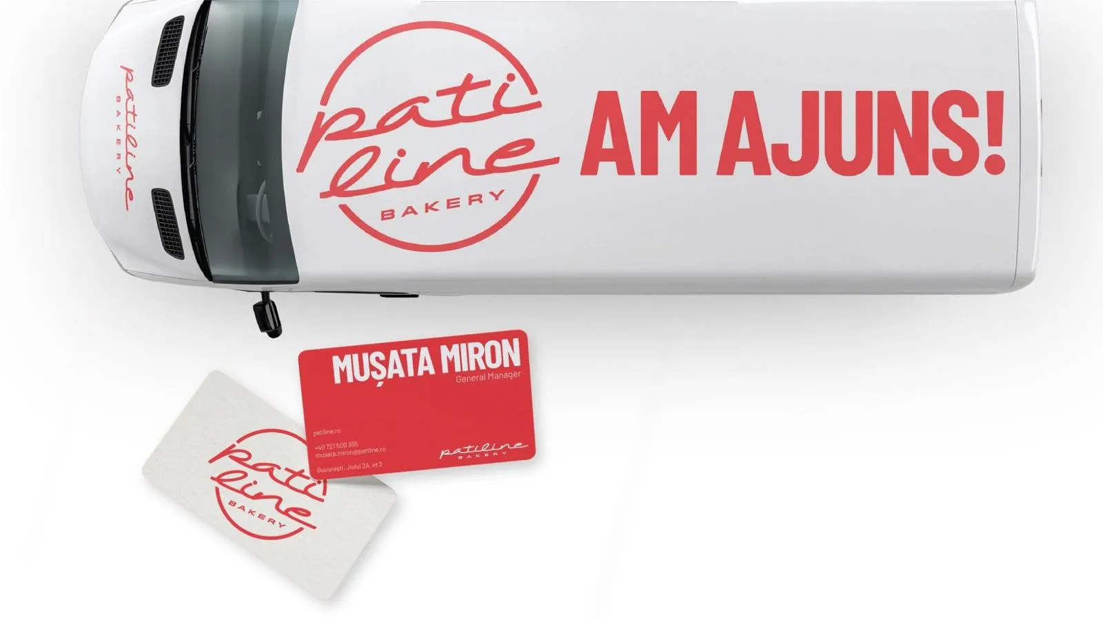
Patiline
Artisan bread at scale, rebranded for HoReCa: always fresh, forever the same.
- Branding & Design
Pain Plaisir
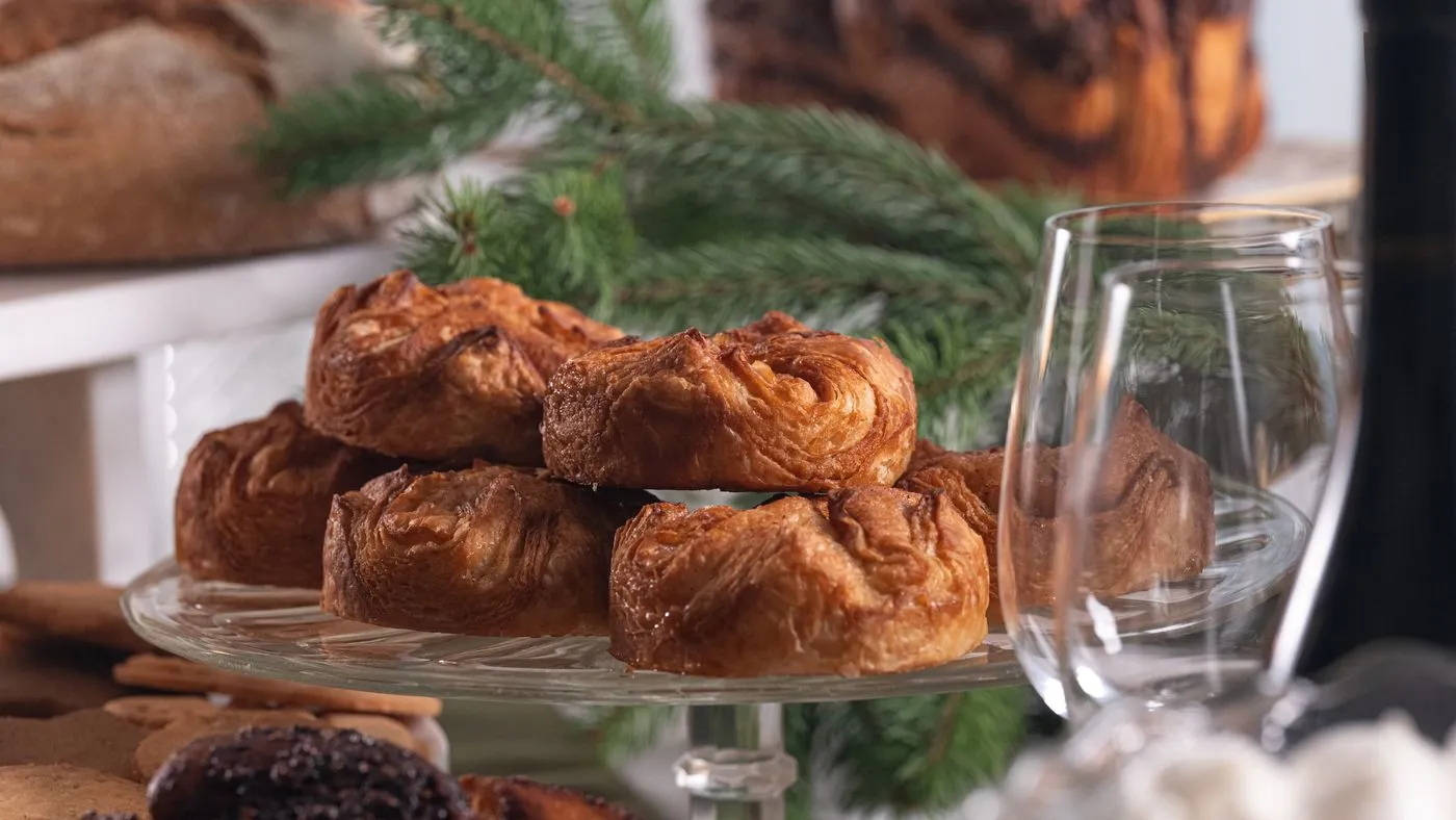
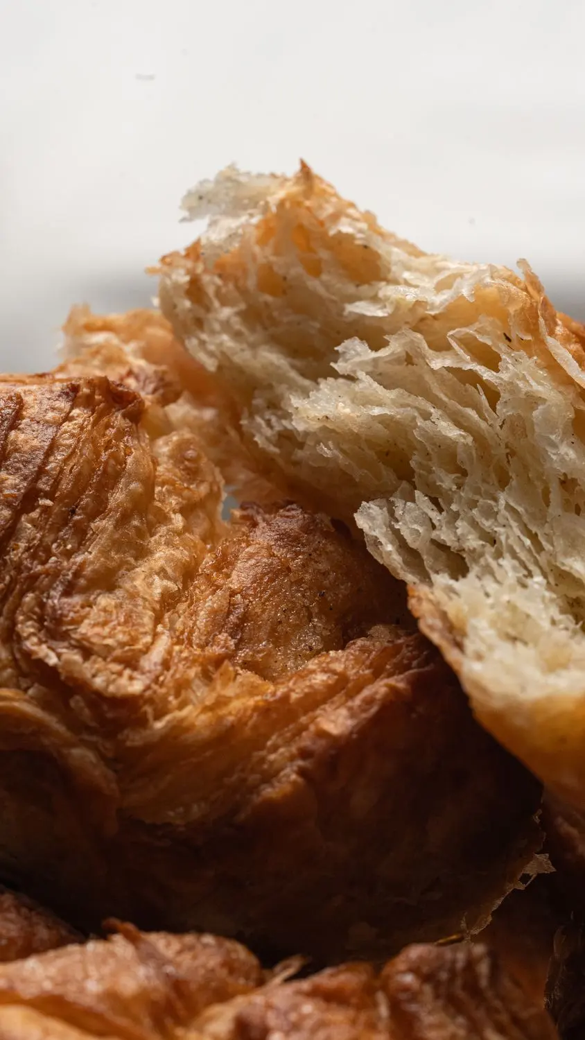
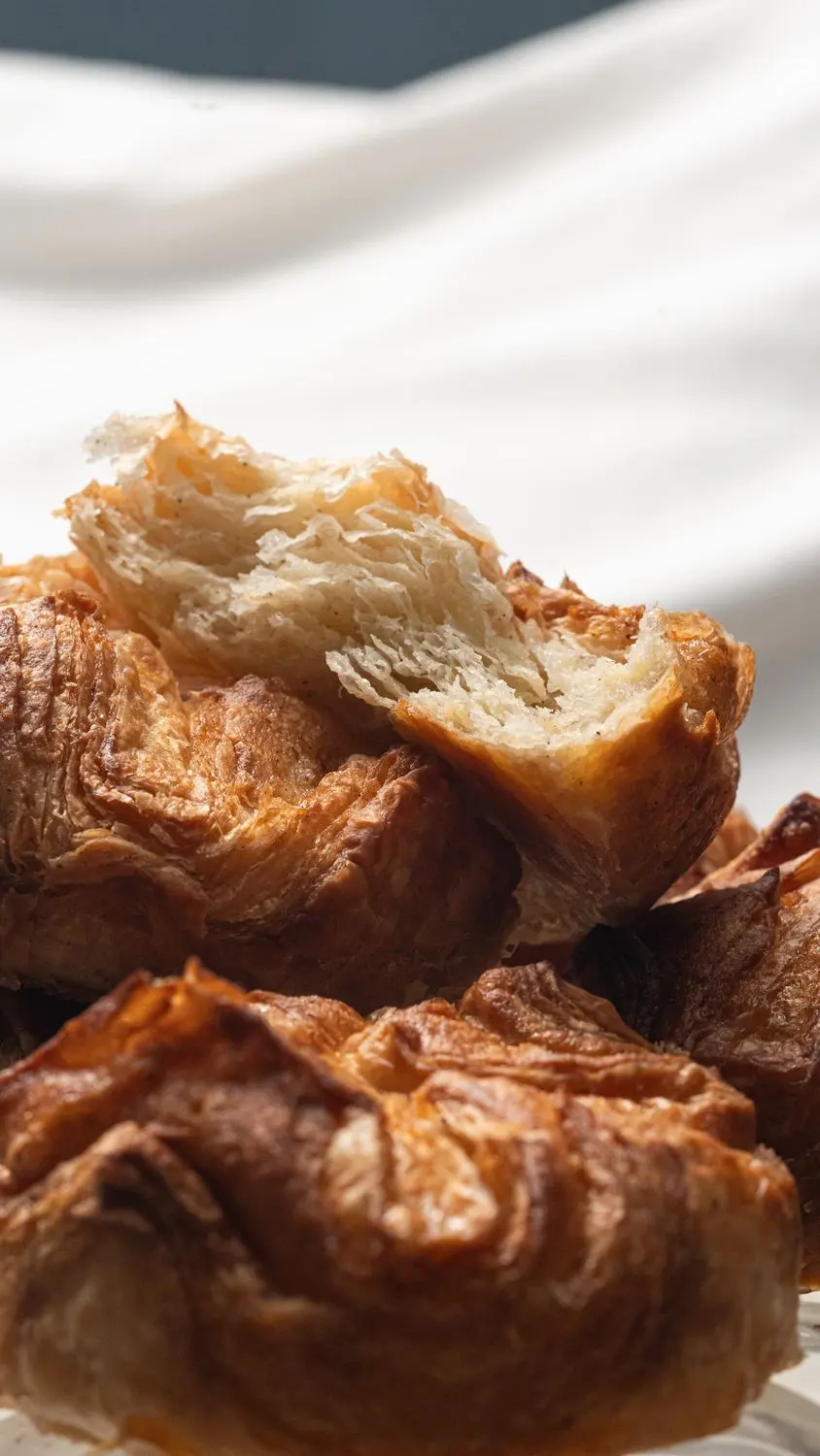
The Anemone is croissant dough with sugar and vanilla, Pain Plaisir's take on the kouign-amann, folded at four points.
Pain Plaisir wanted it to stand out as a product of its own: on the shelf, in a gift box and on Instagram.
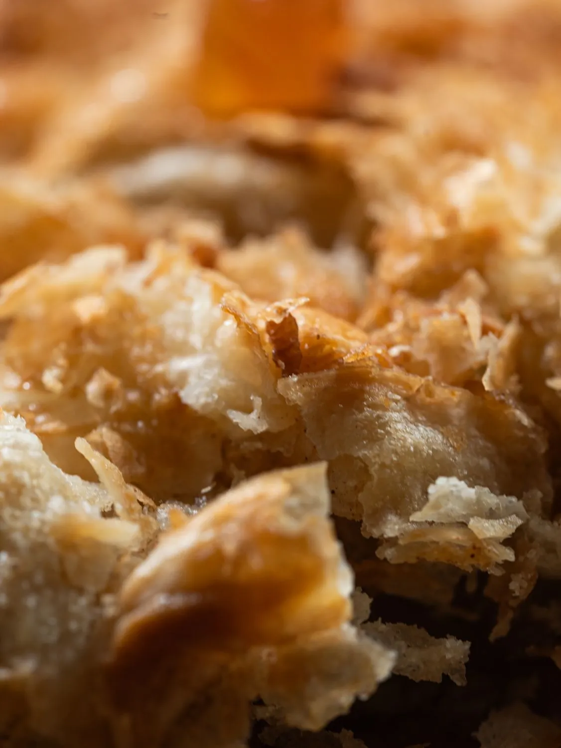
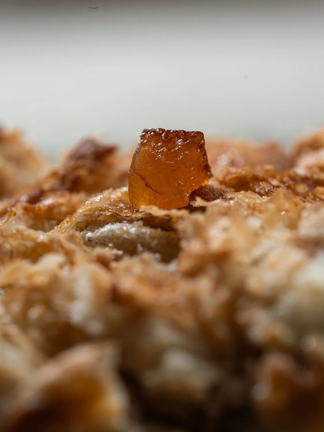
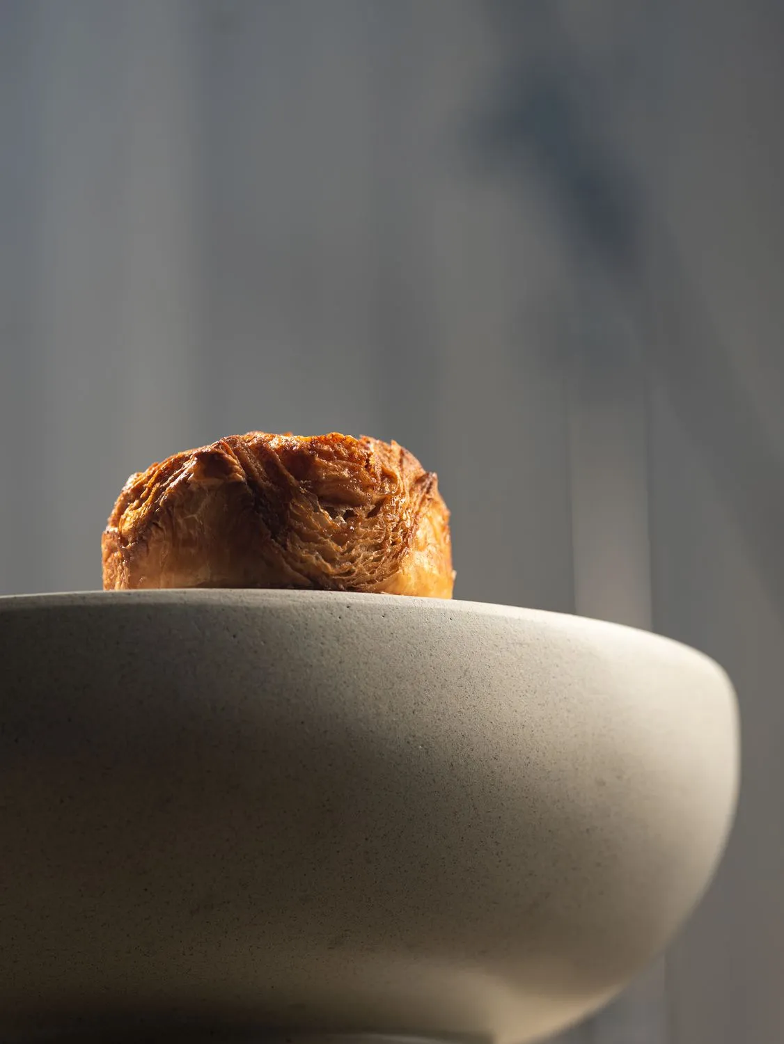
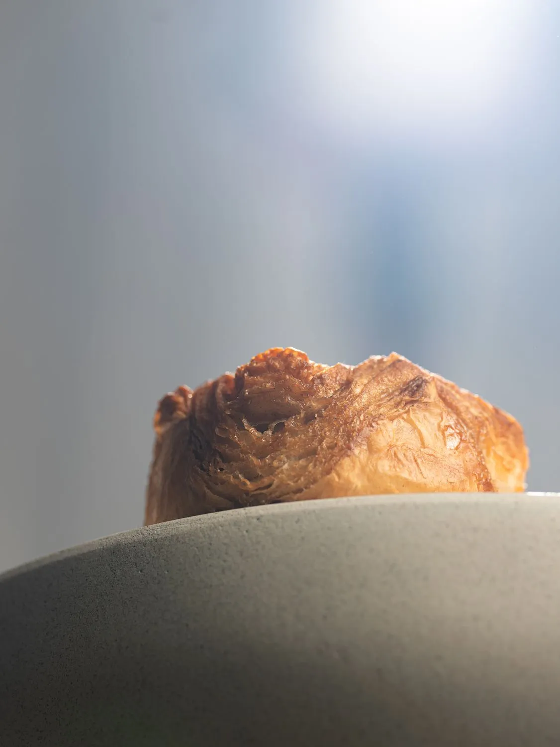
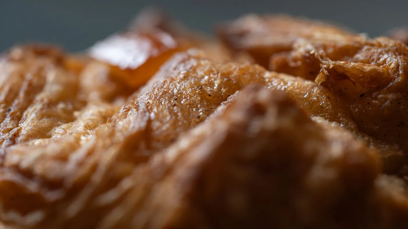
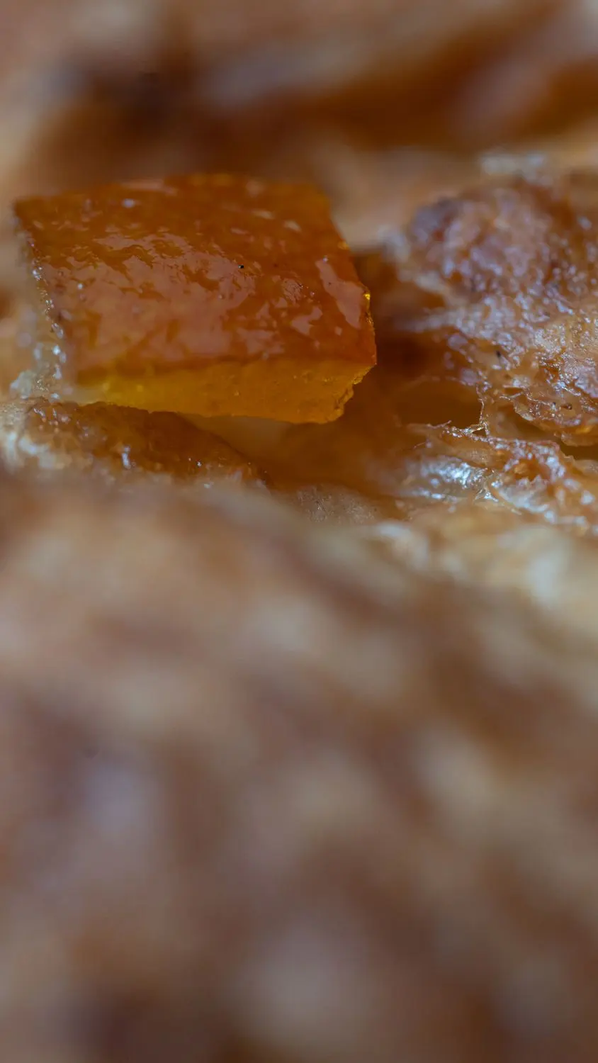
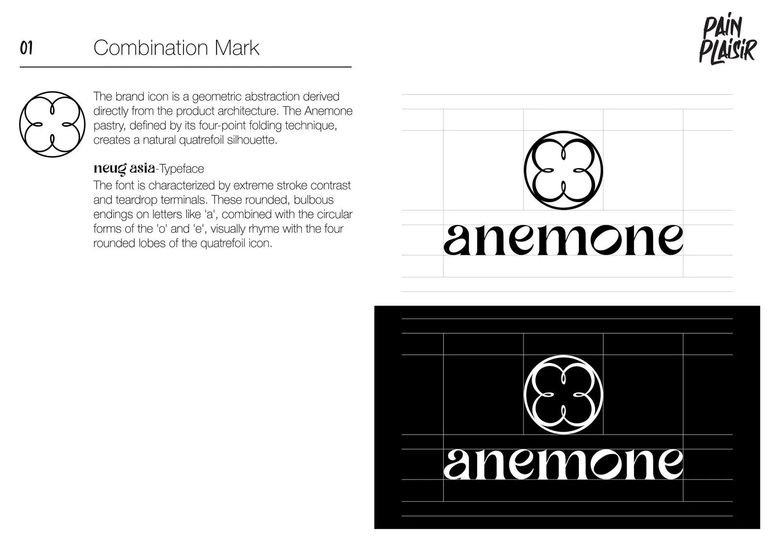
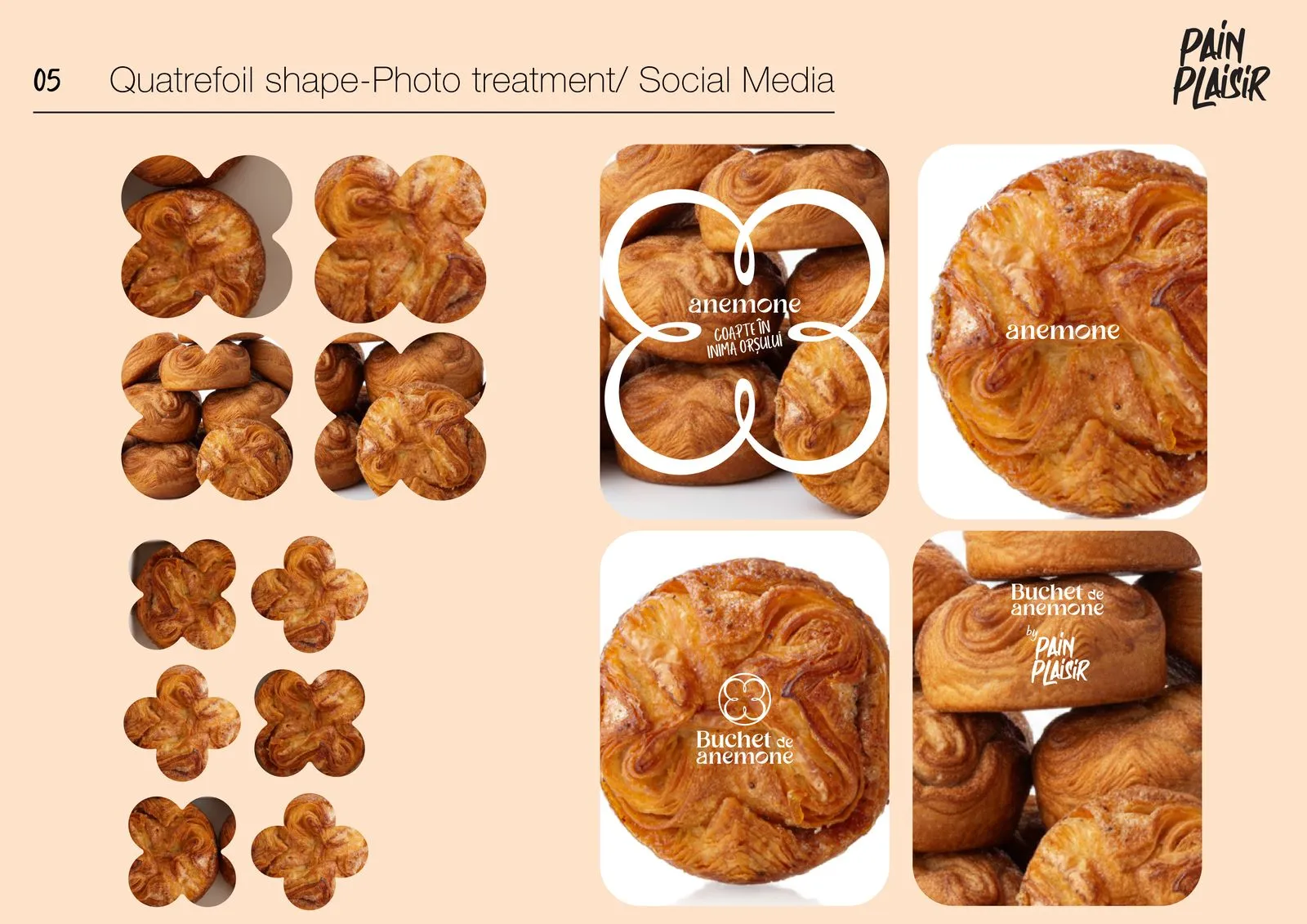
The brand icon is a geometric abstraction of the product itself: the four-point fold makes a natural quatrefoil. Neug Asia, with its extreme contrast and teardrop terminals, rhymes with the four rounded lobes.
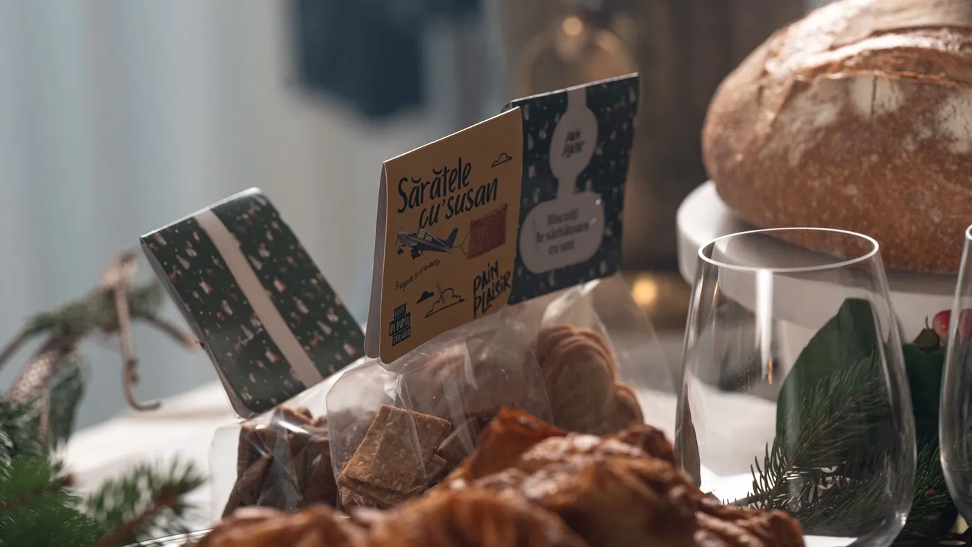
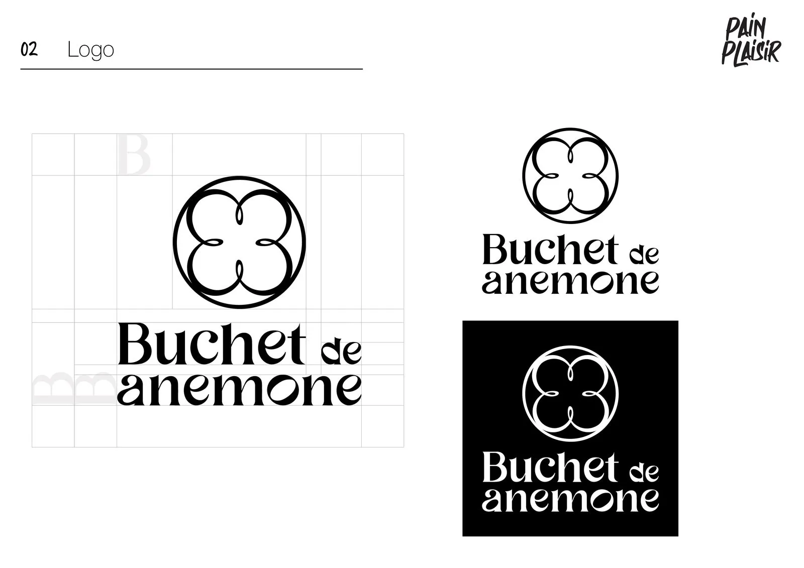
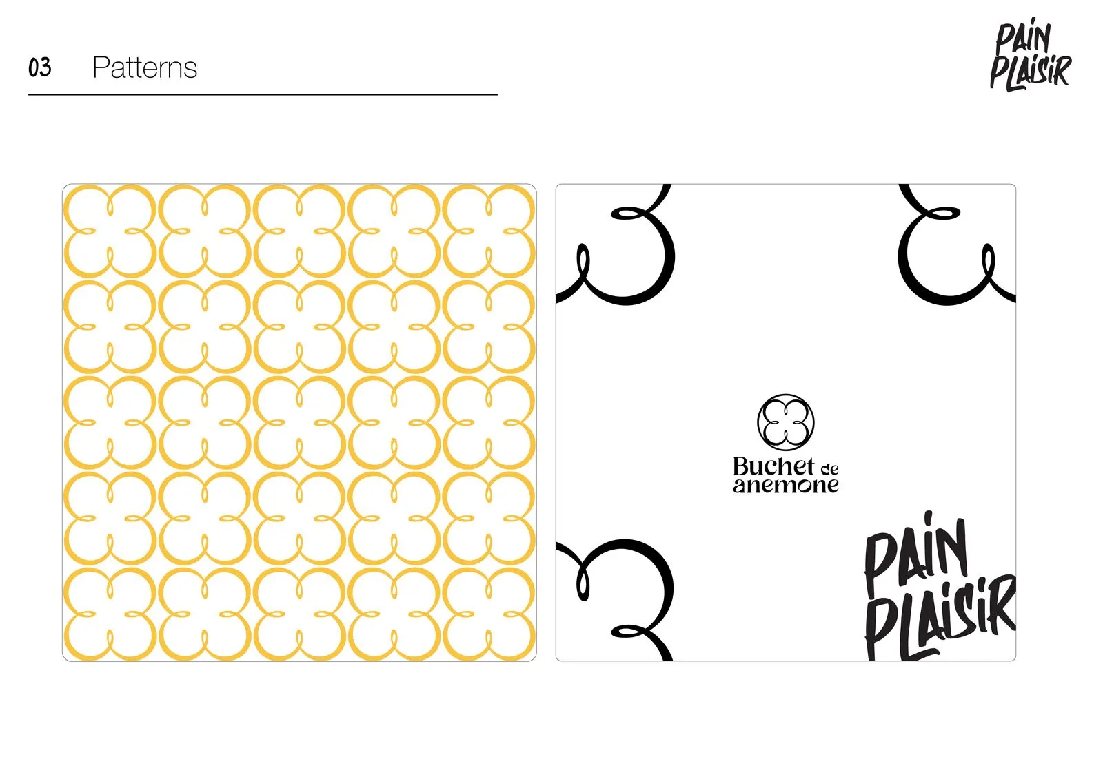
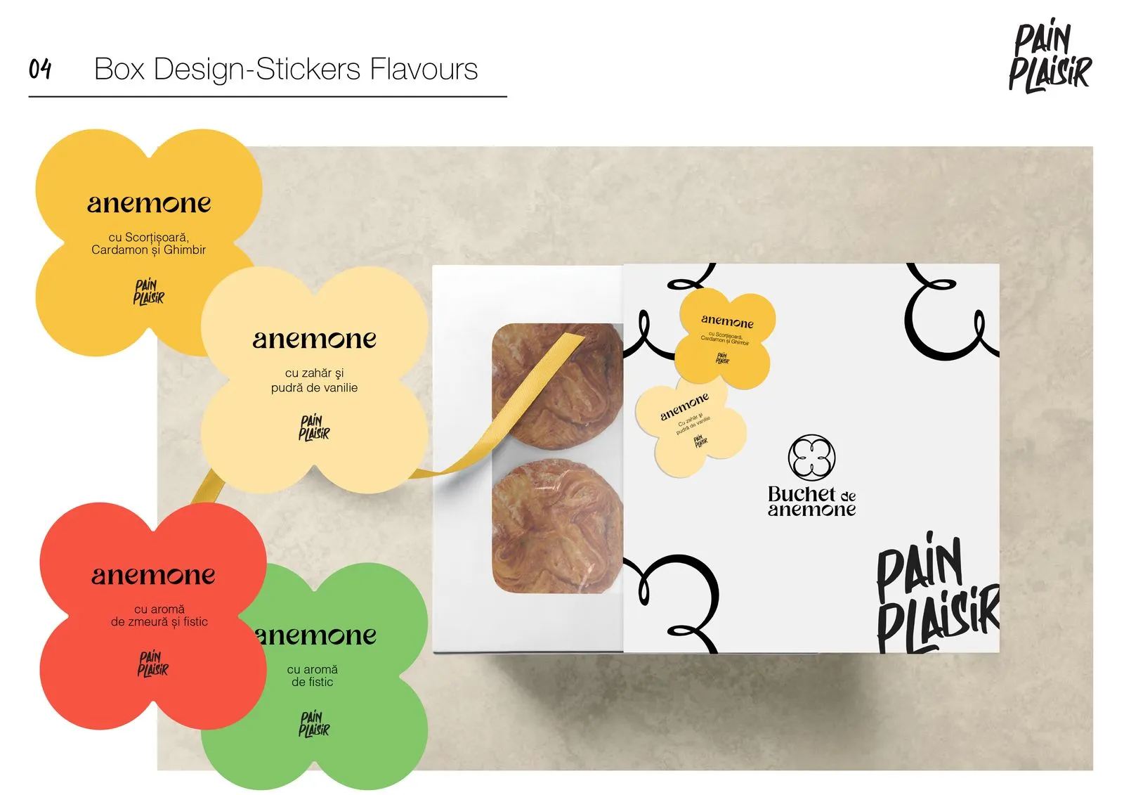
The anemone combination mark, a “Buchet de anemone” gift version, a quatrefoil pattern, flavour stickers in yellow, red and green, and a quatrefoil crop for photos and social media.
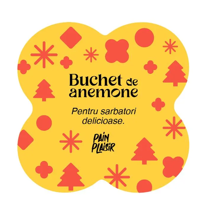
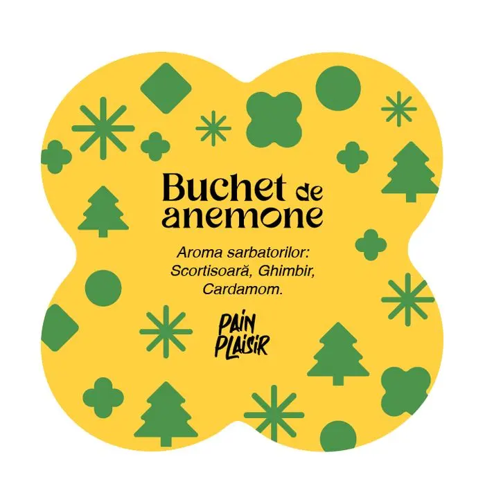
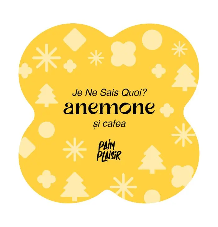
In the shops: window graphics, shelf talkers, posters and coffee cups.
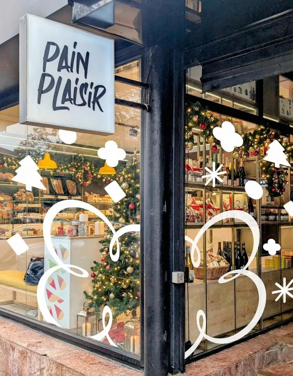
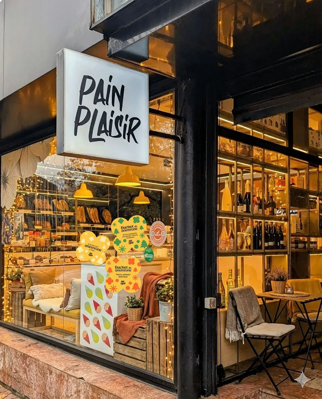
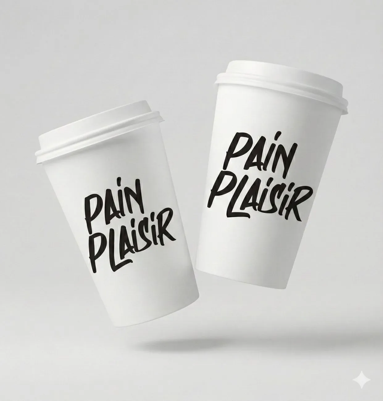
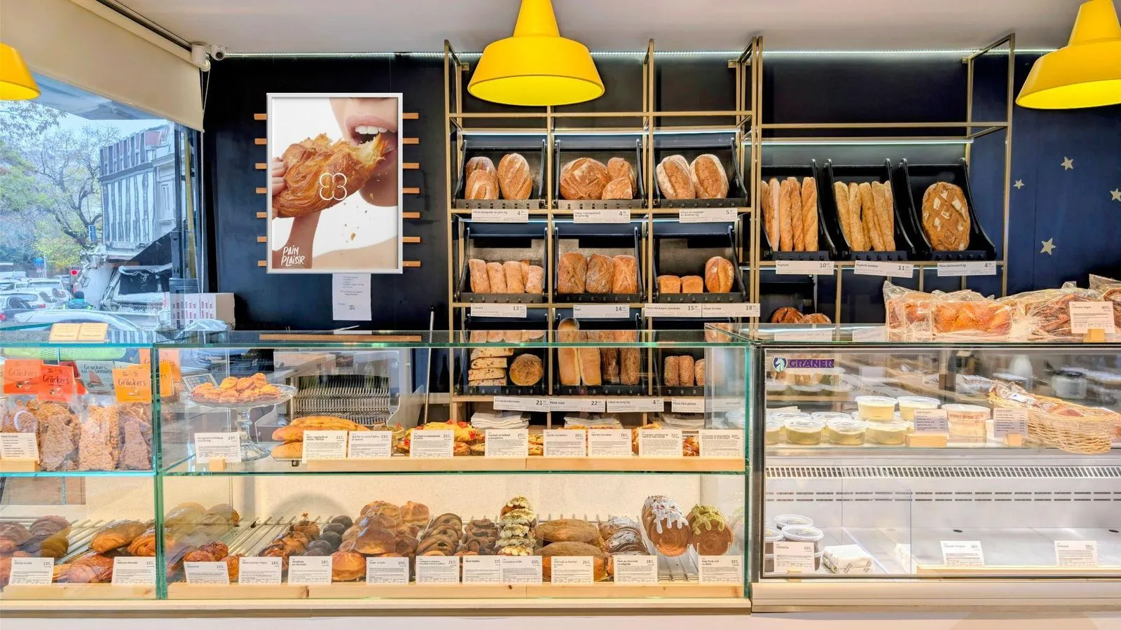
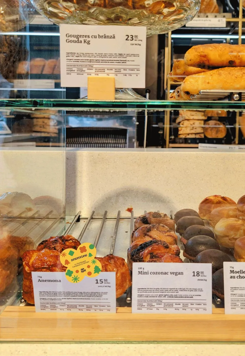
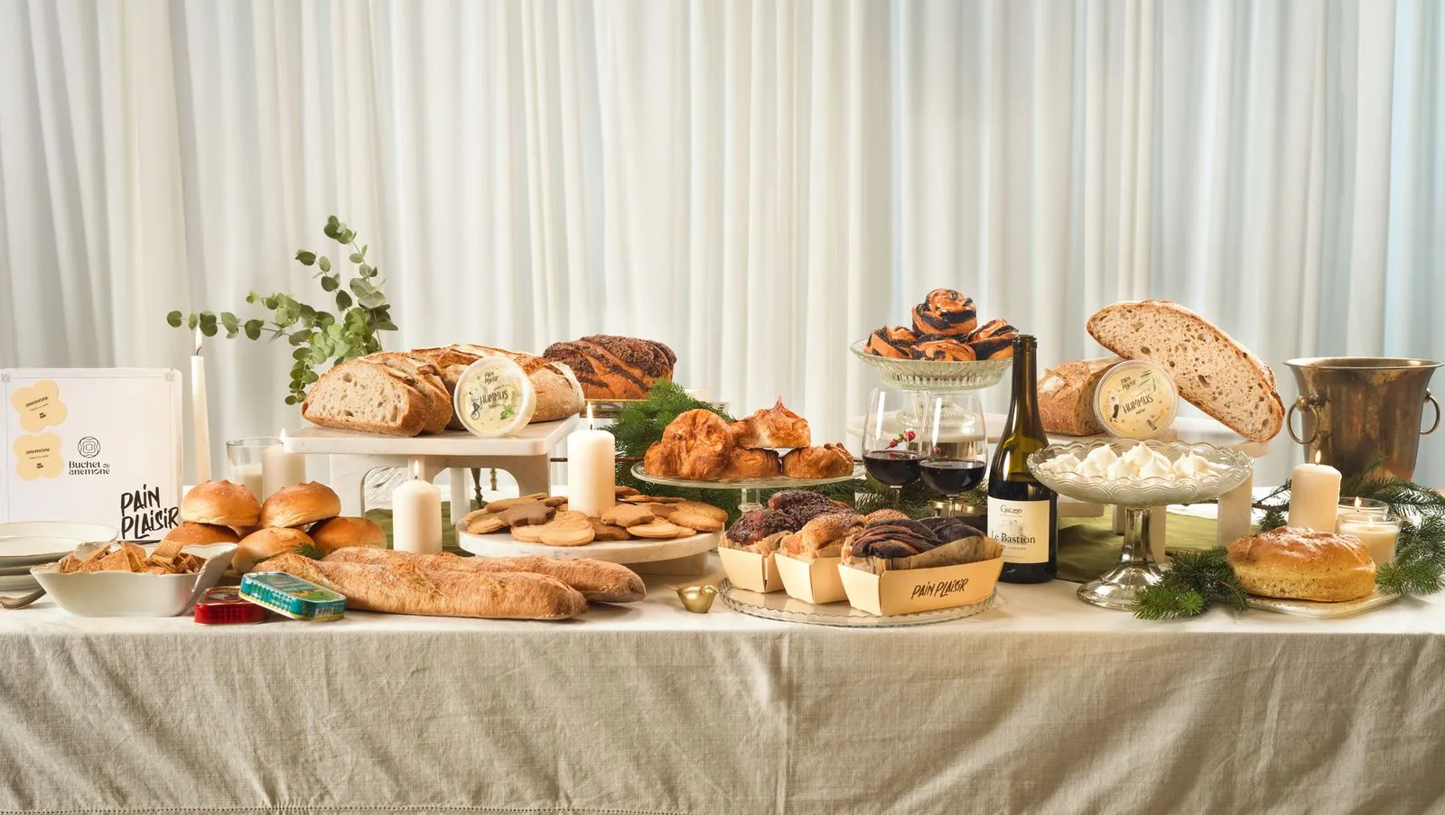
We filmed and shot the Anemone the way it should be eaten: torn, bitten, held up to the eyes. Then a Christmas table full of Pain Plaisir.
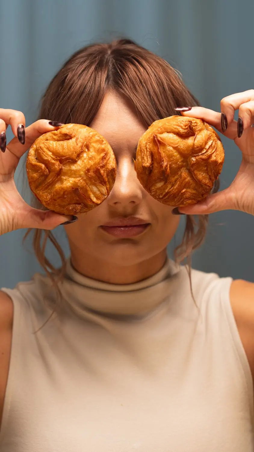
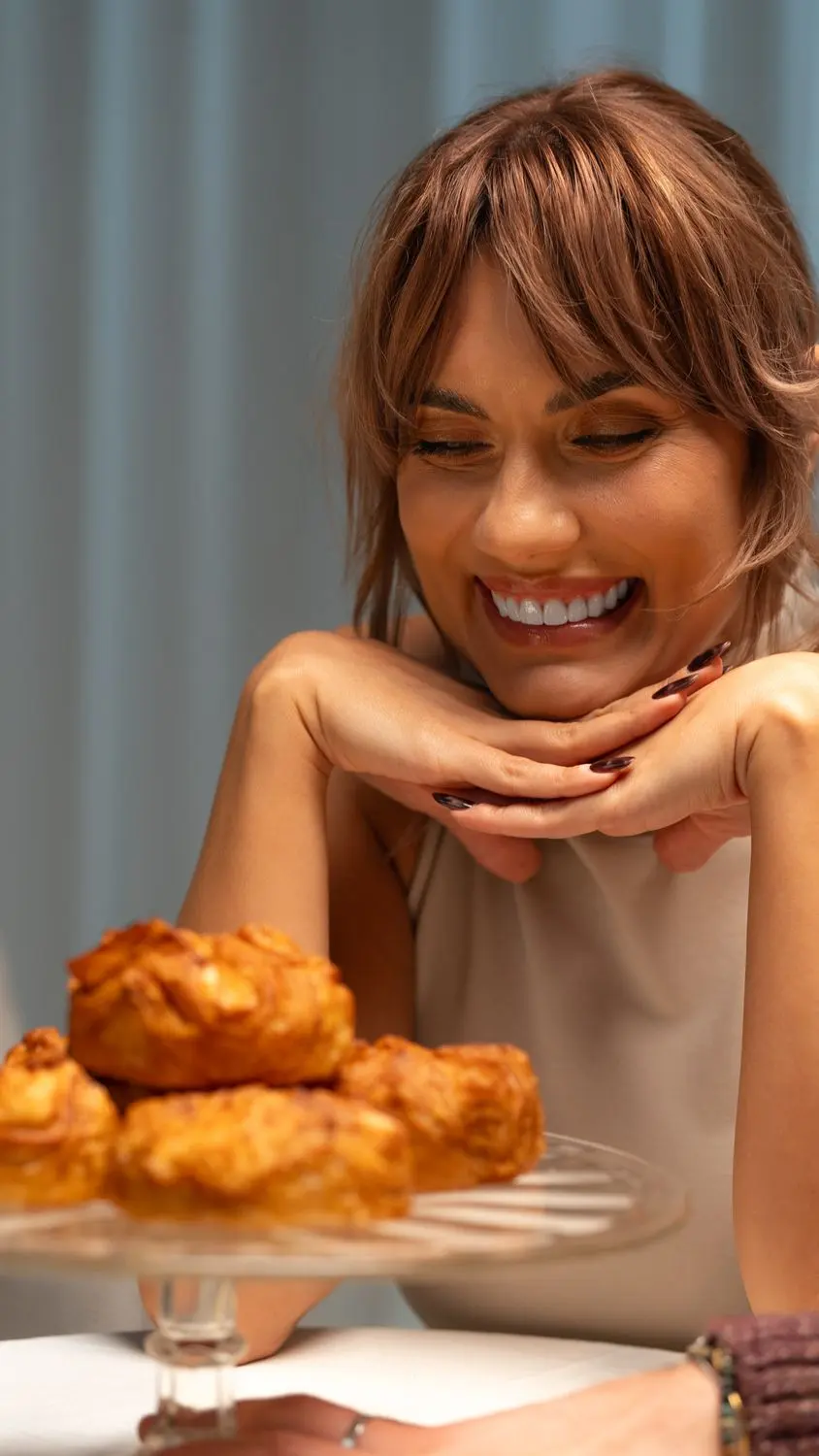
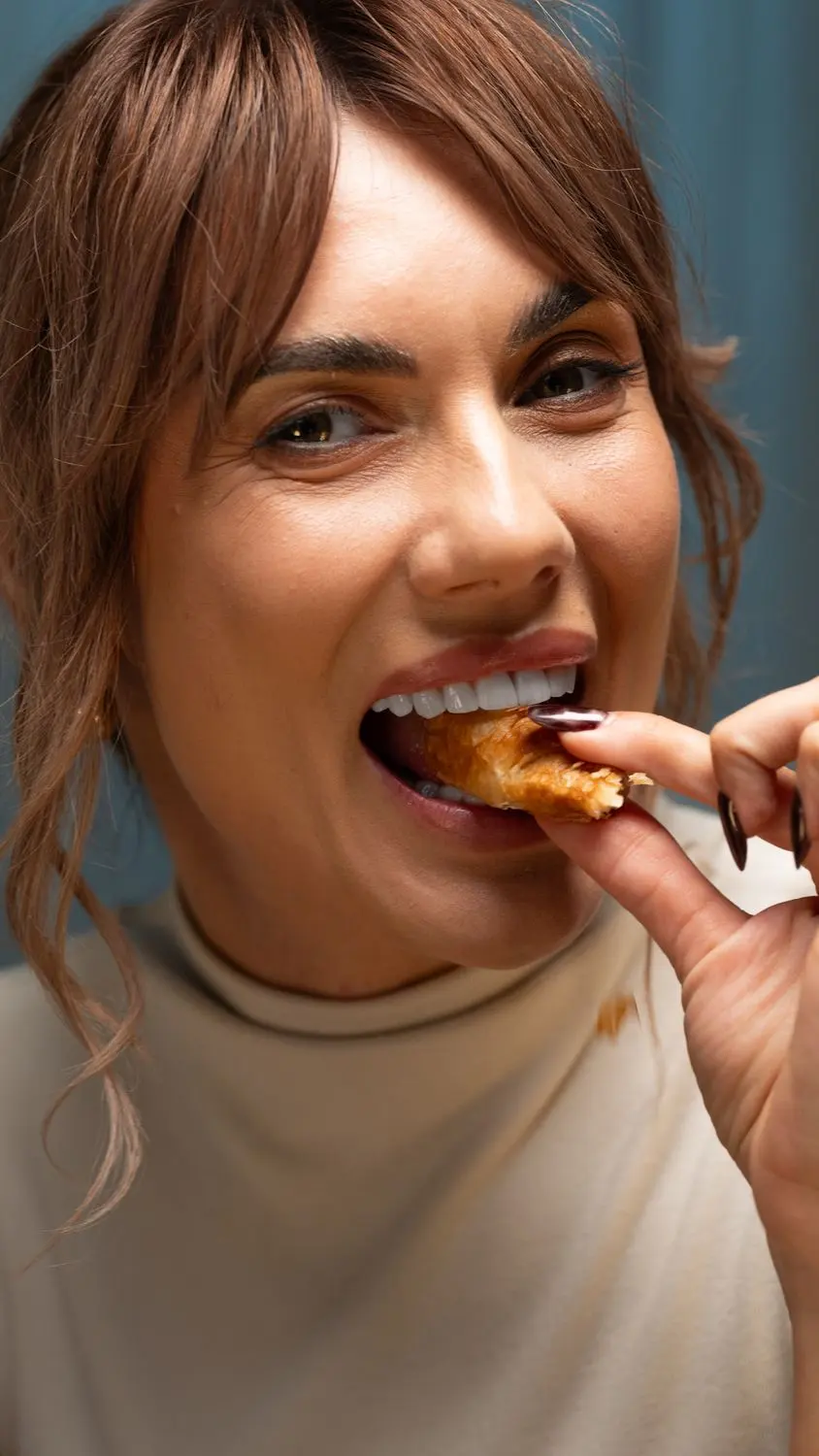
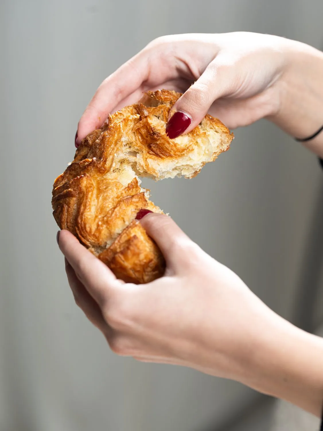
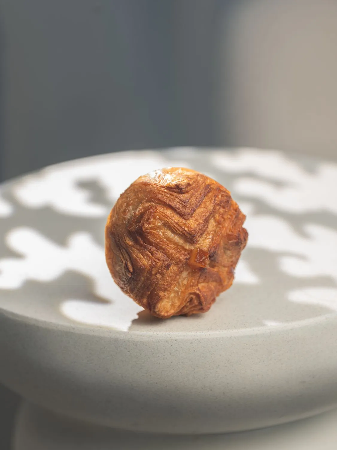
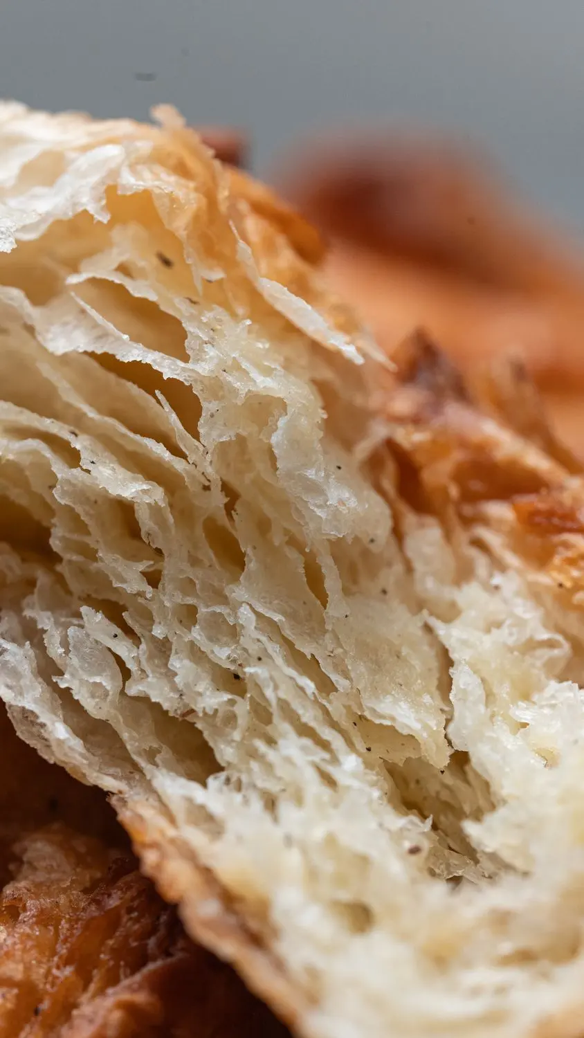
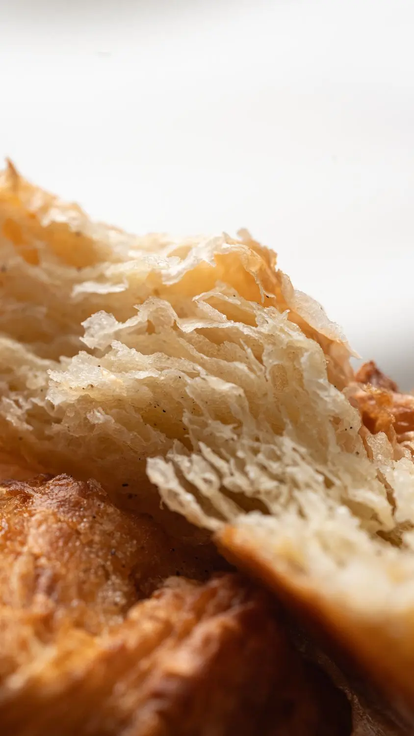
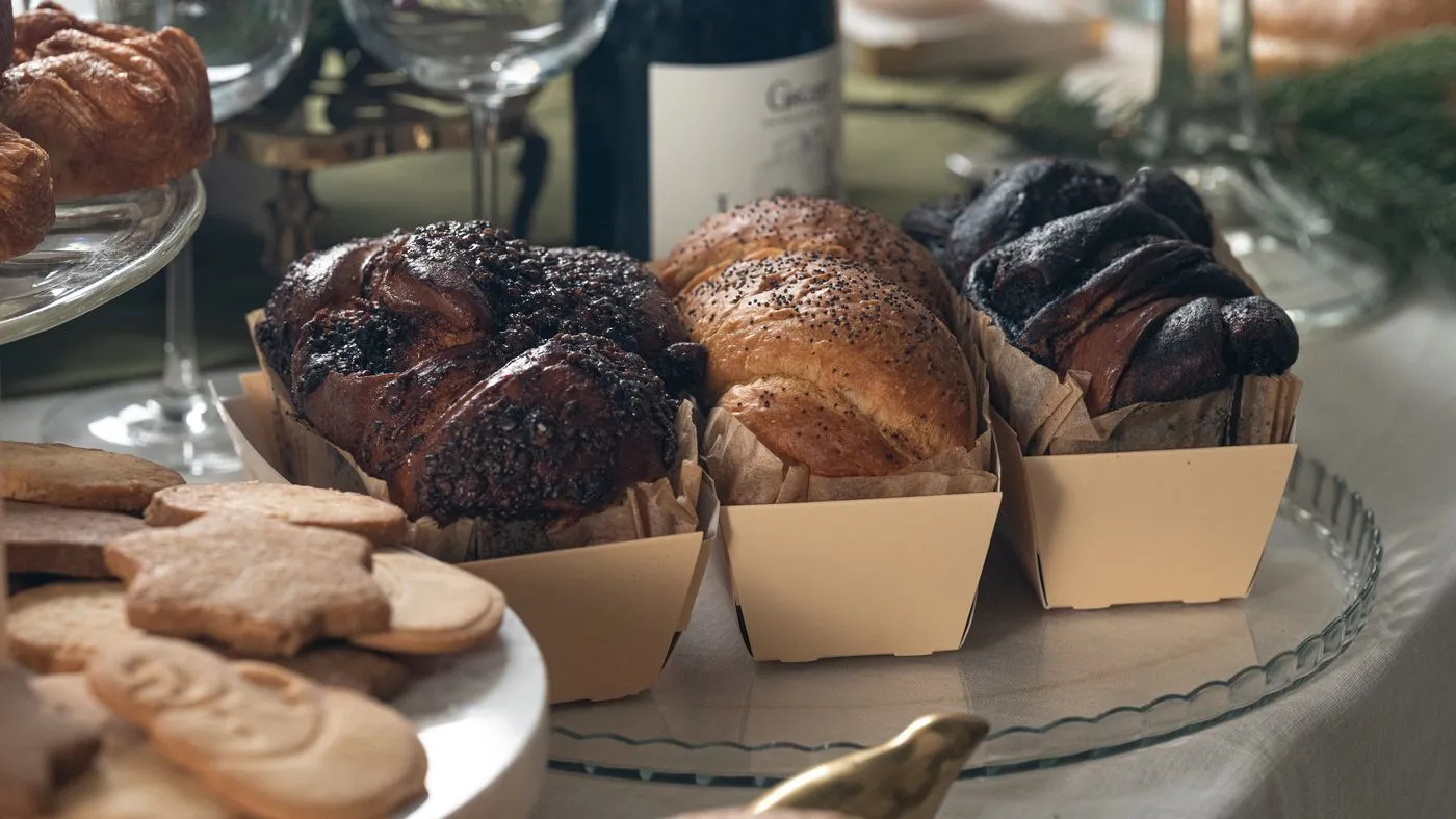
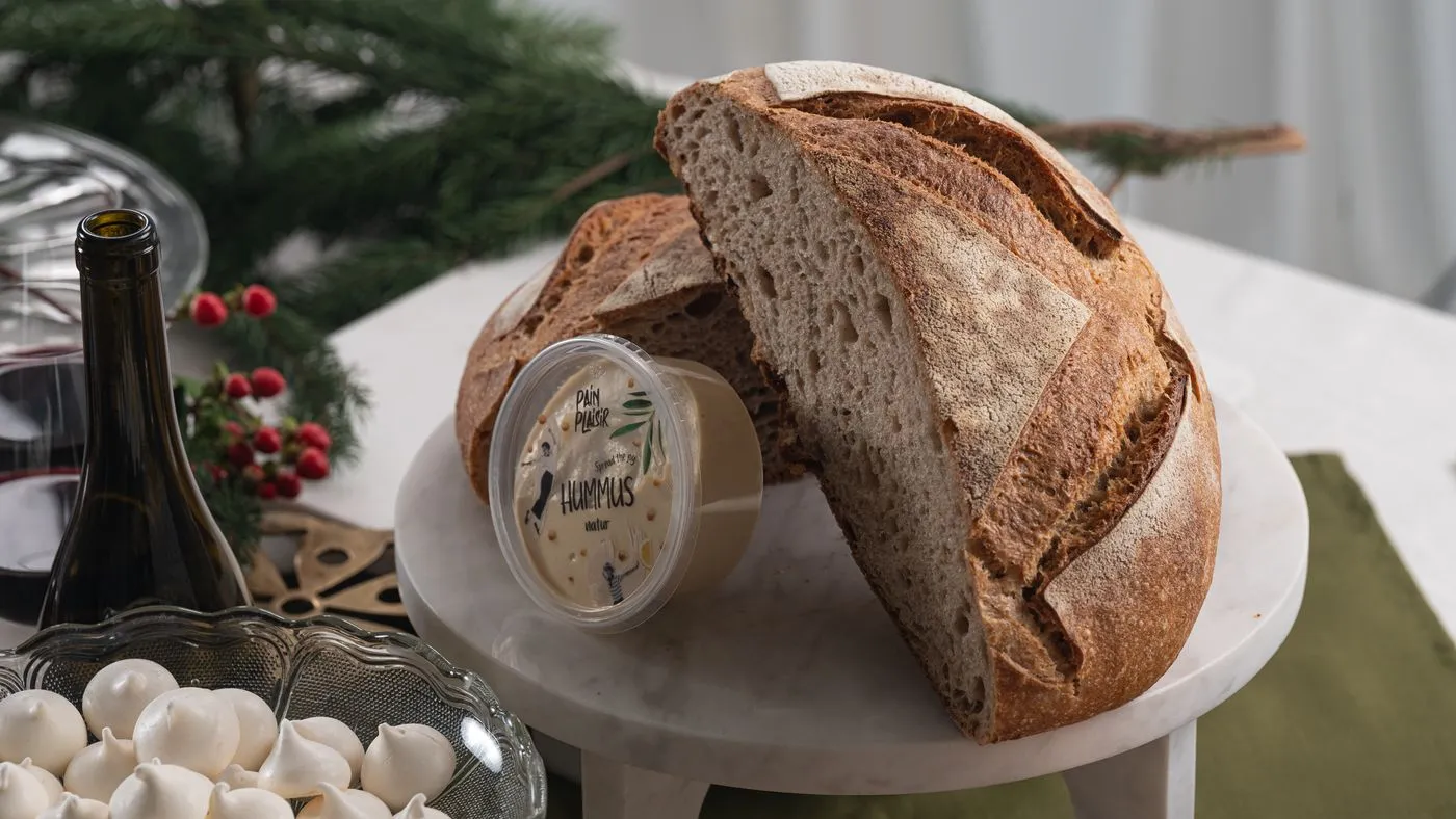
One pastry, one shape, a whole small brand: a mark you can bite into, stickers for every flavour and a shoot that makes you hungry.
Artisan bread at scale, rebranded for HoReCa: always fresh, forever the same.
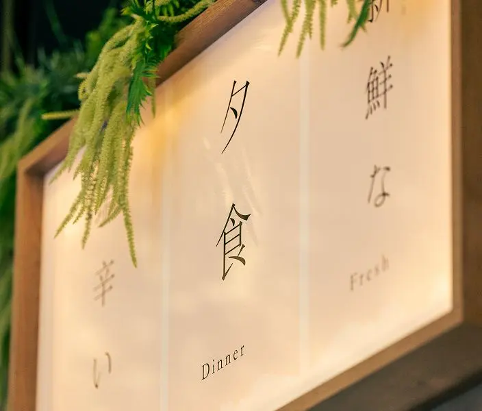
Delivering top content for the best sushi in town.
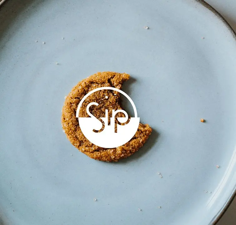
Complementing one of the best designed coffee shops in town with a branding that fits.