RO ← Cromatic Studios

Artisan Coffee Gear

Branding coffee gear for people who take coffee seriously.

  • Branding project · Coffee equipment, retail
  • 2019
  • Brand strategy, brand universe, visual identity, illustration, packaging, website
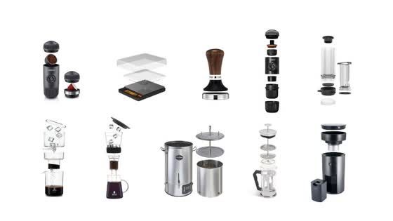
Line drawings of brewers, grinders, scales and kettles

Gear for people who take coffee seriously

Artisan sells coffee equipment to passionate customers: people who weigh their doses, time their pours and read up on every grinder before they buy it.

A catalogue alone does not speak to them. Artisan wanted a tailor-made environment with a personal voice, one that helps customers join the specialty coffee community and feel understood.
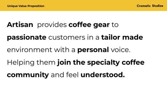
The Artisan value proposition
The value proposition the whole brand was built on

The One Who Knocks

We built the direction on three keywords: only the best coffee gear, understood, coffee community. The archetype is part Explorer, part Ruler, and every choice that followed, from type to the webshop, comes back to it.

60 / 40 Explorer and Ruler, the archetype mix behind every decision Drop for more
Branding& Design

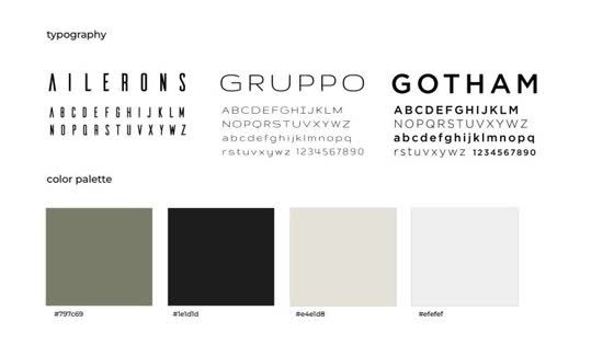
Ailerons for the mark, Gruppo and Gotham for everything else, and an olive, ink and paper palette that lets the equipment be the hero. The A of Artisan folds into a repeating chevron, and every machine is drawn as a technical illustration.
  • Brand strategy
  • Brand archetype
  • Logo
  • Typography system
  • Colour palette
  • Letterform pattern
  • Technical illustration
  • Stationery
  • Merch
The Artisan wordmark with the line coffee gear
The wordmark: Ailerons, spaced wide, with coffee gear set quietly underneath
Ailerons, Gruppo and Gotham with the olive, ink and paper palette
Three typefaces and four colours: olive, ink, paper and white

The A of Artisan folds into a chevron.

A texture that runs across tape, packaging and posters without ever repeating itself the same way twice.
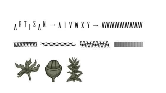
The A of Artisan turning into a chevron pattern, with botanical drawings
From letter to pattern, with the botanical drawings that go with it
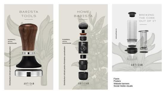
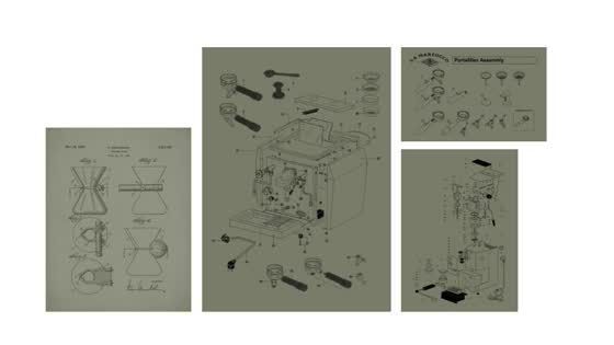
Olive posters with blueprint drawings of coffee machines
The gear, drawn as blueprints, so the catalogue reads like a manual
Posters for barista tools and home brewing
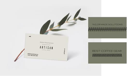
Business card and branded tape with an olive branch
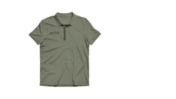
Olive polo shirt with the Artisan mark
Business cards, washi tape and polo shirts: the system built to be touched
ProductDesign

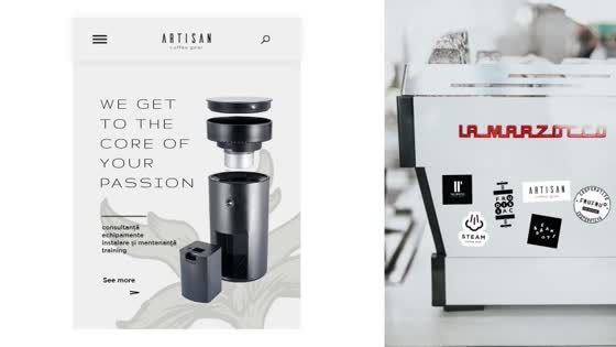
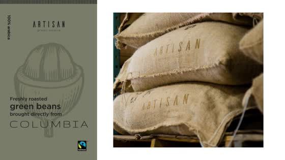
The branding carried into a webshop that reads like an atelier: botanical line art, generous space and the machines centre stage, under one line, “Get to the core of your craft.” The same system dresses the green coffee side of the business.

  • Website
  • E-commerce UI
  • Packaging
  • Campaign visuals

“Get to the core of your craft.”

The line that opens the webshop.
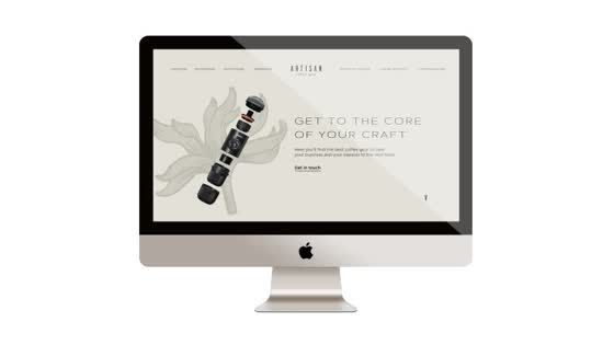
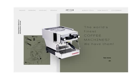
The Artisan website on a desktop screen
The webshop on desktop
Website section presenting espresso machines
Mobile pages and a shop counter with Artisan stickers
The world's finest coffee machines, as the page puts it, and the brand on the phone and the counter
Green coffee packaging and jute sacks with the Artisan mark
Packaging for green beans, brought in directly from Colombia
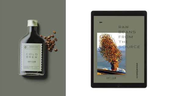
Bottle and tablet visuals for raw beans from the source
Campaign visuals: raw beans, from the source

A complete brand universe, from the letterform pattern to the webshop, for a shop that wants to be part of the specialty coffee community, not just sell to it.

What is your winning soundtrack?

We can bring the mixtape