
Slow Coffee Festival · Brand universe · By Cromatic Studios
For five years, we've been shaping the face of Slow Coffee Festival.

Not just a logo and a poster, but a positioning and a visual language that connects with people. For us, branding is more than design: it's meaning, a voice and a vibe made visible. A way to turn values into graphics, and graphics into something you actually feel.


The first face of the festival: hand-drawn, warm, a little rebellious. The festival grew bigger and more ambitious every year. And so did its looks.


Bolder type, brighter colour: a poster system that could shout from any wall in Bucharest.


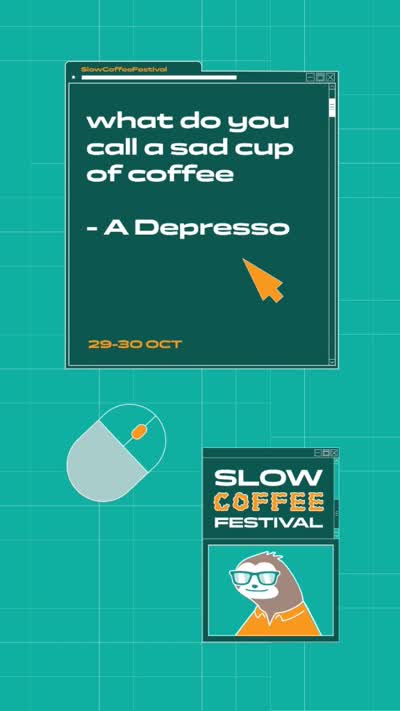

The system matures: layouts breathe, illustration and photography start talking to each other.
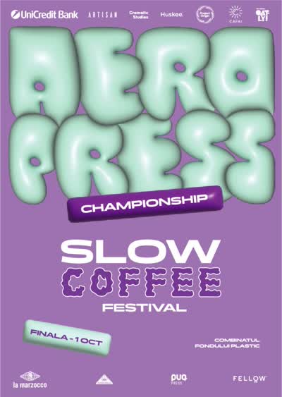


Four editions in, the brand could stretch across posters, merch, digital and the venue itself.
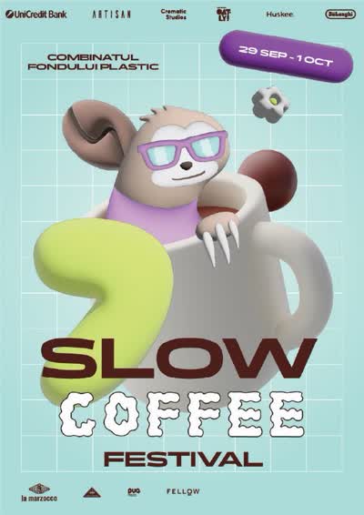
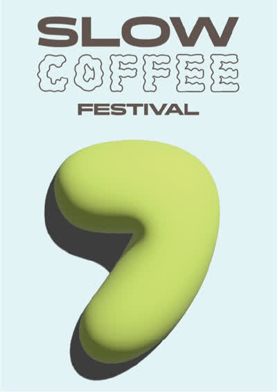
A new chapter: SLOW
After four years of building and learning, we returned to the essence: slow. The visual manifesto speaks with hands, and a palette of Sage Bean, Lavender Roast and Golden Crema tells of slow mornings, shared conversations and the ritual of brewing.

2025
The new chapter, on every wall.



Your brand next?
More work