Bonilash
Lashes, close up.
- Lash and brow serums, Bonilash
- Romania · Zdrovit portfolio
- Product website, desktop and mobile
Two serums, one slim tube each
Bonilash makes two serums, one for lashes and one for brows. Each comes in a slim tube with a fine applicator.
Both go on in the evening, on clean skin, and the site is plain about time: the first results take weeks. It puts that next to the products, the reviews and the safety advice.
bonilash.ro has a home page, a page for each serum and a blog, all reached from the menu.
Pink, white and the product up close
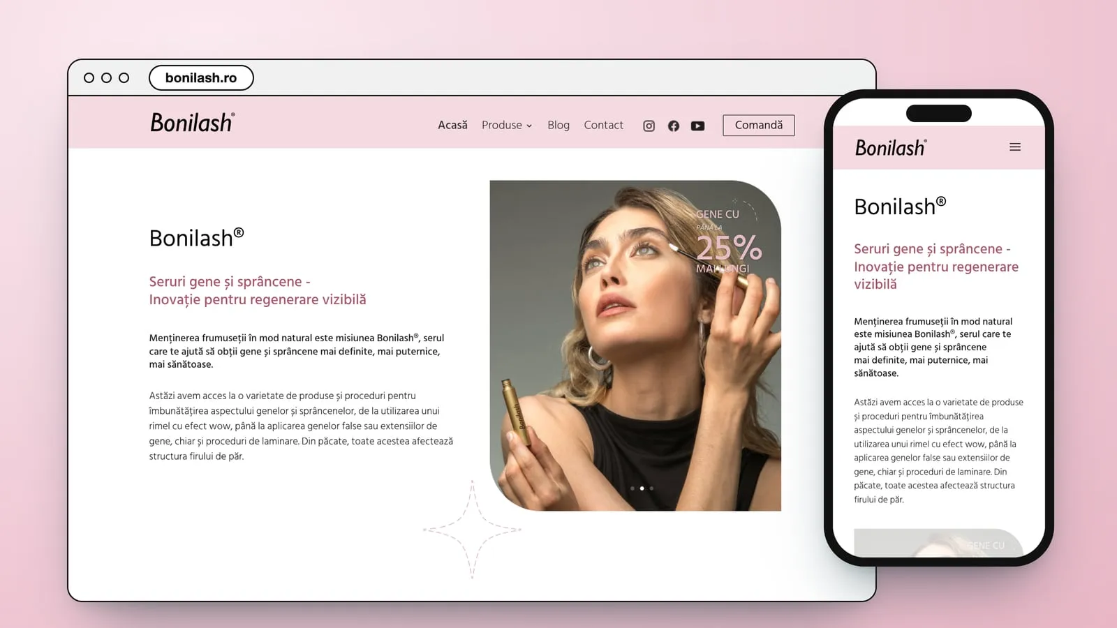
The site takes its colours from the packs: soft pink fields, a lot of white and a deep rose for headings and buttons. The serums lie flat on pink, and the hero slides through portraits of a woman with the tube in her hand, each with the line “Gene cu până la 25% mai lungi”.
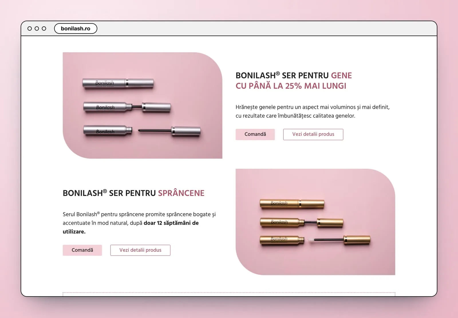
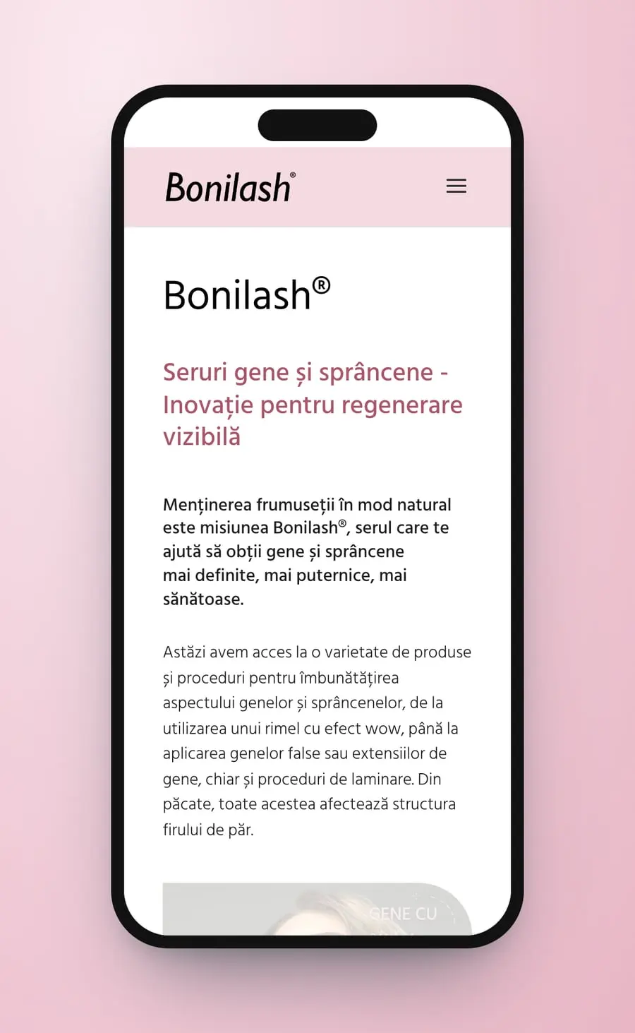
The menu runs Acasă, Produse, Blog, Contact, with Bonilash® gene and Bonilash® sprâncene under Produse and a Comandă button at the end. The home page opens with the name, the line “Seruri gene și sprâncene - Inovație pentru regenerare vizibilă” and the portrait slider. Then come the two serums, the specialist articles, the reviews, an Instagram strip, the safety tips and the questions.
- Product website
- UX/UI design
- Desktop and mobile
- Product pages
- Blog
Thelanding page
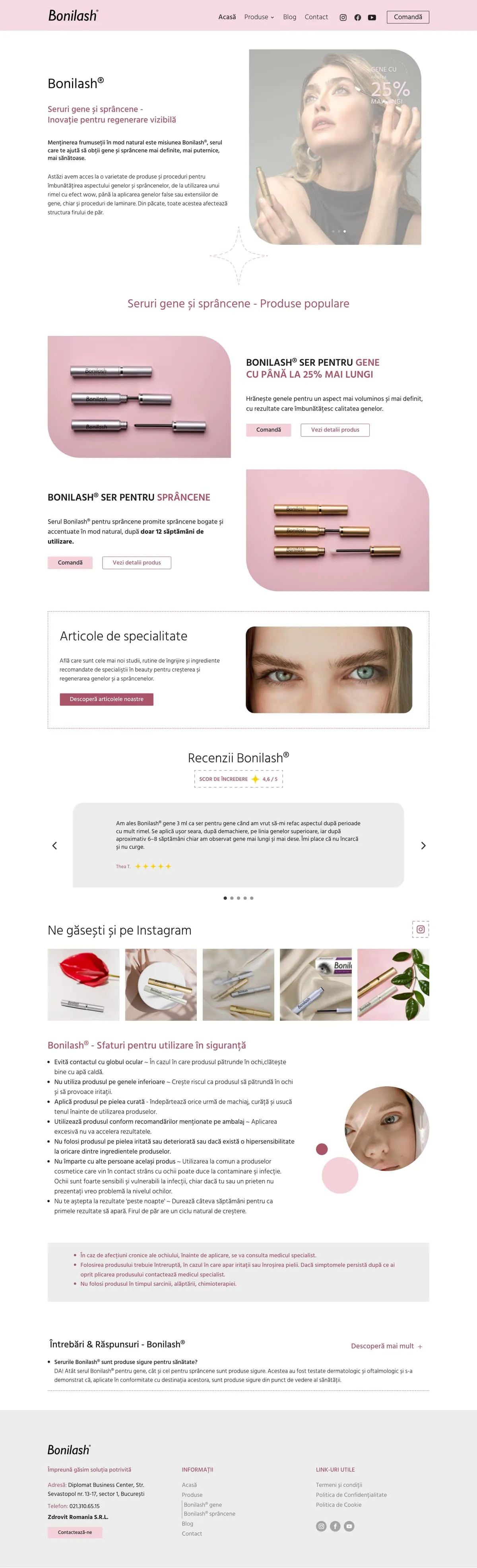

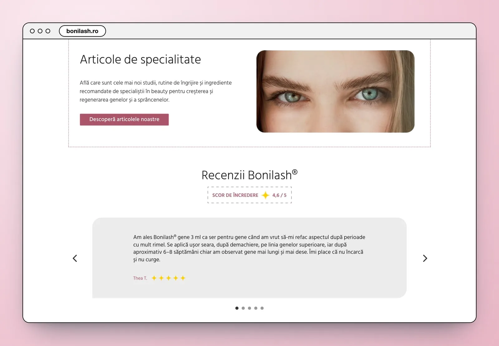
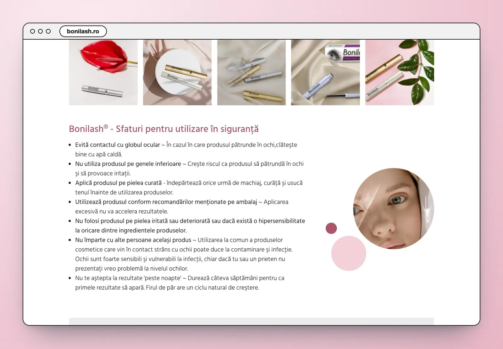
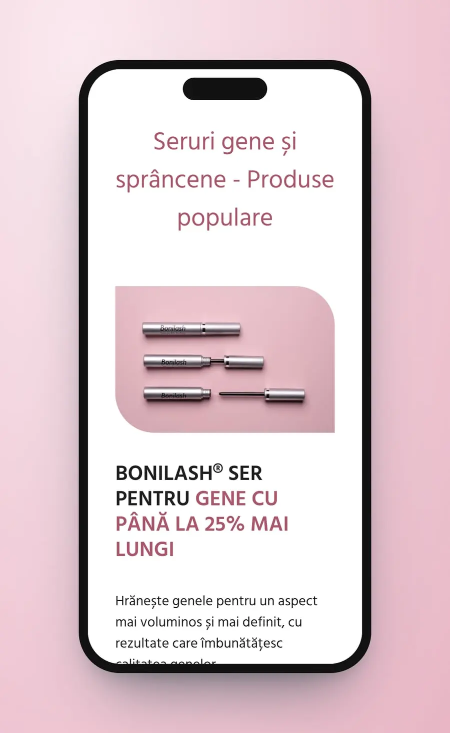
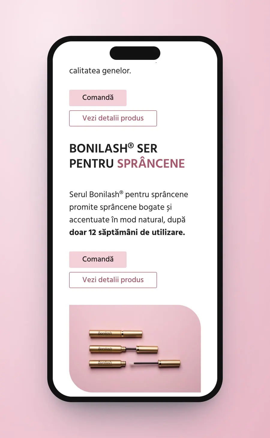
Each serum gets a pink card with a product shot, a short promise in the site's words and two buttons, Comandă and Vezi detalii produs. The lash serum leads with “până la 25% mai lungi”, the brow serum with results “după doar 12 săptămâni de utilizare”. Further down, a strip of product photos opens the safety tips, listed one by one: keep it out of the eye, not on the lower lashes, only on clean skin, and no results overnight.
- Product cards
- Safety tips
- Reviews
On a phone the menu folds behind one icon and the page stacks into a single column: the name and the line first, then the portrait slider, then each serum as a pink photo above its name and its two buttons. The safety tips keep their full wording.
- Mobile layout
- One column
Fourscreens
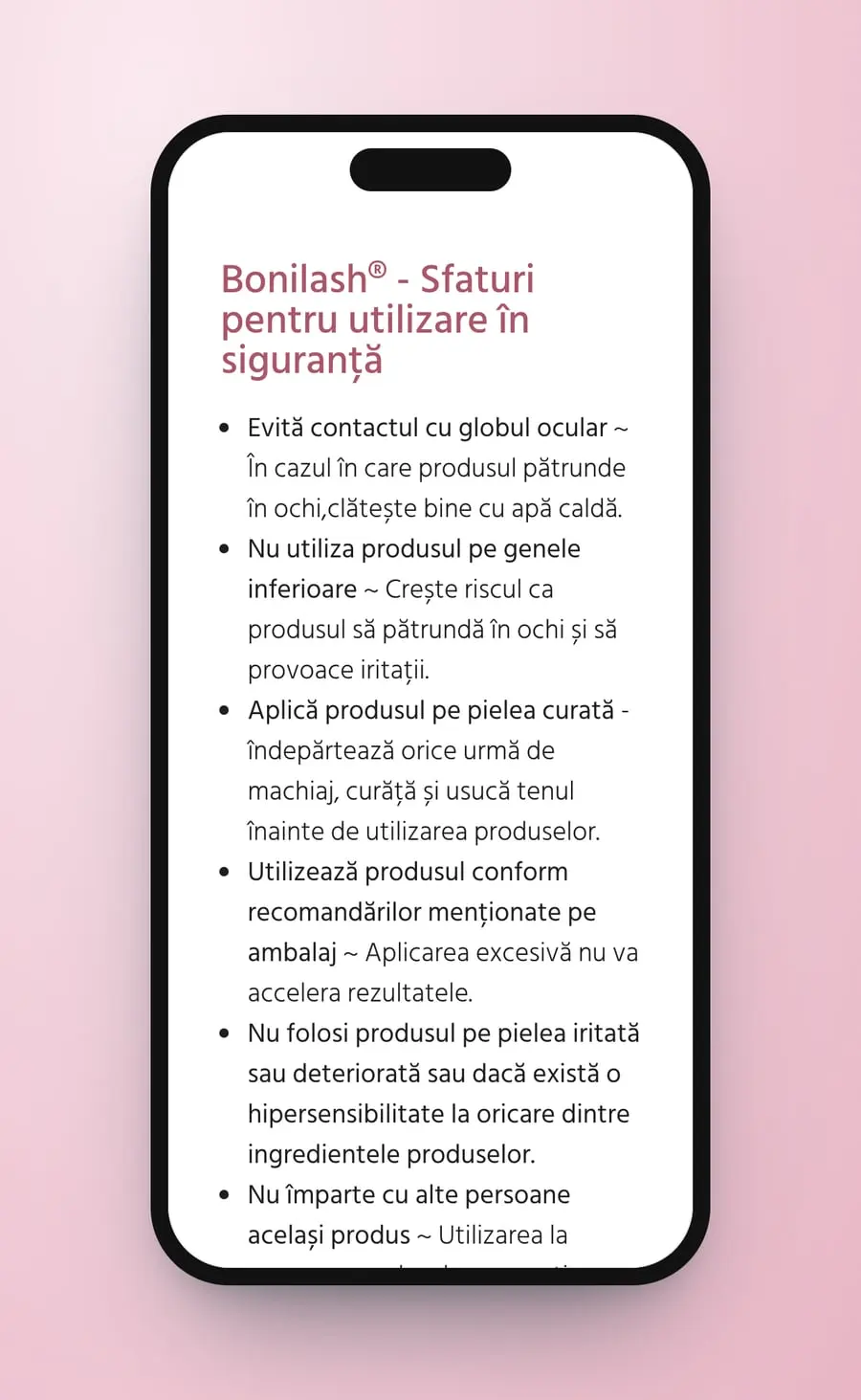
Two serums, one pink site: the products, the reviews and the safety tips, in the colours of the pack.
Medical Avenue
On the same street
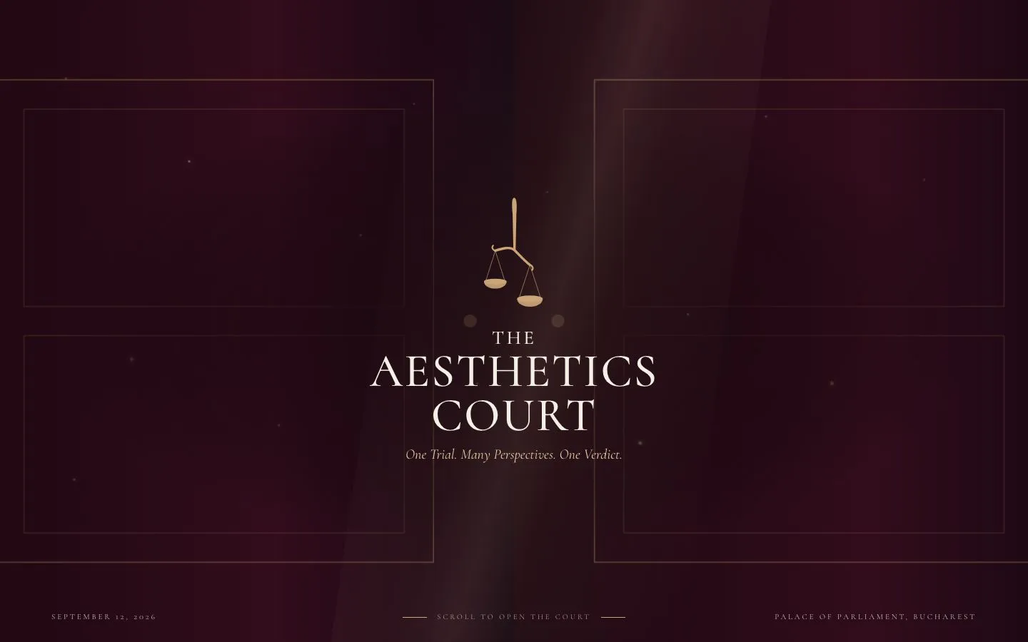 The Aesthetic CourtWebsite · UX · UI
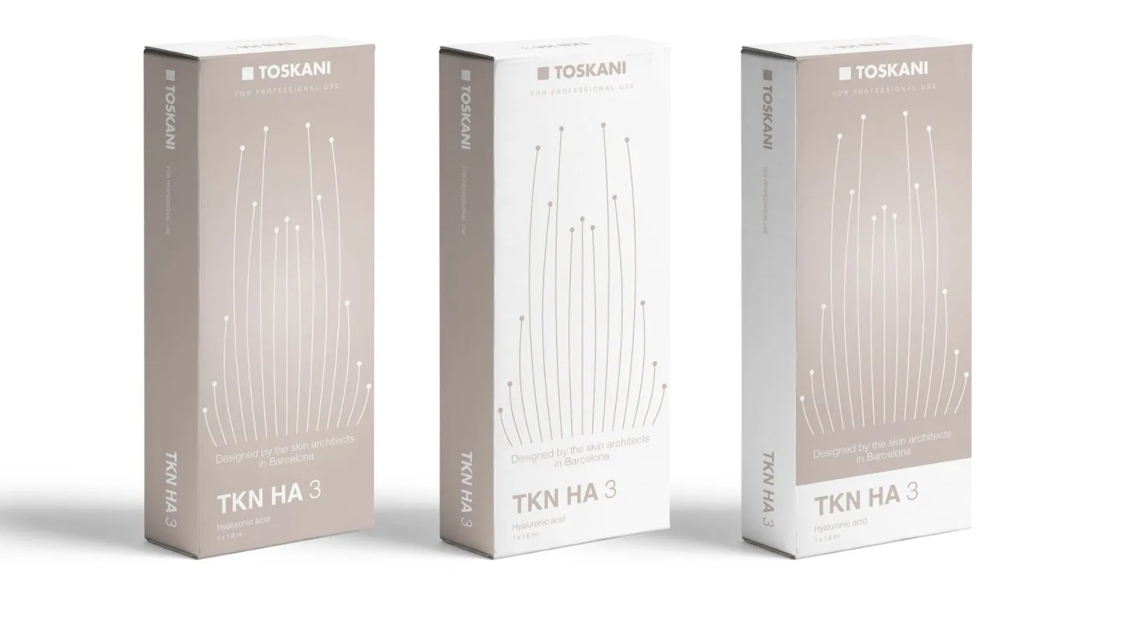 Toskani MEDBrand strategy · Packaging · Barcelona
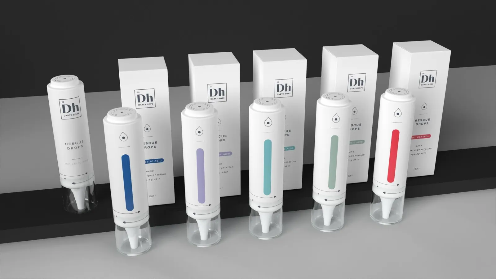 Darya HopeBrand strategy · Social media · Packaging
 Tracy JBrand strategy · Identity · Packaging
 Routine ParisBrand · Identity
Cromatic Air · Now boarding
Ready to fly, already?
Complete your boarding pass in a minute. We'll be in touch within a day.
Begin boarding