Vizik
One eye, three colours.
- Eye drops, Vizik
- Romania · Zdrovit portfolio
- Product site, four pages, desktop and mobile
Three problems, three bottles
Vizik is a family of eye drops from Zdrovit, in three versions. Each one is named for what it is for, in the site's words: “alergiilor oculare”, “ochi iritați și roșii”, “ochi uscați și obosiți”.
The three boxes share a logo, a bottle and a layout. The problems they answer do not, and someone with sore eyes is looking for one of them, not for all three.
So vizik.ro starts with the eyes, not the product, and lets the visitor say which kind of trouble they have.
A colour for each problem
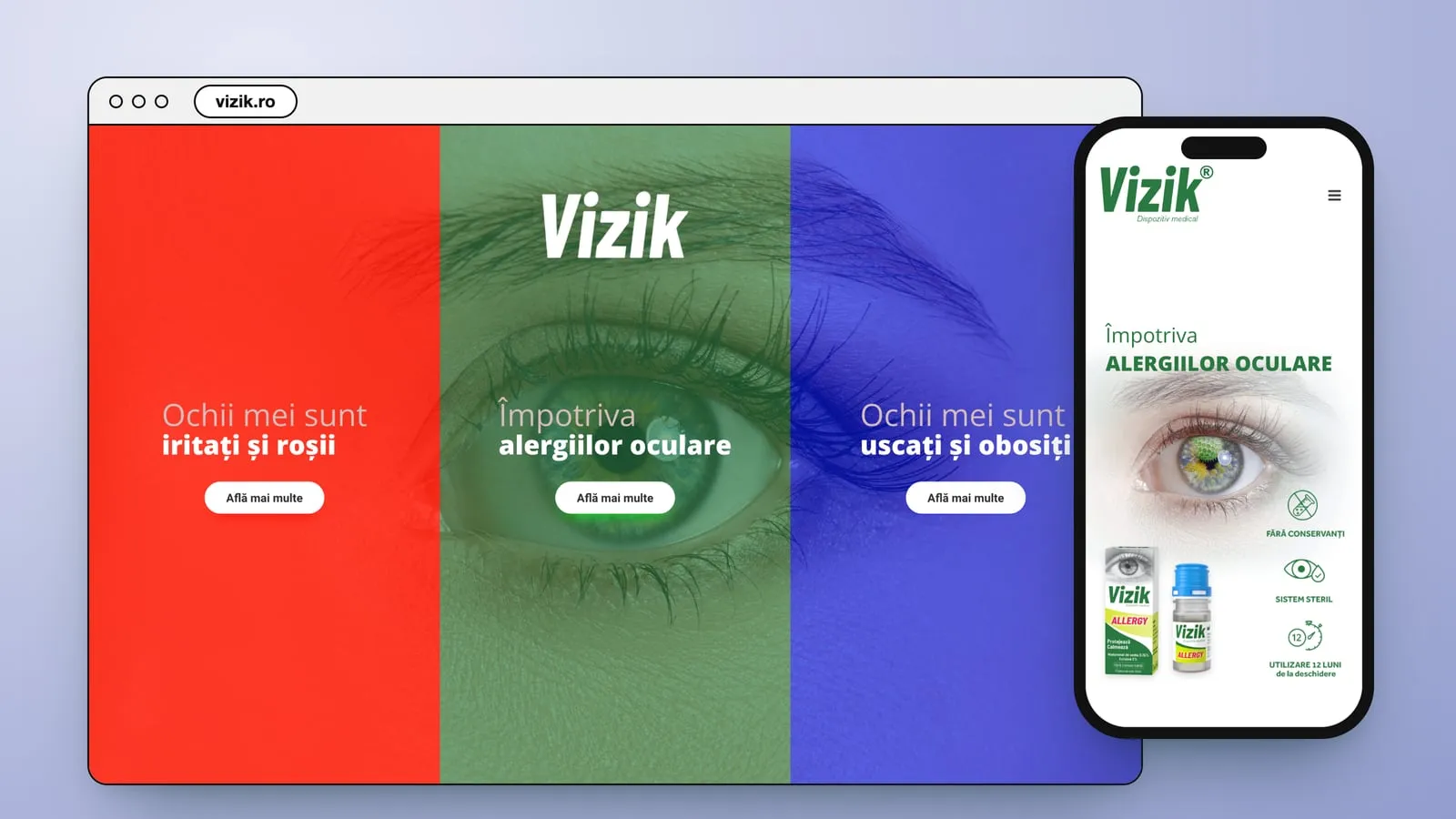
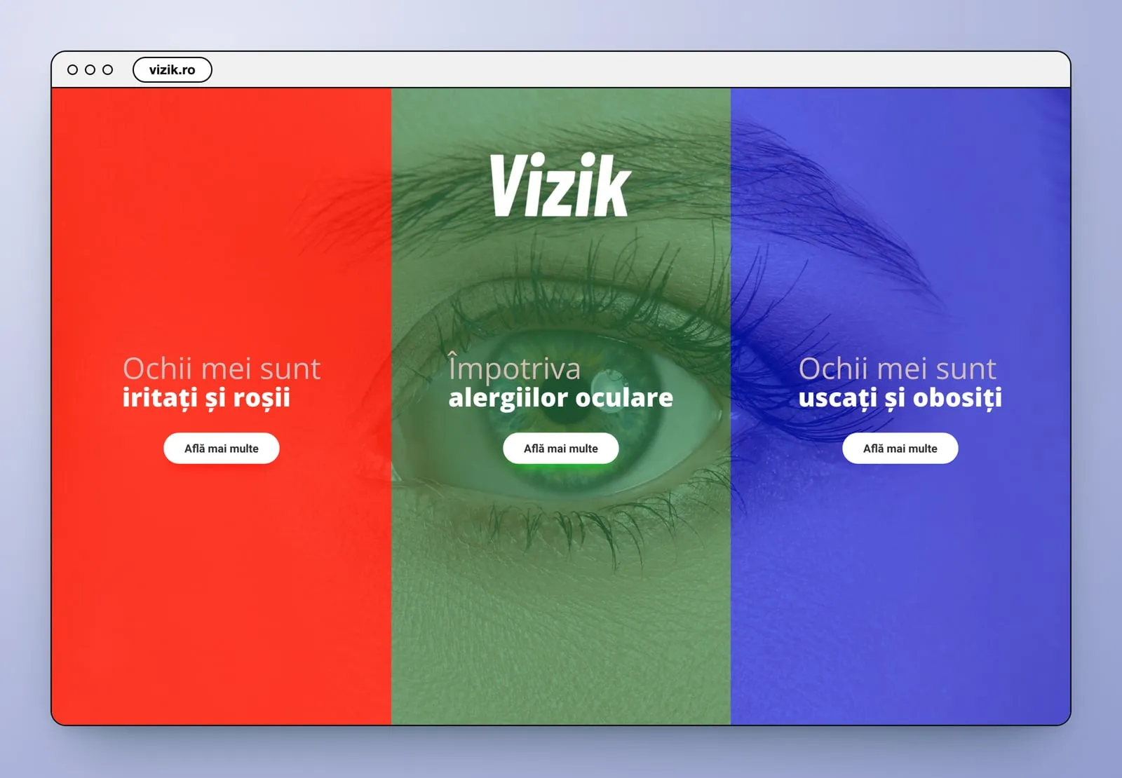
The home page lays three colour panels over one close-up of an eye: red for irritated, green for allergies, blue for dry and tired. Two of them speak in the visitor's voice, “Ochii mei sunt…”. Each panel opens a page of its own, built on the same frame and dressed in its colour, from the line under the logo to the footer, and each page's menu links to the other two.
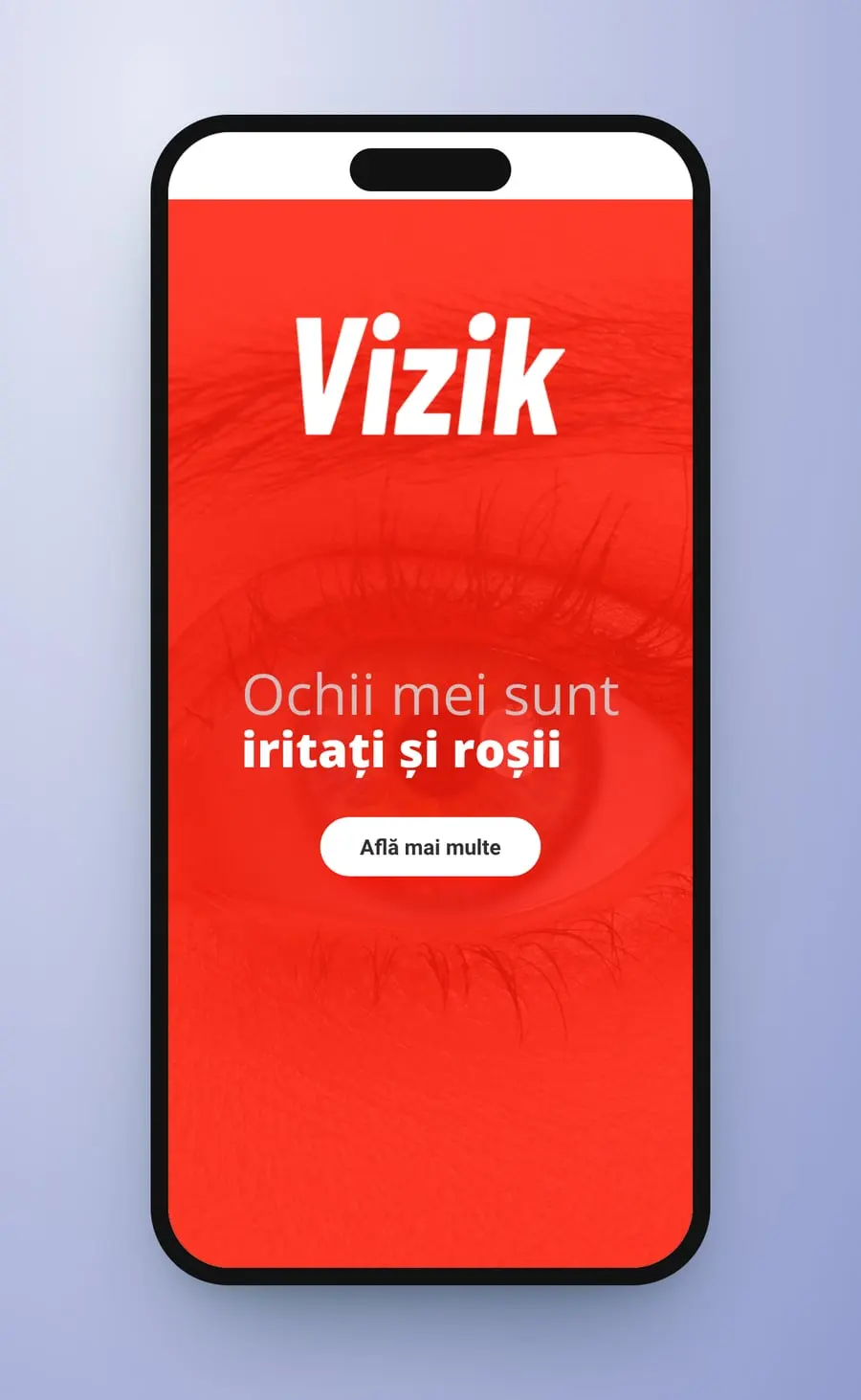
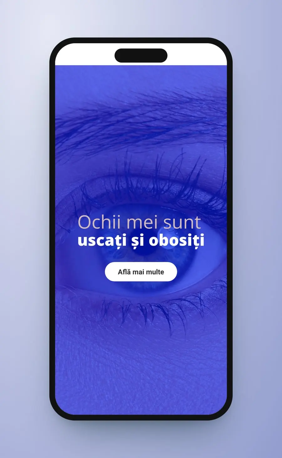
vizik.ro is a single screen. One eye fills it, under three vertical panels in red, green and blue, with the Vizik logo in white over the middle one. Each panel carries a line and an “Află mai multe” button: “Ochii mei sunt iritați și roșii”, “Împotriva alergiilor oculare”, “Ochii mei sunt uscați și obosiți”. On a phone the panels stack, one screen each, and the eye shows through all three.
- Home page
- Chooser
- UX/UI design
Threepanels
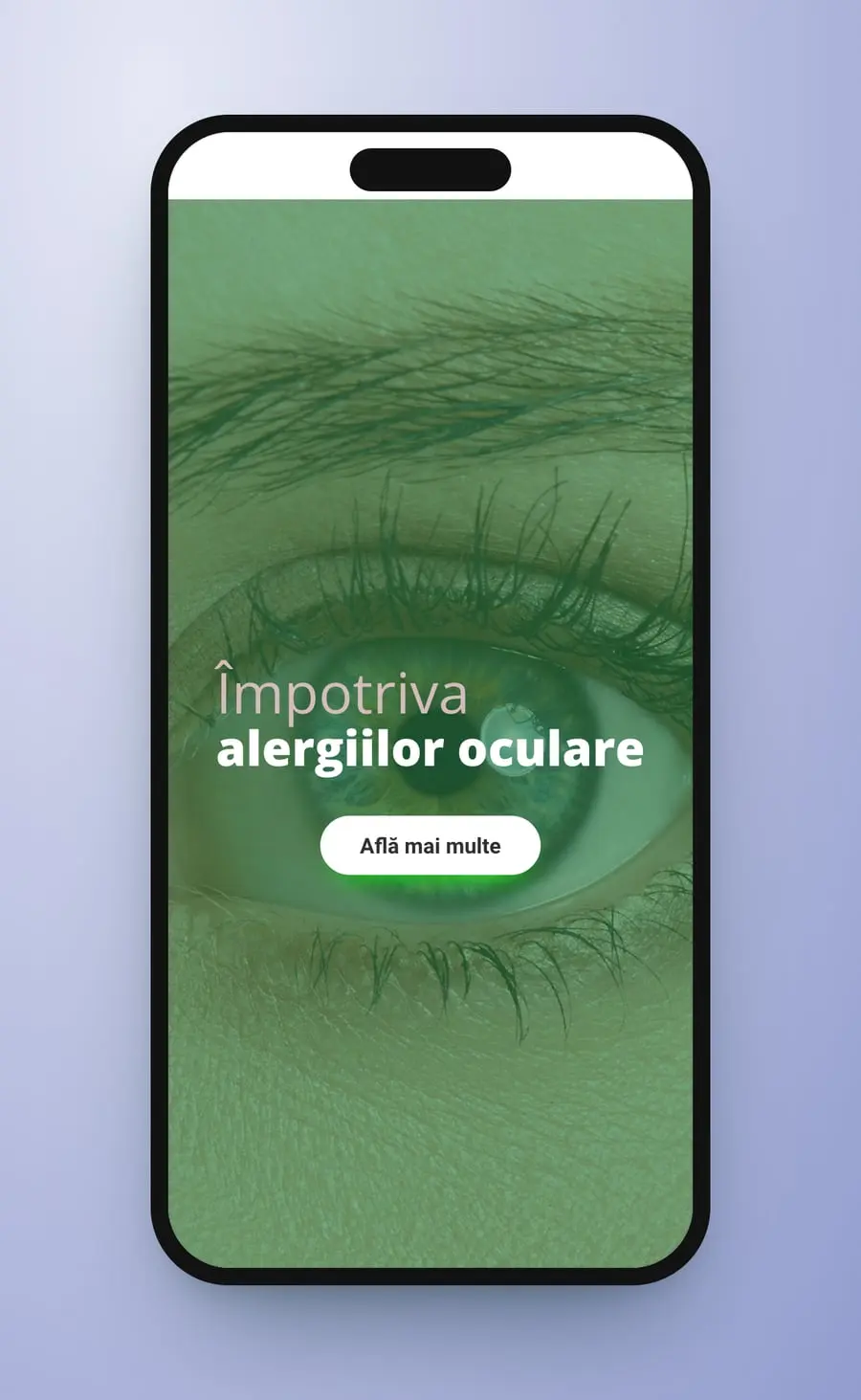
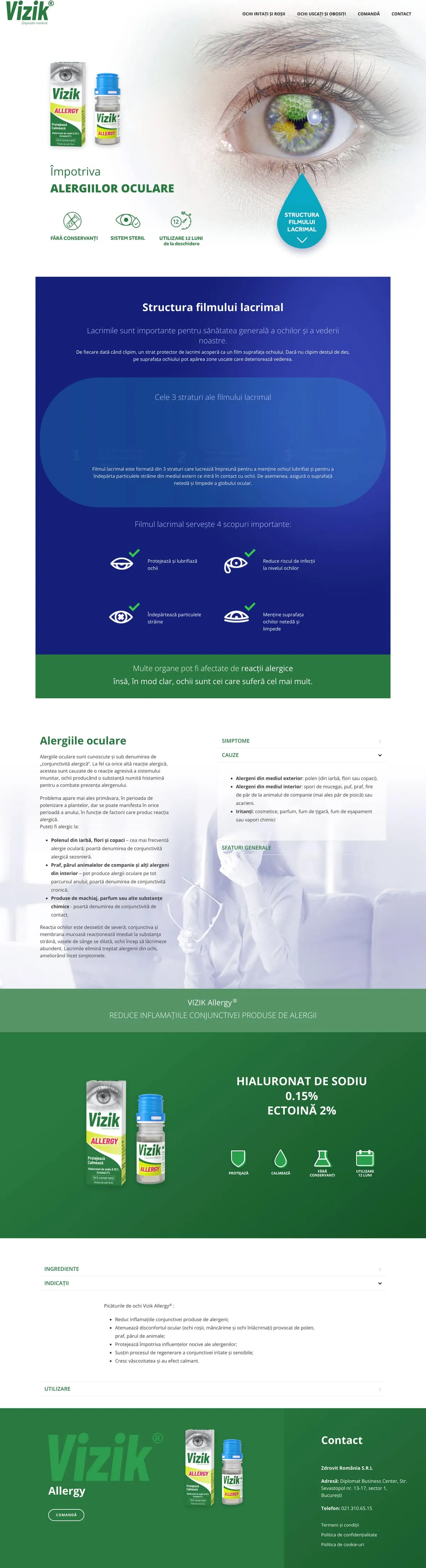
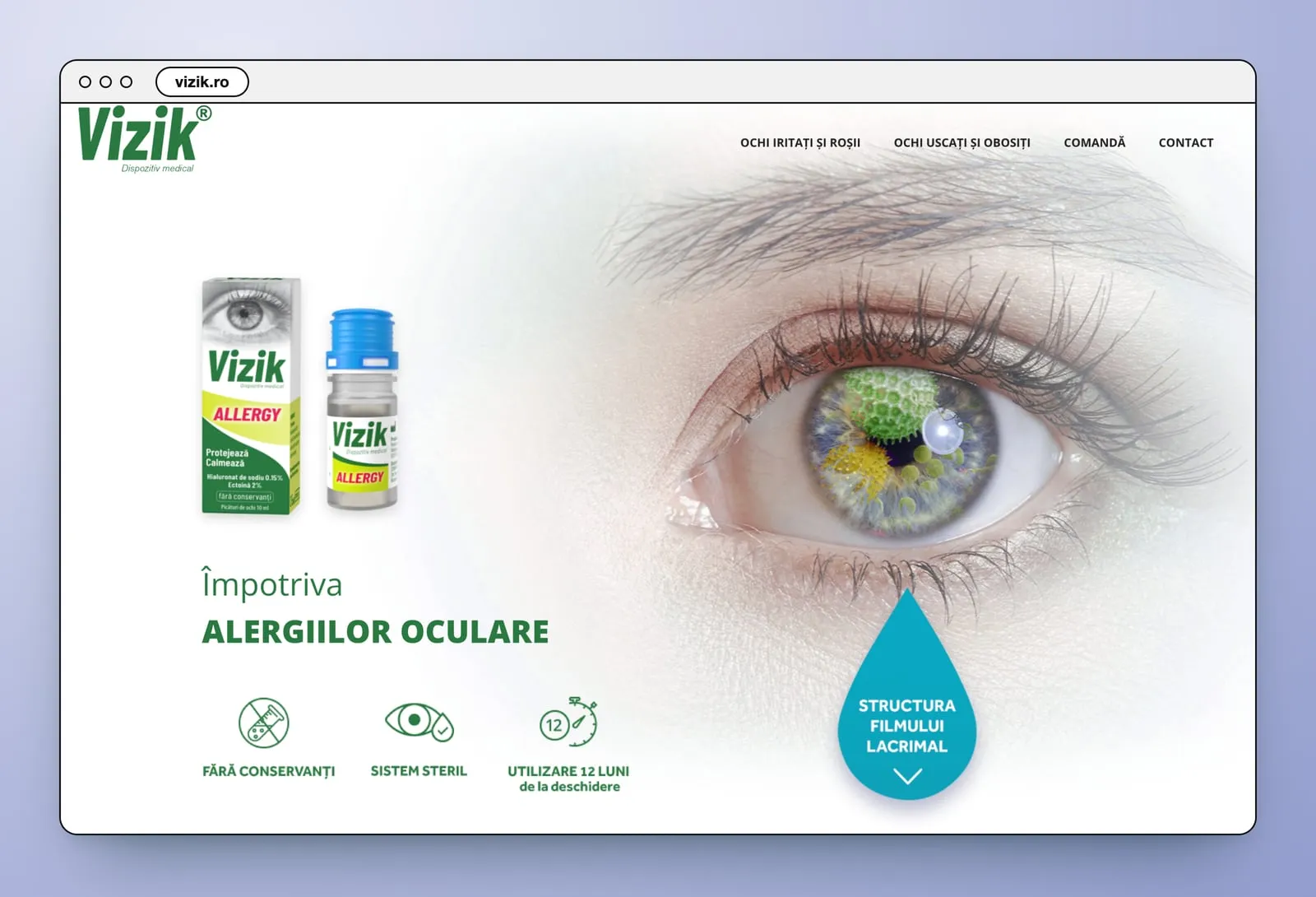
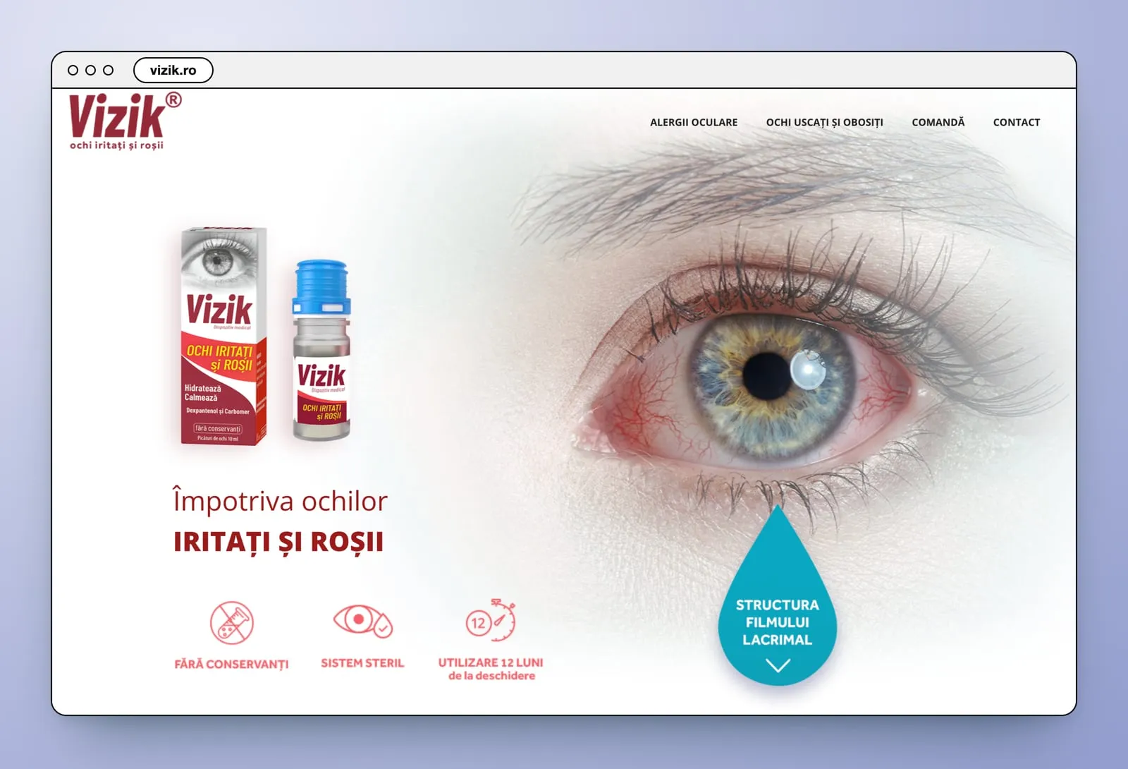
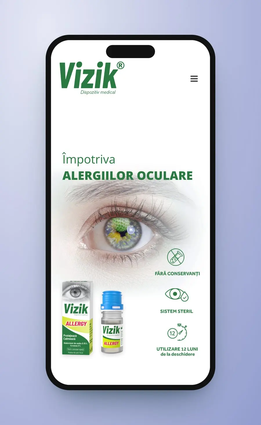
Behind each door, the same page in a different colour. A close-up eye sets the problem: pollen-green for allergies, red veins for irritation, a cracked surface for dryness. The box and the bottle stand beside a line in the page's colour, over three icons, “Fără conservanți”, “Sistem steril”, “Utilizare 12 luni de la deschidere”, and a turquoise drop points down to the structure of the tear film. Then the condition, its symptoms and causes in an accordion, the product with its formula, the ingredients, the directions and the order button.
- Product pages
- Page template
- Desktop and mobile
- Accordion
TheAllergy page

Threeeyes
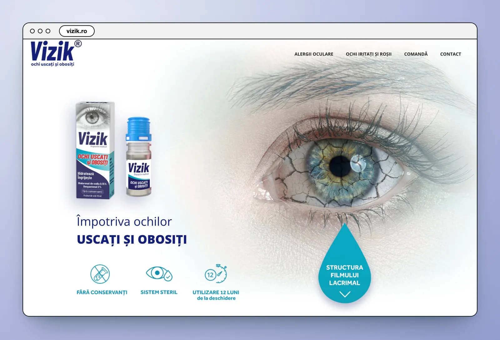
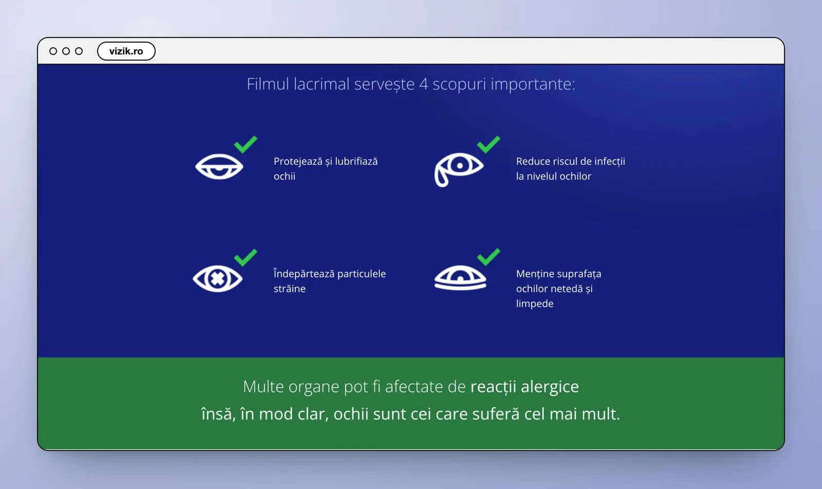
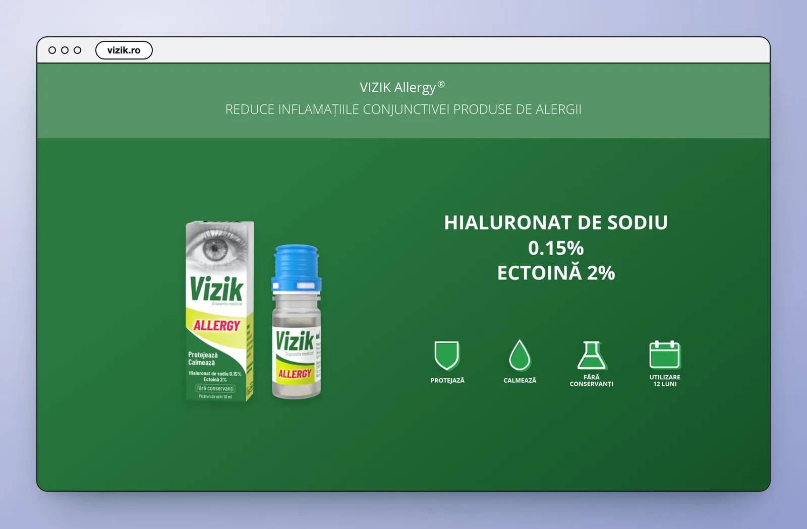
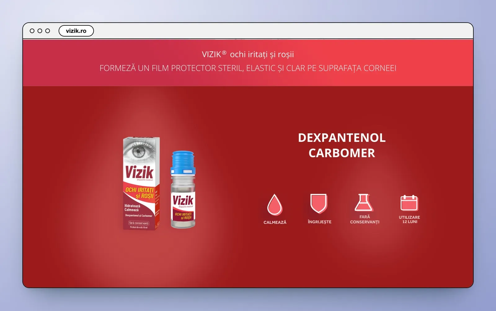
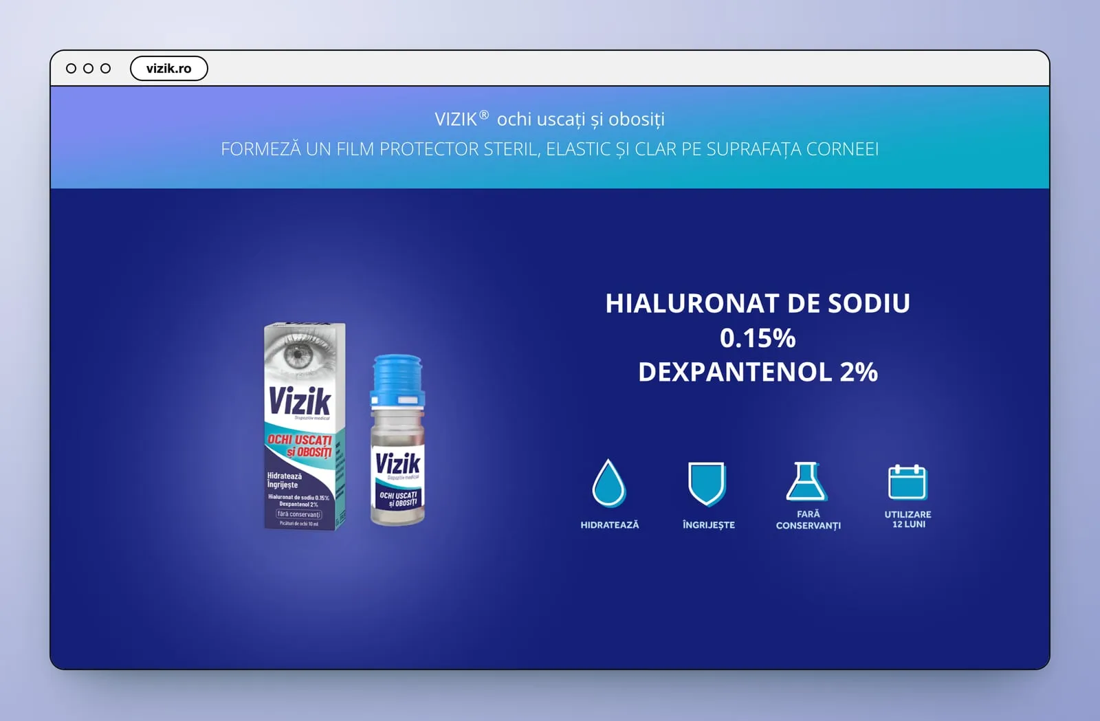
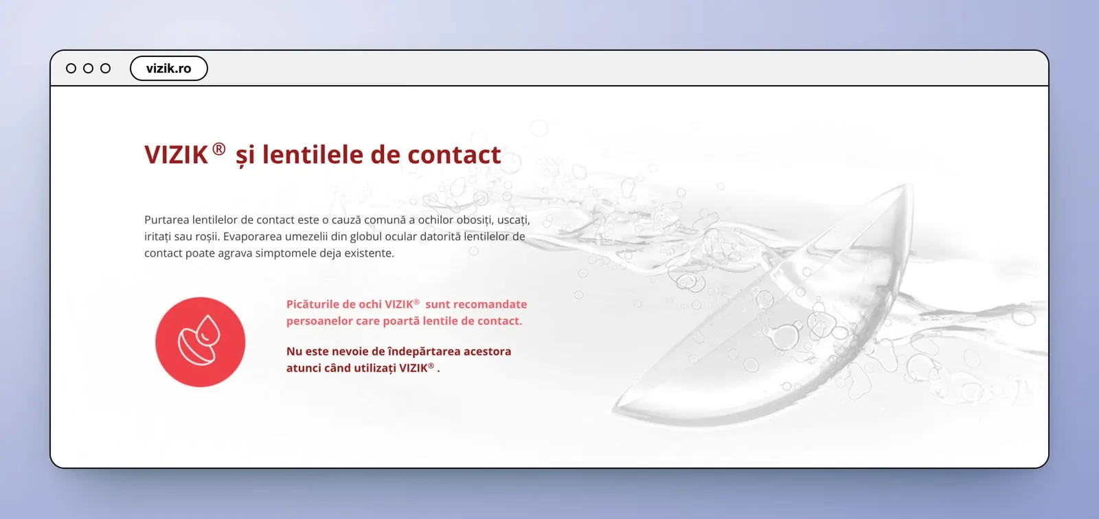
The middle of each page explains before it sells. The tear film gets a dark blue section: why tears matter, its three layers, and four things it does, each with a line icon and a green tick. Then each product has a band in its own colour, with the box and bottle on one side and the formula in large capitals on the other, from “Hialuronat de sodiu 0.15%” to “Dexpantenol”, over four icons. The red and blue pages add a section on contact lenses.
- Product story
- Icons
- Product bands
Threeformulas
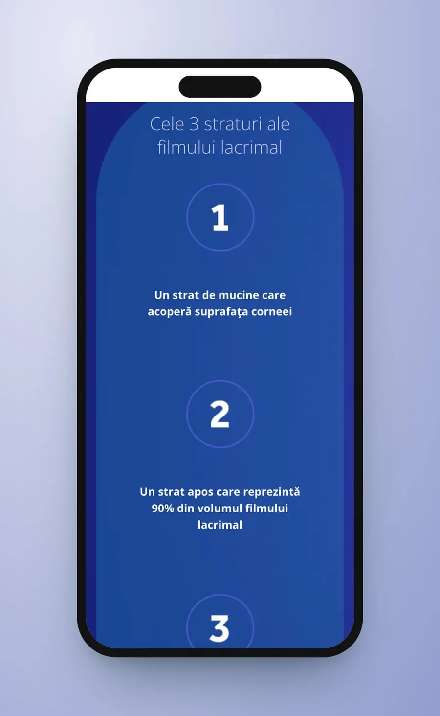
On a phone each page keeps its order. The line moves above the eye, the three icons line up down the right-hand side, and the box and bottle sit at the bottom of the first screen. The tear film's three layers stack as three numbered circles, one under another.
- Mobile layout
- One column
Fourscreens
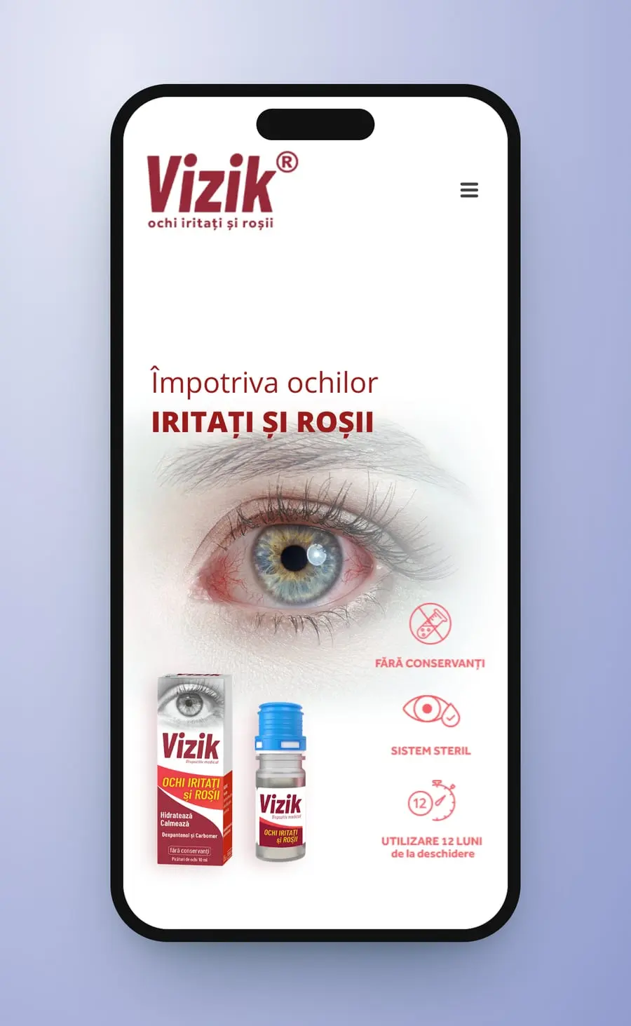
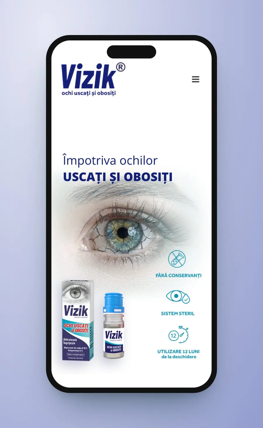
One eye, three colours: you pick the page by how your eyes feel, and every page keeps its colour to the footer.
Medical Avenue
On the same street
 AltiusMedical
 ElithiaMedical
 Clinica SanteClinic · Brand · Film
 The Aesthetic CourtWebsite · UX · UI
 Toskani MEDBrand strategy · Packaging · Barcelona
Cromatic Air · Now boarding
Ready to fly, already?
Complete your boarding pass in a minute. We'll be in touch within a day.
Begin boarding