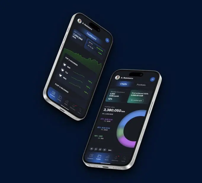
Investimental
Helping the newest retail broker in the market win in digital.
- Product Design
Venevo
Venevo is a platform for fractional startup investing. Investors browse the listings and back the projects they believe in. Entrepreneurs come to get funding for theirs.
It needed a brand that speaks to both sides, and a visual identity that could keep up with a market that never stands still.
We started from positioning: the archetype, the brand attributes and one sentence for the value proposition. Venevo offers transformative ventures to visionary customers, and makes them feel enabled. Then we drew two creative directions on top of it.
“At Venevo, we believe in democratizing the future.”
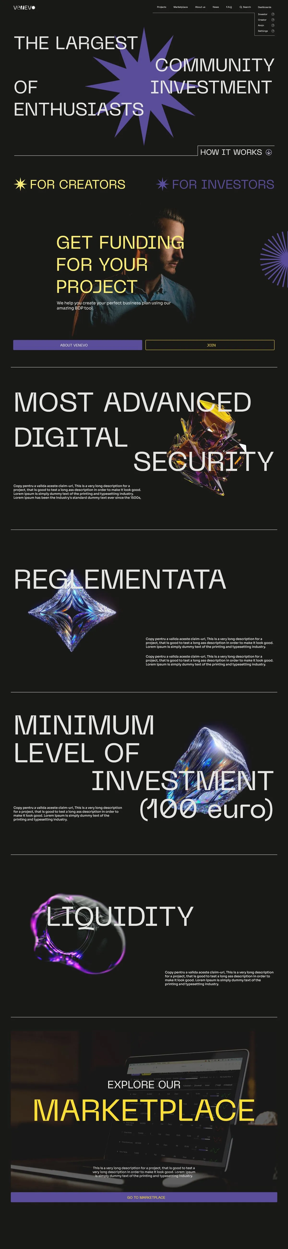

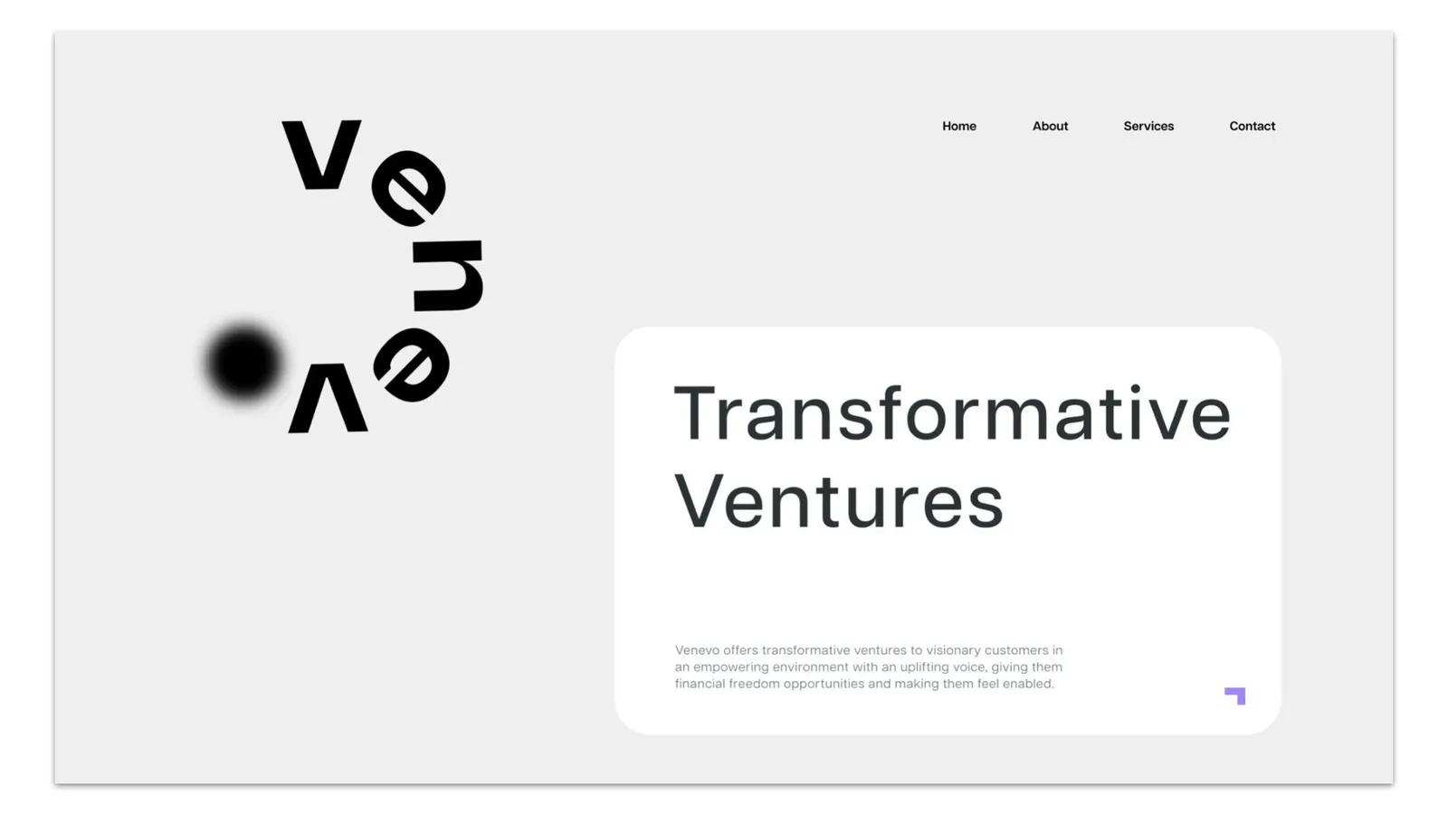
The Venevo homepage
The archetype mix is 55% Creator, 37% Hero and 8% Everyman. The culture is empowering, the voice uplifting, the audience visionary. And Venevo's X factor fits in three words: now you can.
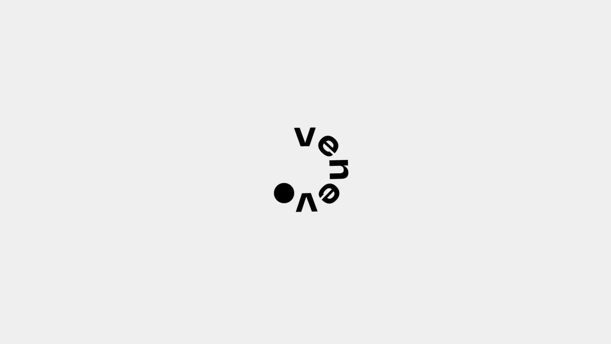
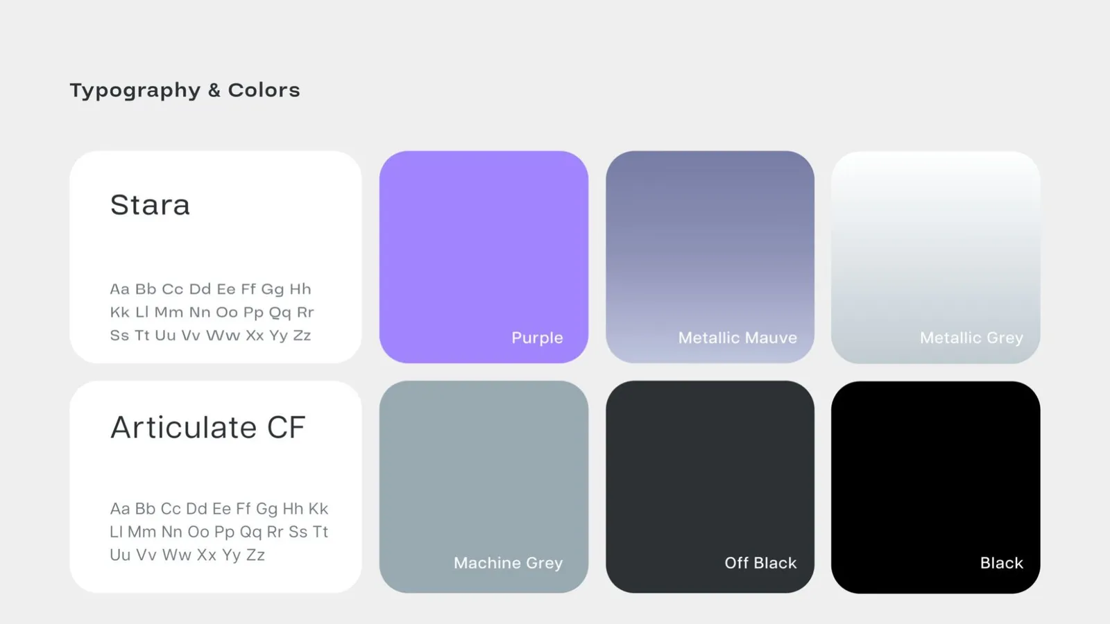
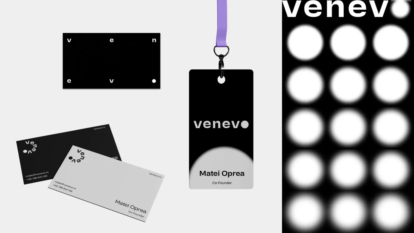
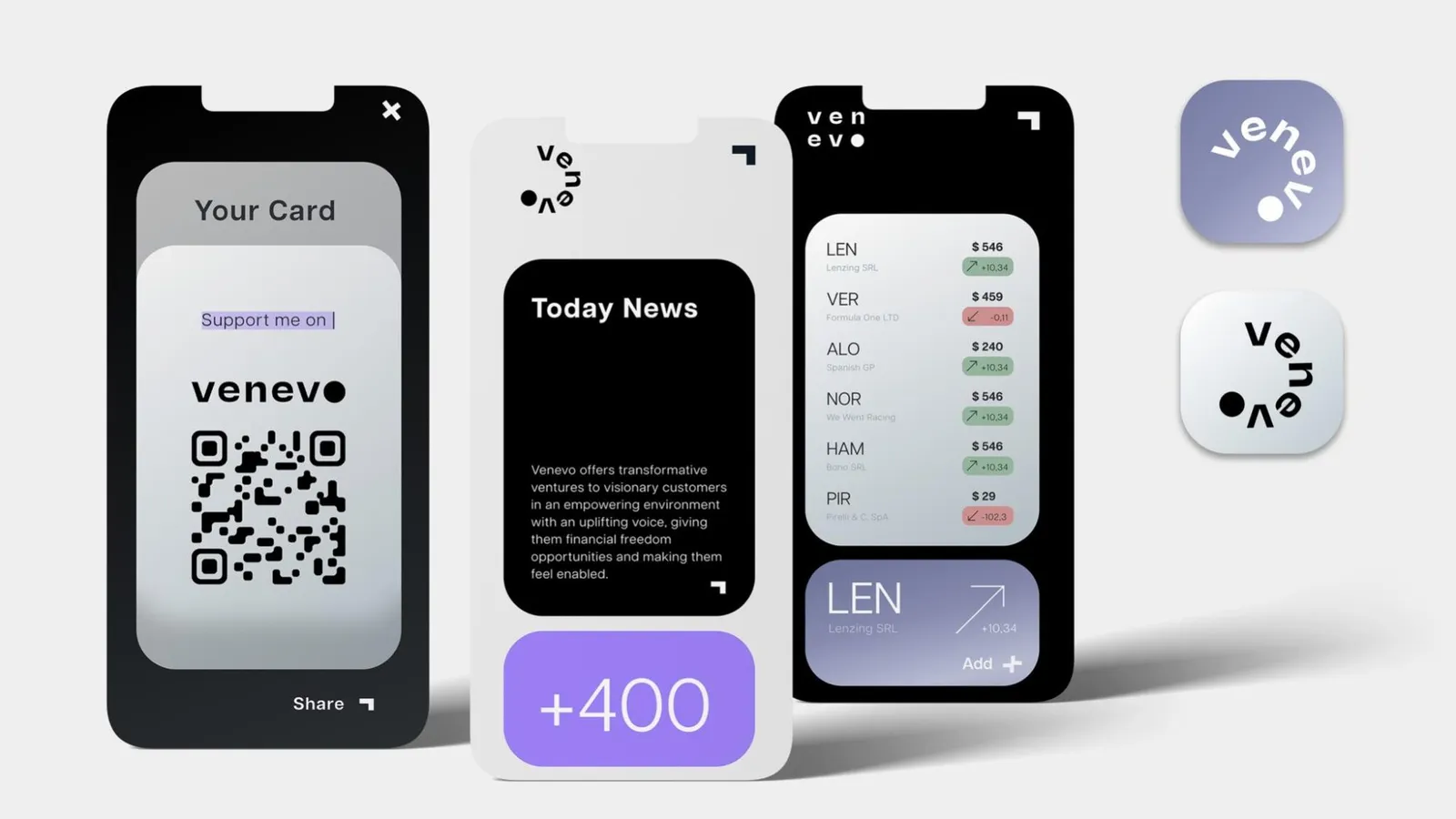
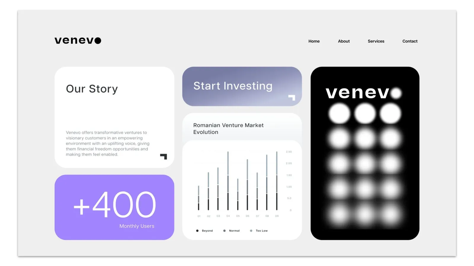
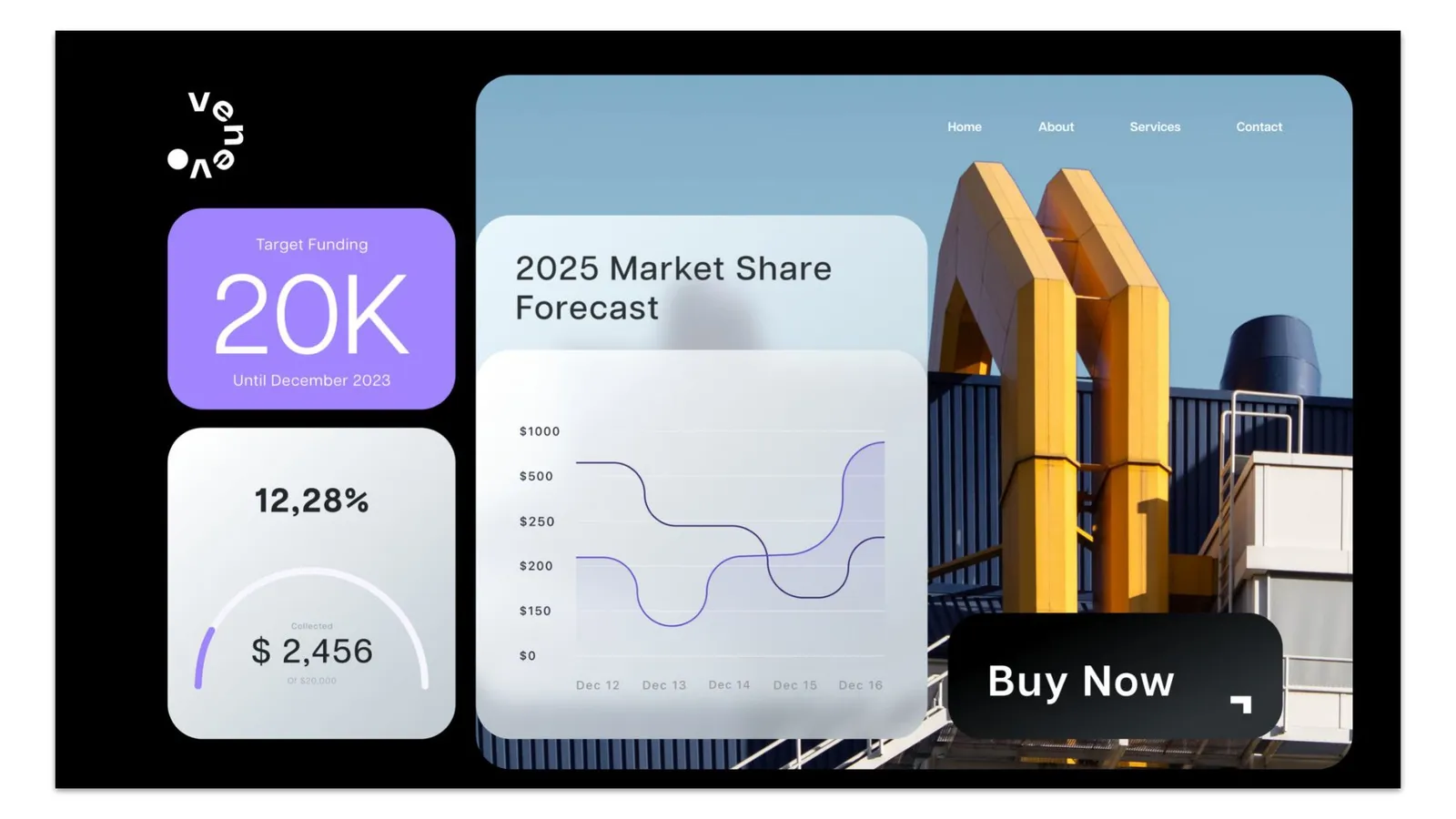
UnBlurred Clarity goes from blur to empowering clarity. Growth, resilience and transparency as keywords. Black, purple, grey and blue. See-through surfaces, blur, gradients and glass. The wordmark comes into focus letter by letter, and the letters orbit a single dot.
From blur to empowering clarity.
The concept of the first direction.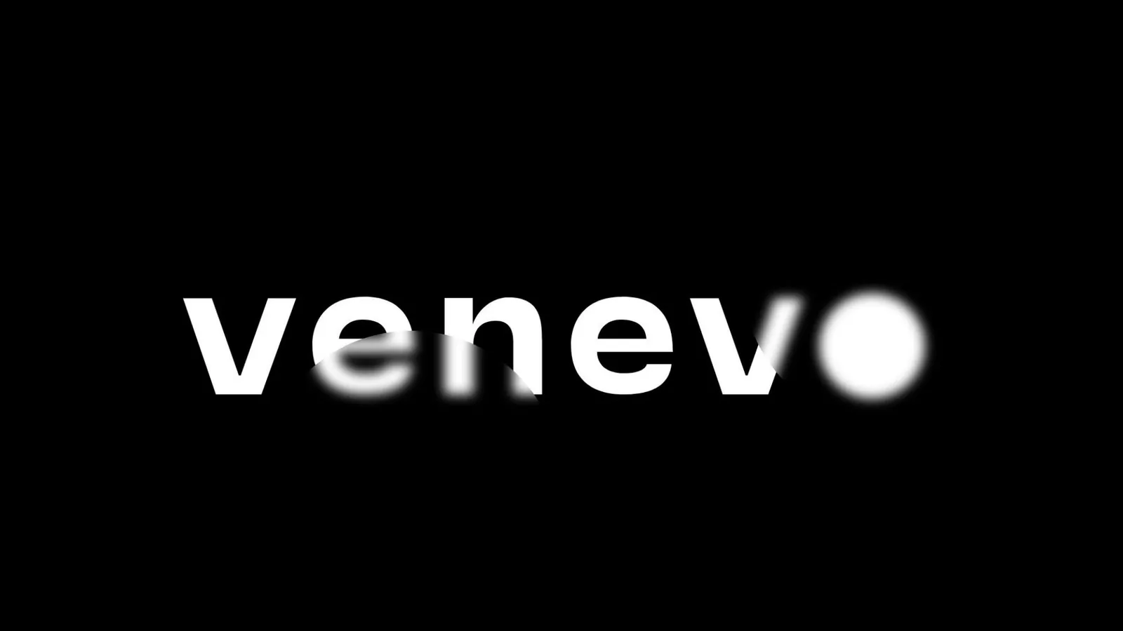
Evolve is about growth, the future and lifting people up. Black, purple and yellow. Flat shapes, cut-outs, illustration, playful type and visuals that point forward. This is the direction Venevo took.
We are the ever growing future.
The concept of the second direction.
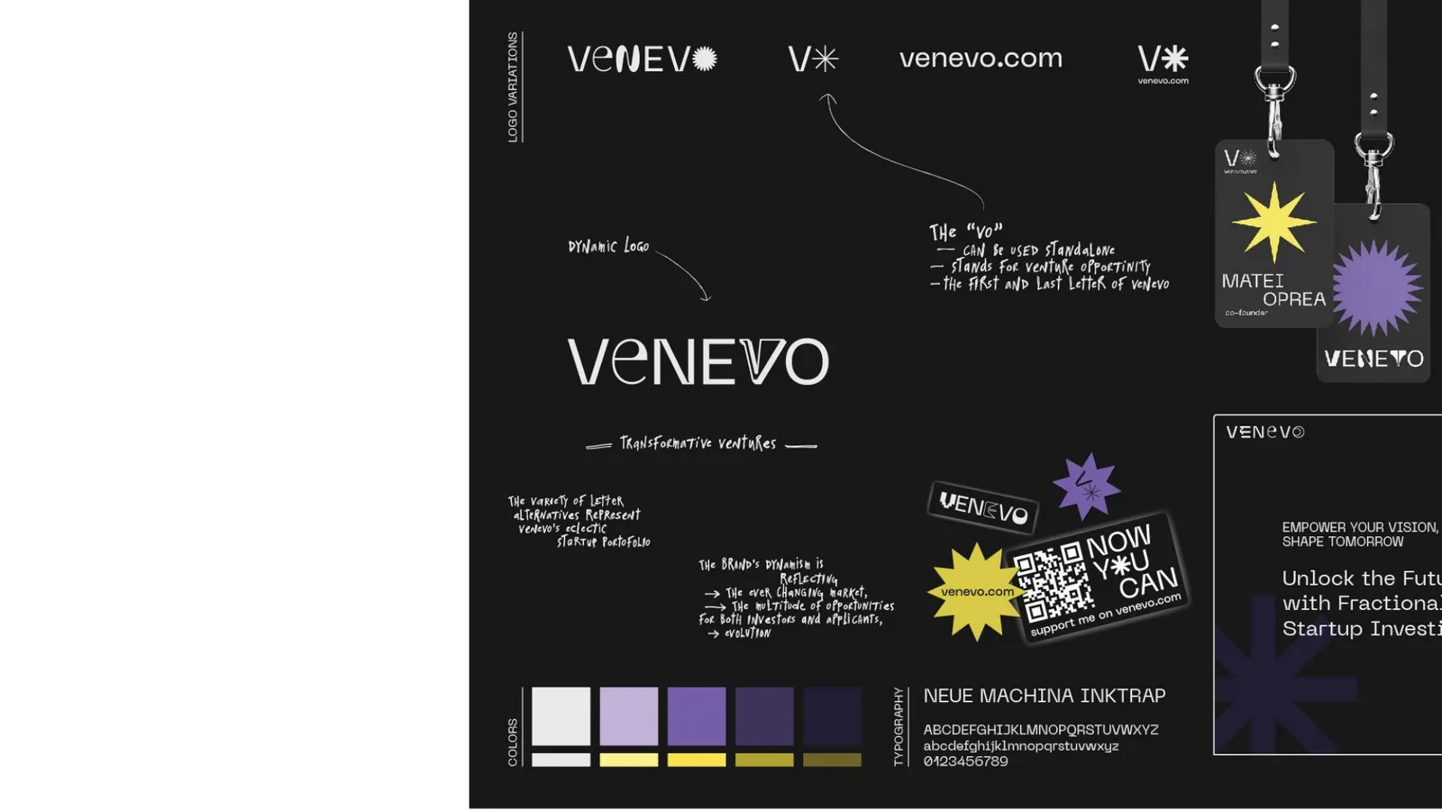
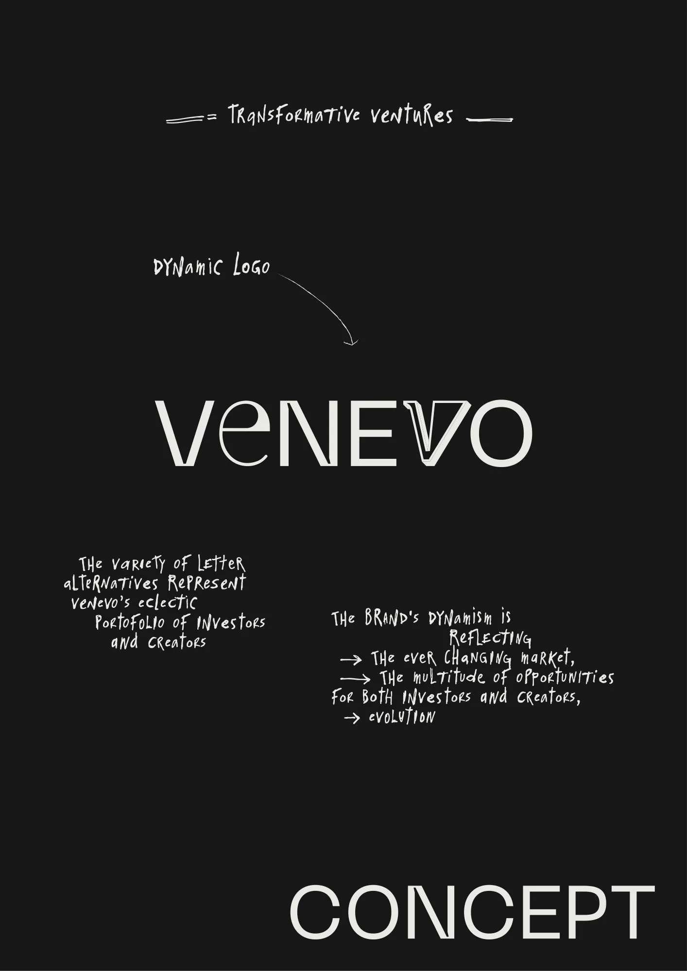
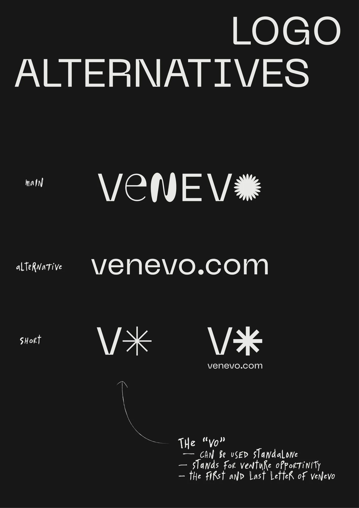
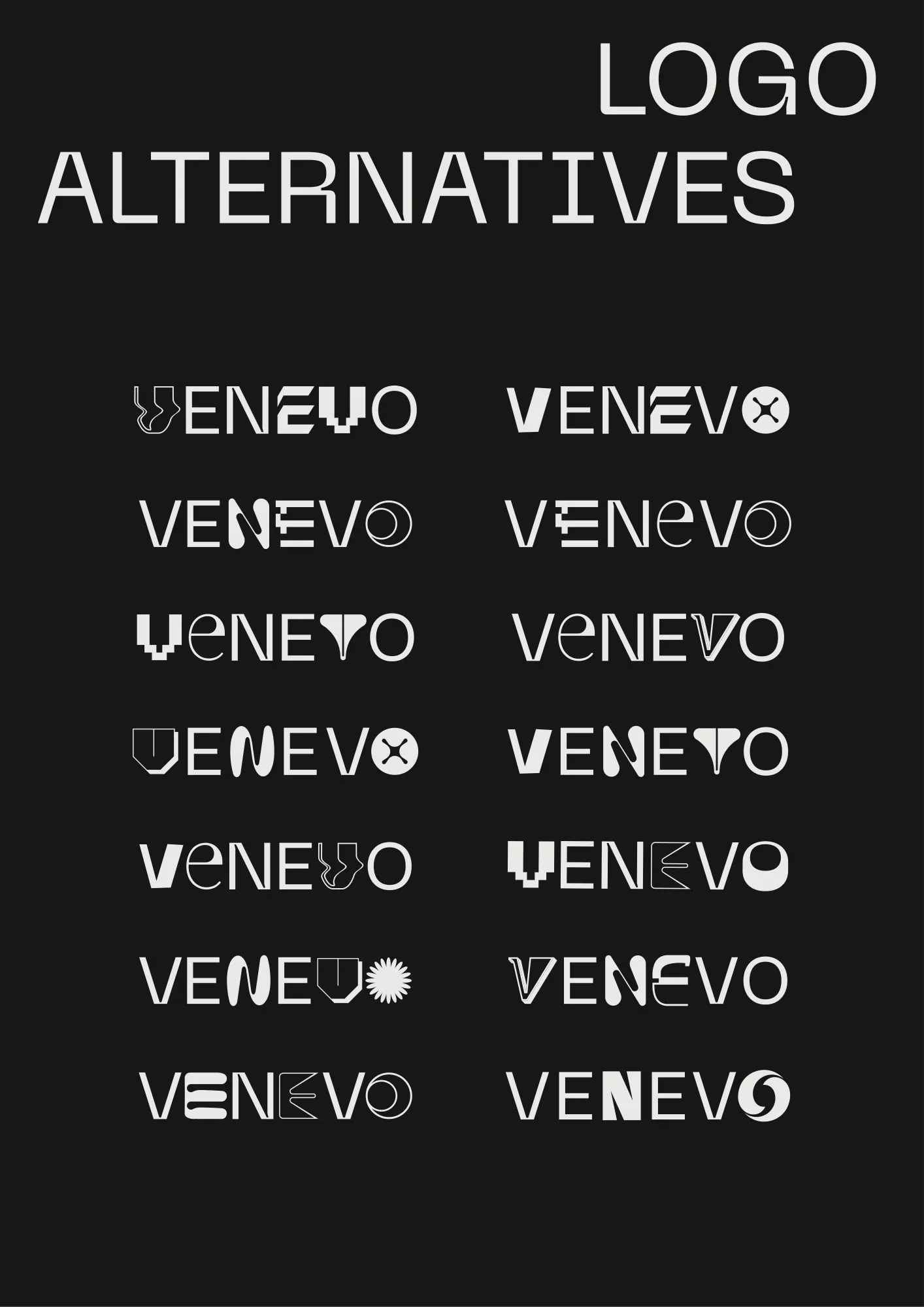
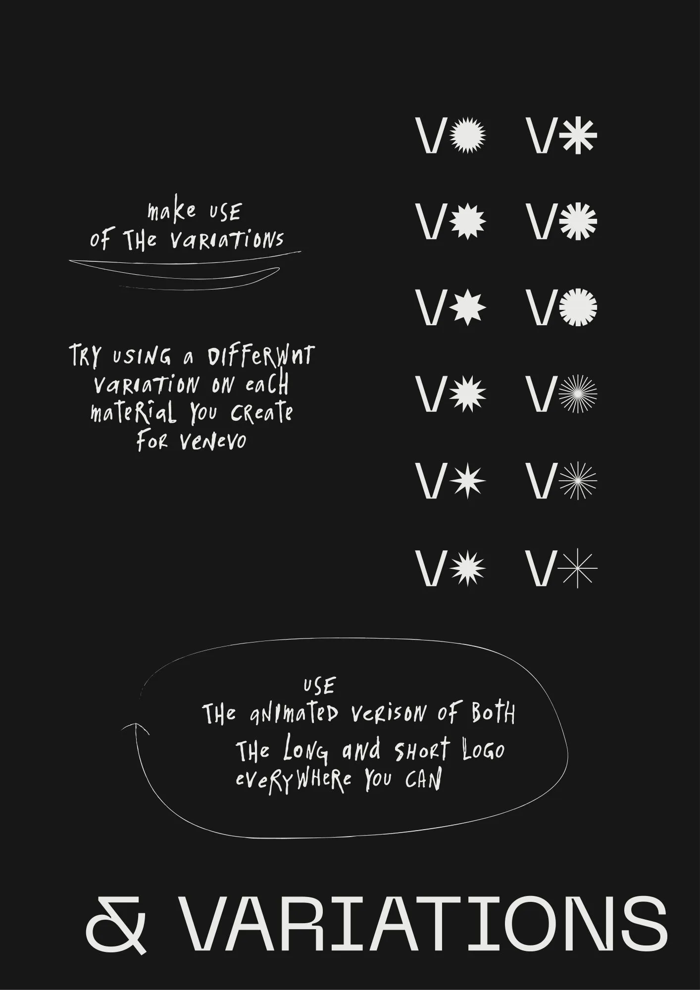
A dynamic logo. The letter alternatives stand for Venevo's eclectic mix of investors and creators. The movement reflects a market that keeps changing and the opportunities in it. The short version, V✳, keeps the first and last letters and stands for venture opportunity.
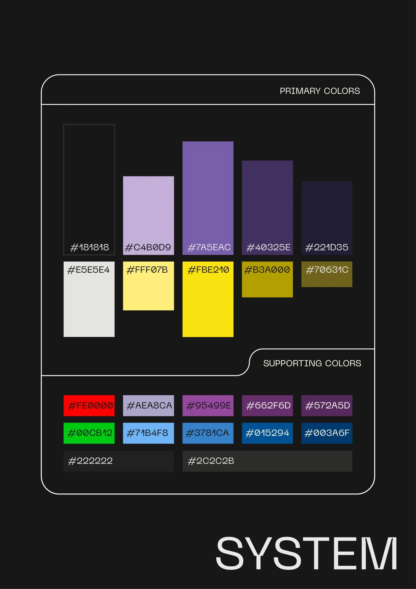
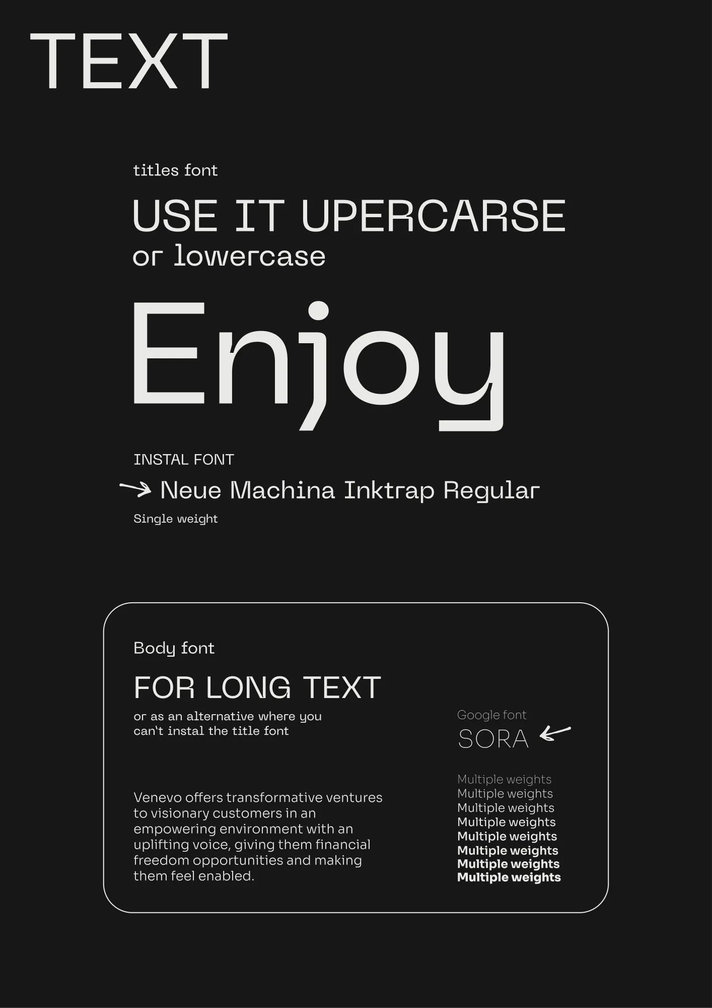
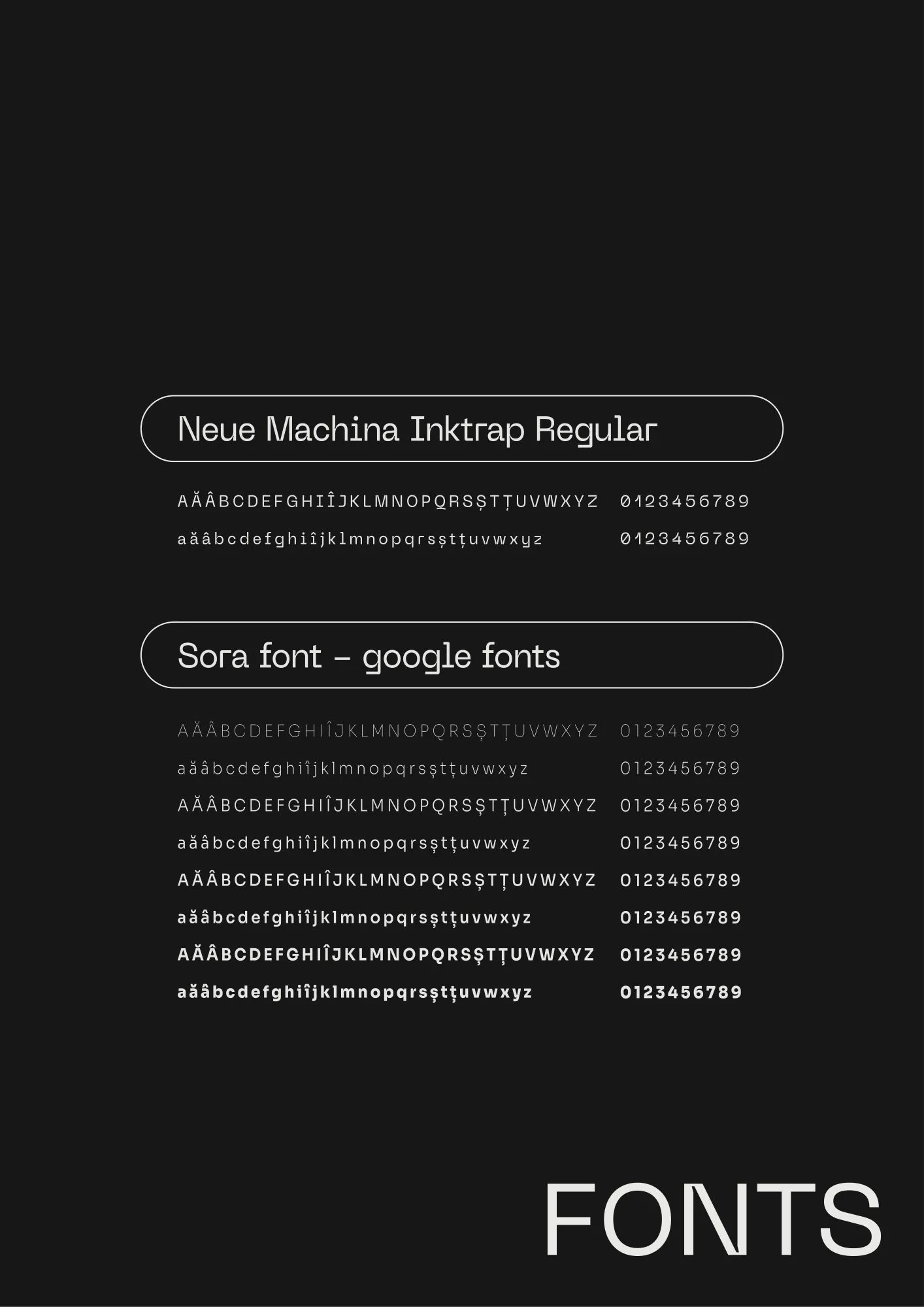
Two families of colour: purples from lilac #C4B0D9 to #221D35, and yellows from #FFF07B to #70631C, on #181818 and #E5E5E4. Neue Machina Inktrap sets the titles, in capitals or lower case. Sora, a Google font in many weights, sets the long text.

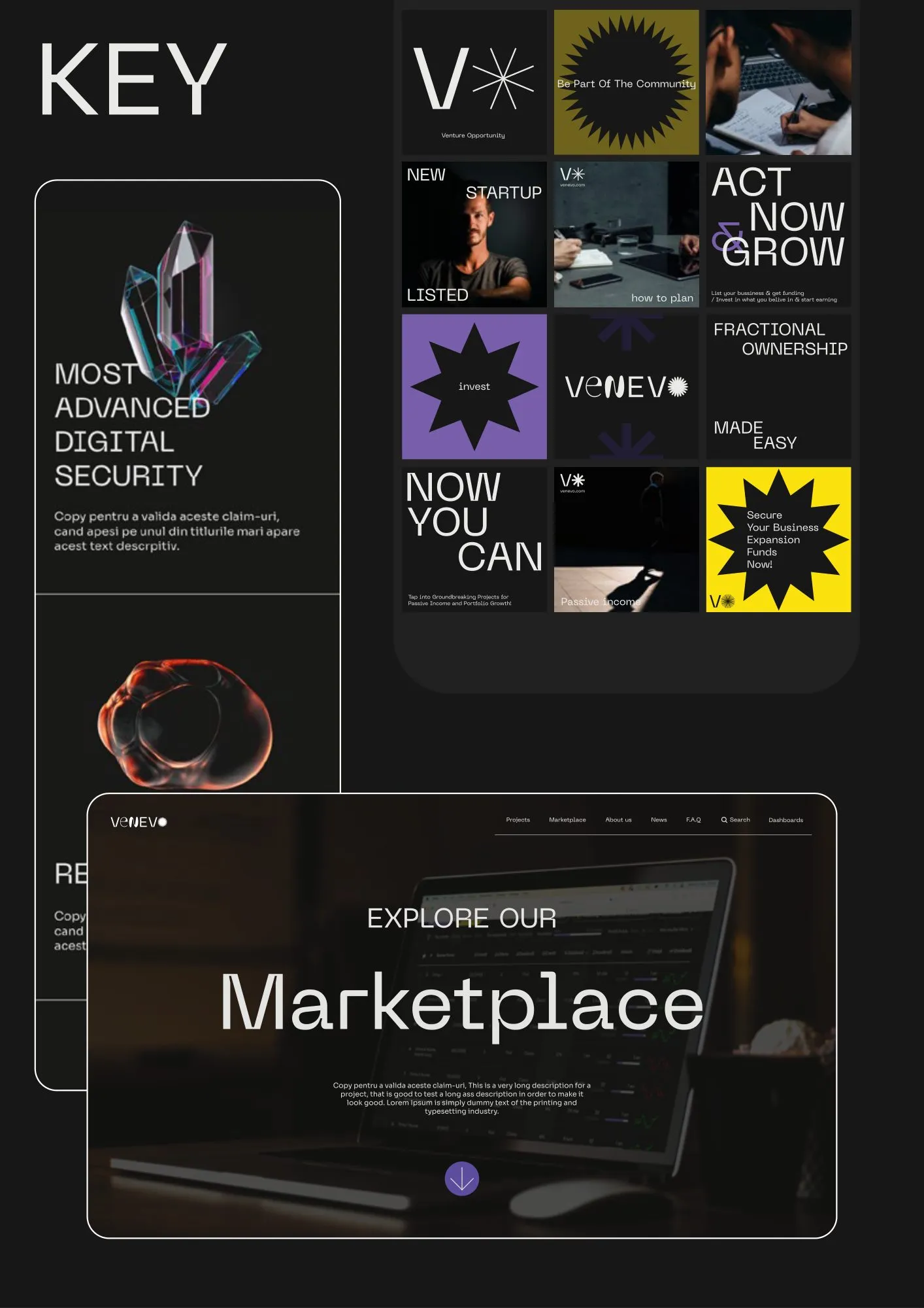
A dark homepage with a big headline and a star that never sits still. The menu opens on invest, how it works, listings and about us. The landing page speaks to creators and to investors in turn, then goes through security, the minimum investment and liquidity, and ends in the marketplace.

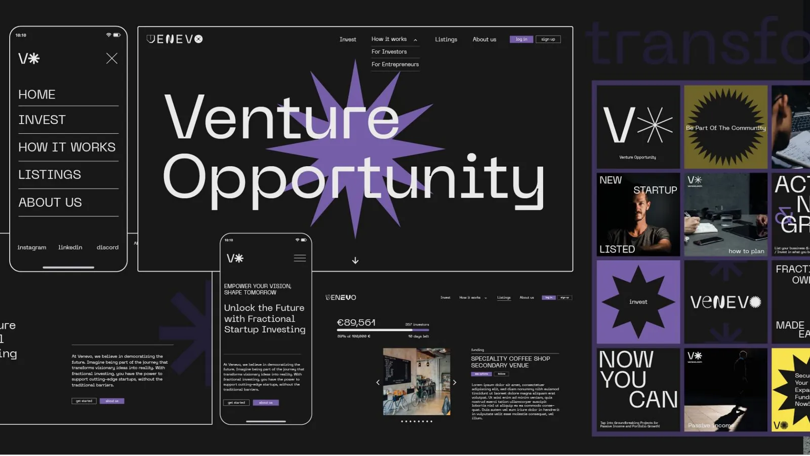
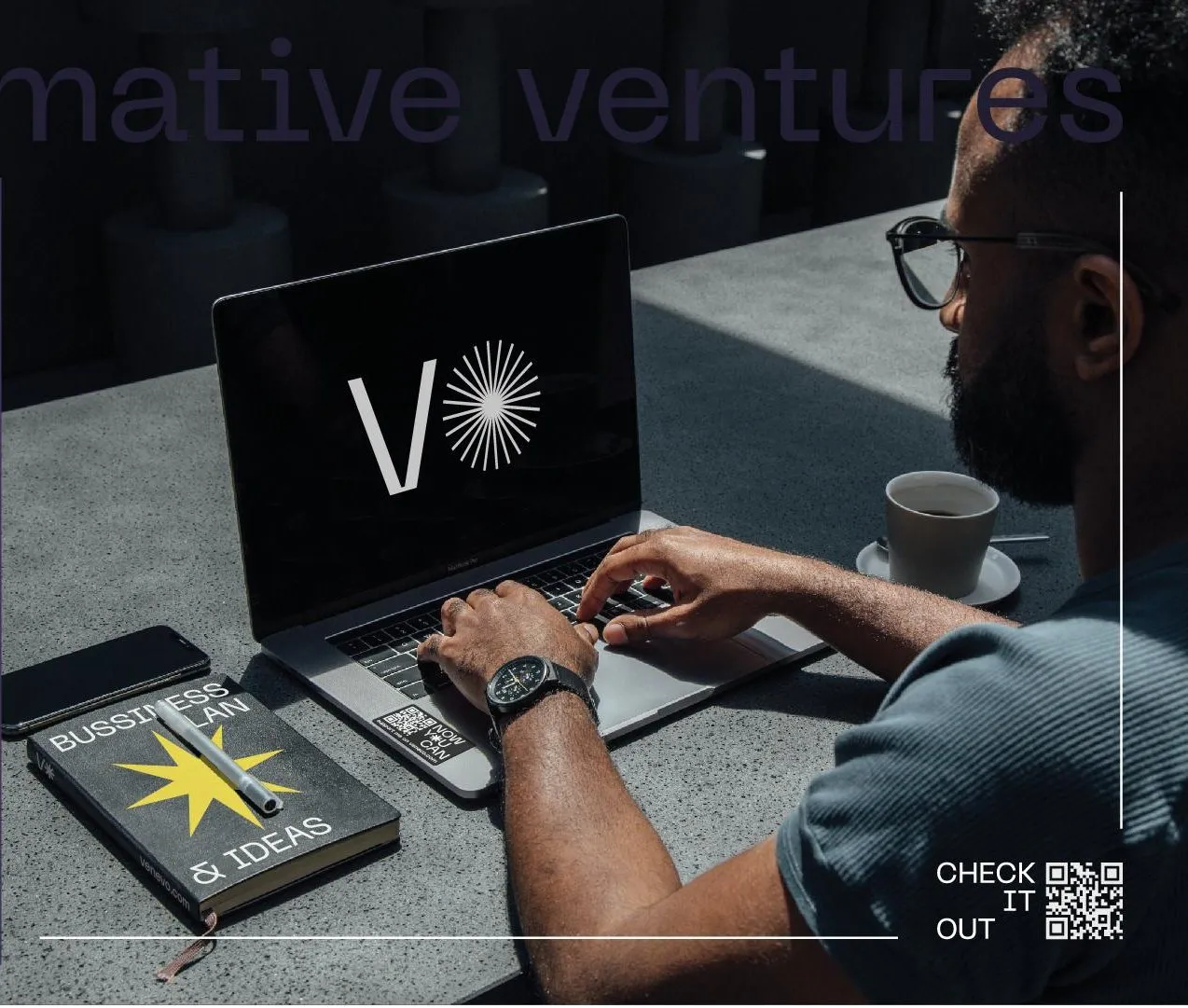
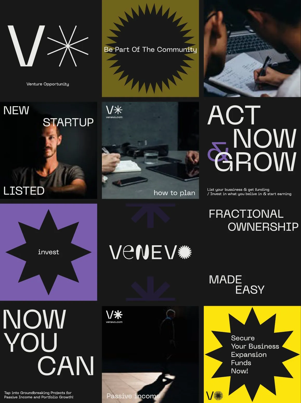
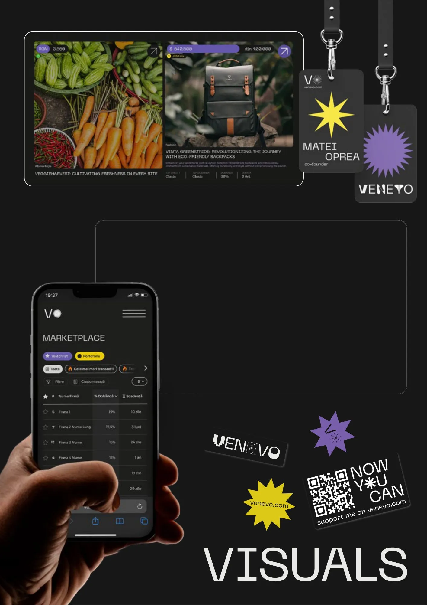
Square posts in black, purple and yellow, each carrying one idea: now you can, act now and grow, fractional ownership made easy, a new startup listed. Badges, stickers and a QR code bring the same voice off the screen.

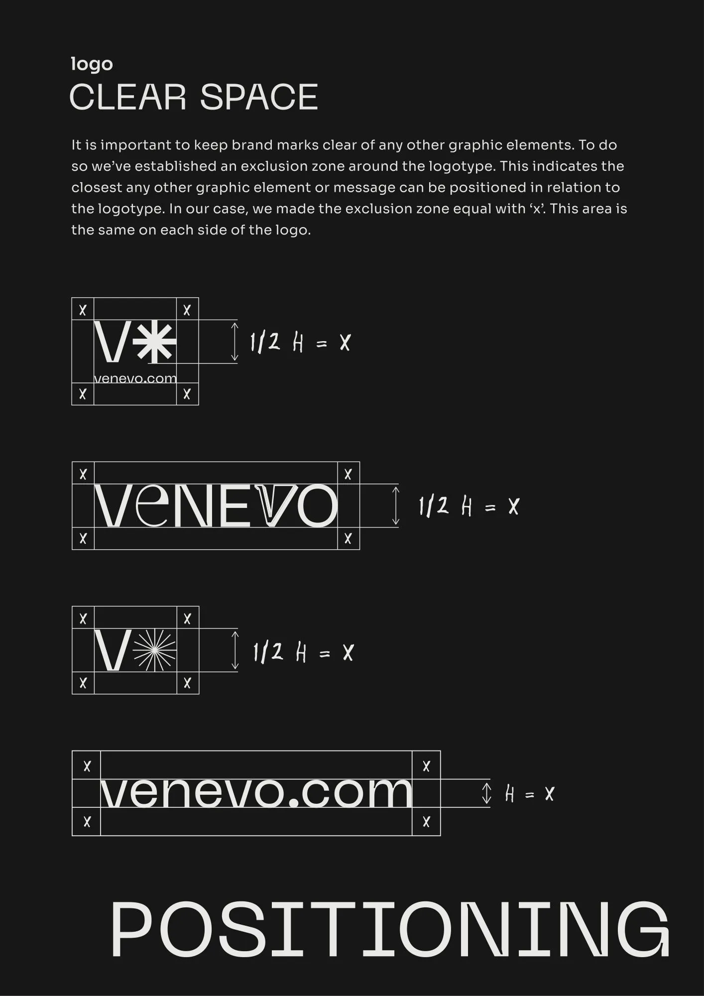
One name that changes shape and stays recognisable. Thirty-two pages of guidelines show how: the concept, fourteen wordmarks, colour and type, key visuals, and the positioning underneath. Now you can.