OchiSan
Comfort for the eyelids.
- Eyelid ointment, OchiSan
- Romania · Zdrovit portfolio
- Product site, desktop and mobile
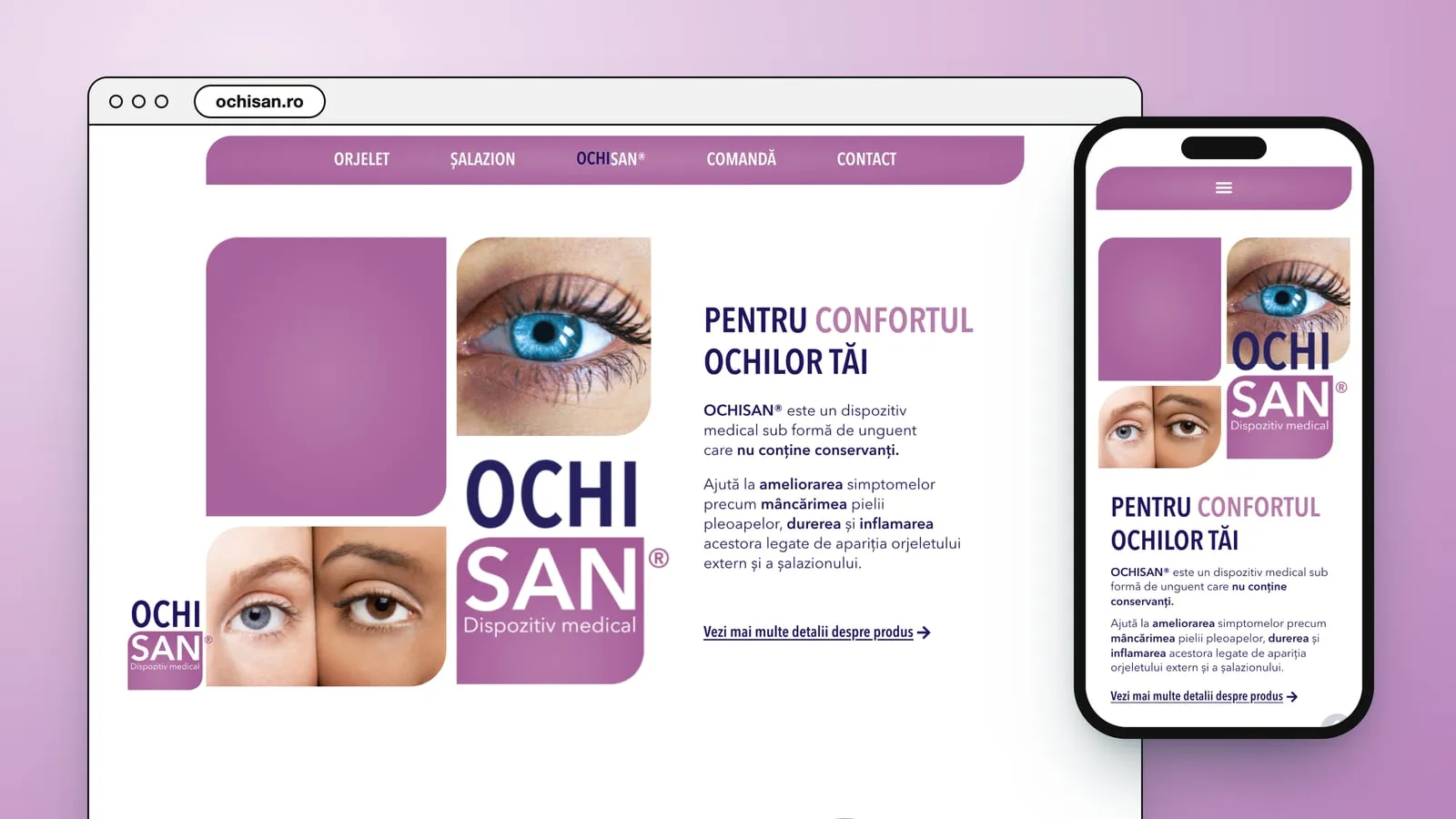
Two conditions that look alike
OchiSan is a medical device from Zdrovit: an ointment for the eyelids that, in the site's words, “nu conține conservanți”. The site says what it is for: it “ajută la ameliorarea simptomelor precum mâncărimea pielii pleoapelor, durerea și inflamarea acestora legate de apariția orjeletului extern și a șalazionului”.
The two look alike. The site gives the stye its everyday name, ulcior, and warns that a stye can turn into a chalazion if the infection lasts.
So the page explains both conditions before it shows the tube.
Rounded tiles, lilac and white
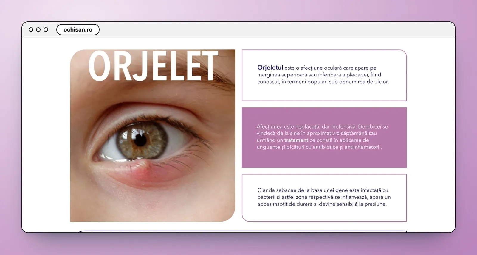
The page is built from rounded tiles, like the logo: some filled in lilac, some outlined in a thin line, the photos cut to the same corners. The stye gets its own block, then its causes, its two kinds and a warning, then the chalazion in the same system. Only then come the tube, its three ingredients and three drawn steps for using it.
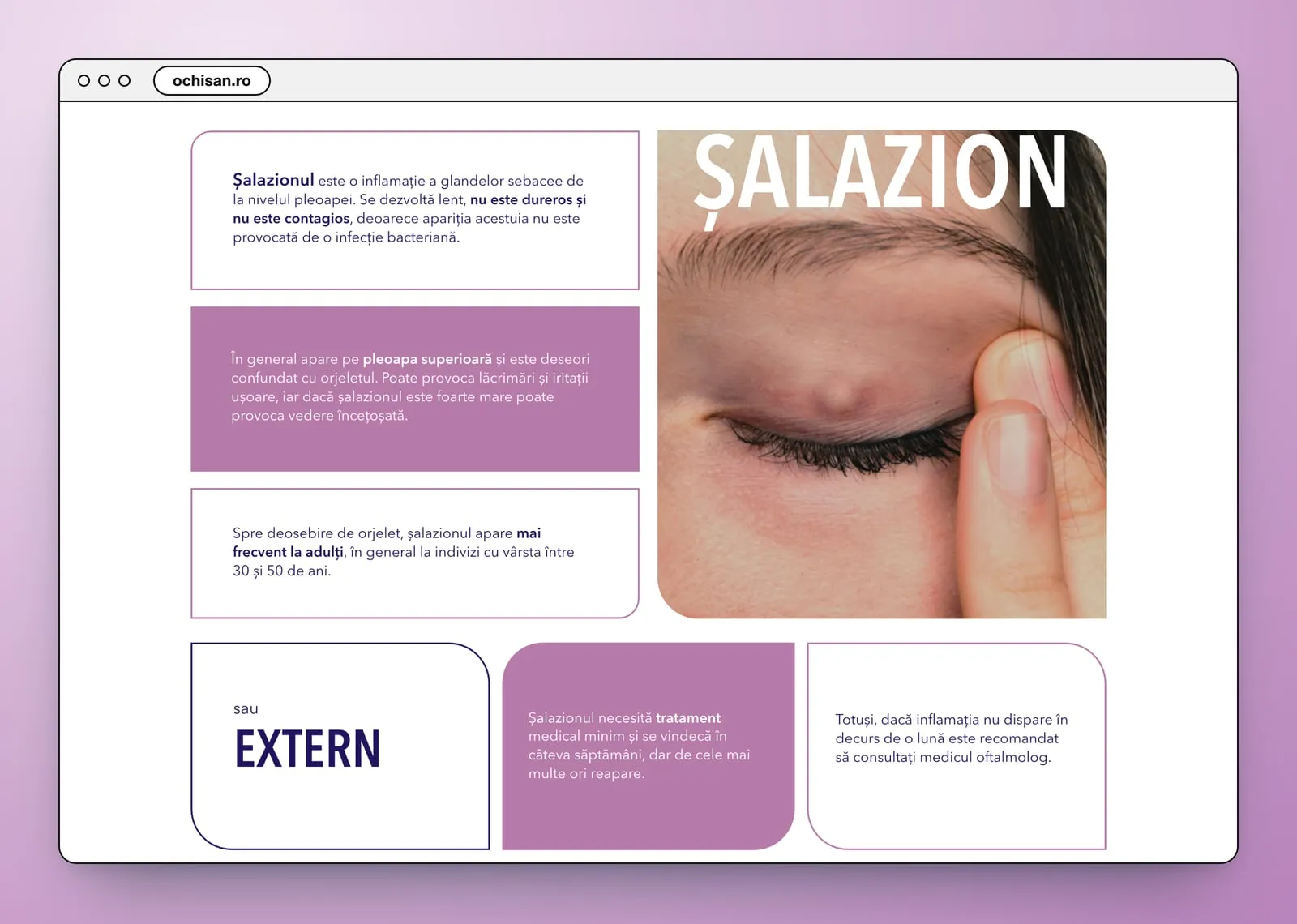
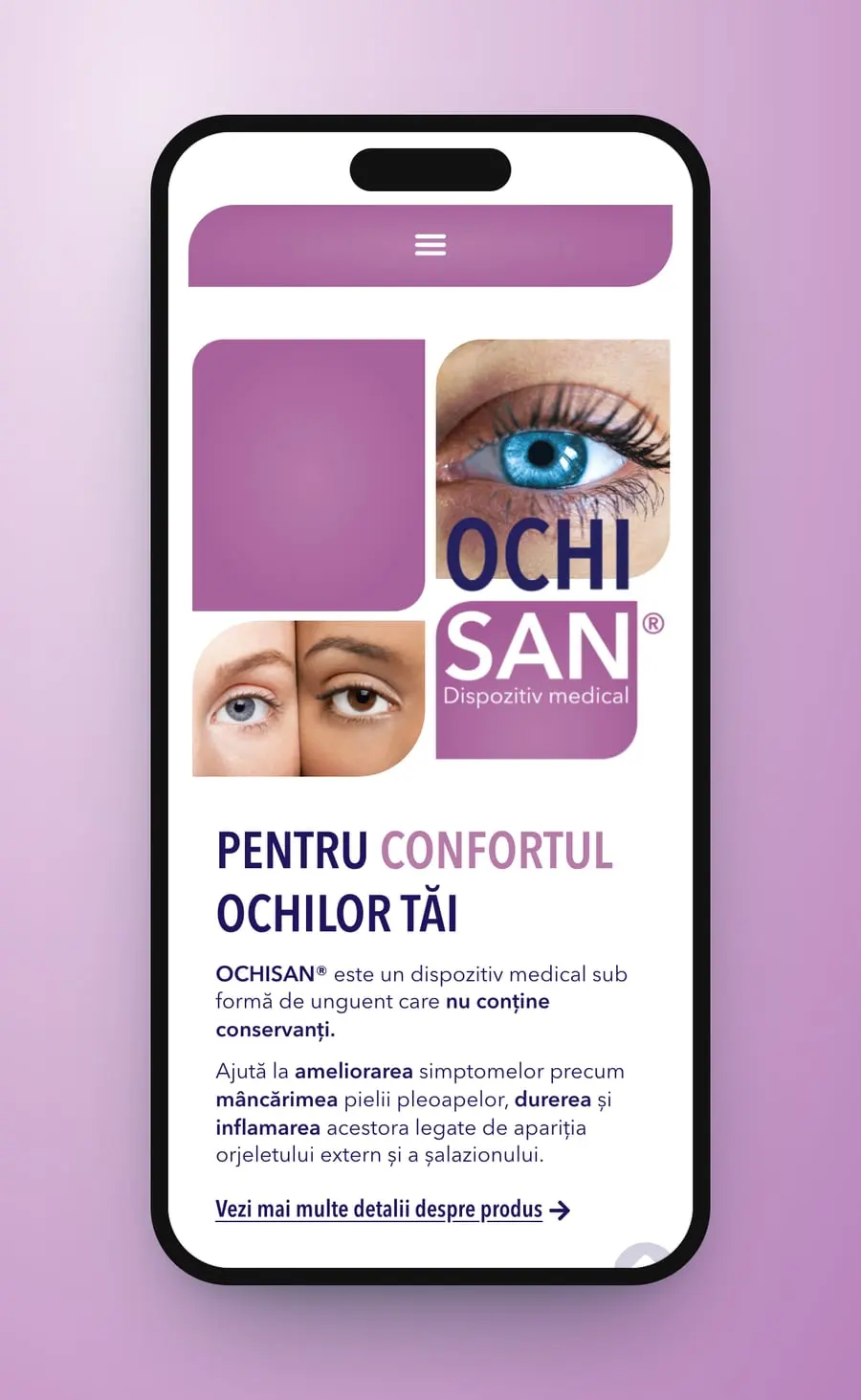
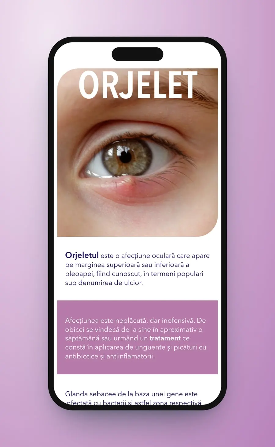
A lilac bar holds the menu: Orjelet, Șalazion, OchiSan®, Comandă, Contact. The hero is a grid of rounded tiles, a plain lilac one, a blue eye, two faces split down the middle and the OCHI SAN logo, beside the line “Pentru confortul ochilor tăi”. A drawn woman rubbing her eye opens the explanation. Then “ORJELET” in large white capitals over a photo of a stye, its causes, its two kinds, Extern and Intern, and a warning with a large exclamation mark. “ȘALAZION” follows in the same tiles.
- Product site
- UX/UI design
- Desktop and mobile
- Navigation
Theproduct site


Section bysection
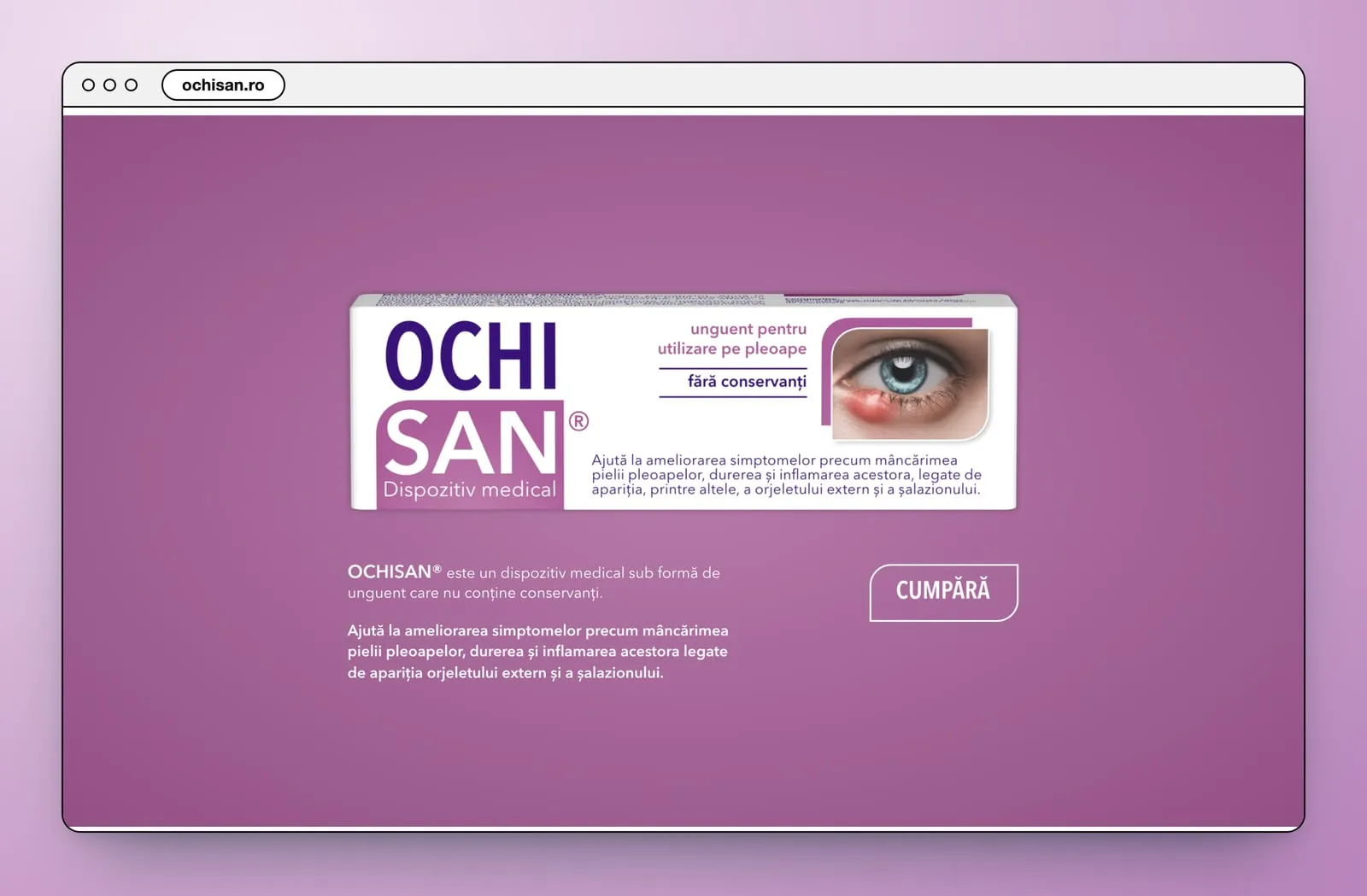
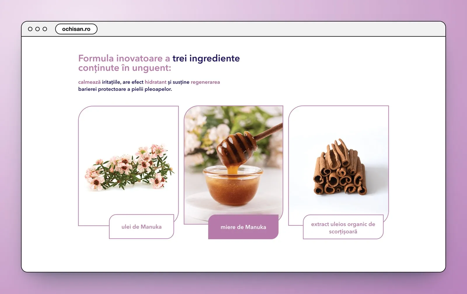
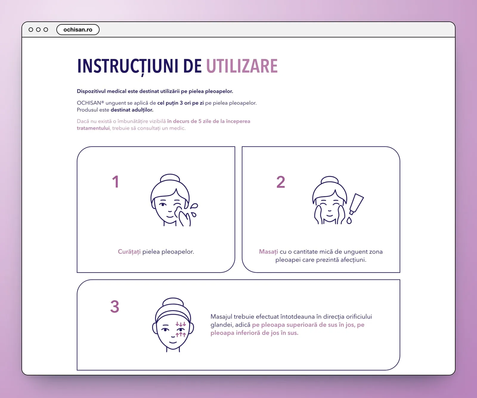
The product, the way the site brings it in. A full-width lilac band sets the OchiSan box beside its description and a “Cumpără” button. “Formula inovatoare a trei ingrediente conținute în unguent” shows each ingredient in a photo tile with a lilac label: ulei de Manuka, miere de Manuka, extract uleios organic de scorțișoară. “Instrucțiuni de utilizare” draws the use in three numbered tiles, a woman in fine line in each: cleaning the eyelid, a little ointment, and the direction of the massage.
- Product band
- Ingredients
- Illustrated instructions
On a phone the menu folds into a lilac bar with one icon, and the tile grid of the hero sits above the line. Each condition becomes a column of tiles, the Extern and Intern cards show a photo of each kind, and the three steps stack in their outlined tiles.
- Mobile layout
- One column
Fourscreens
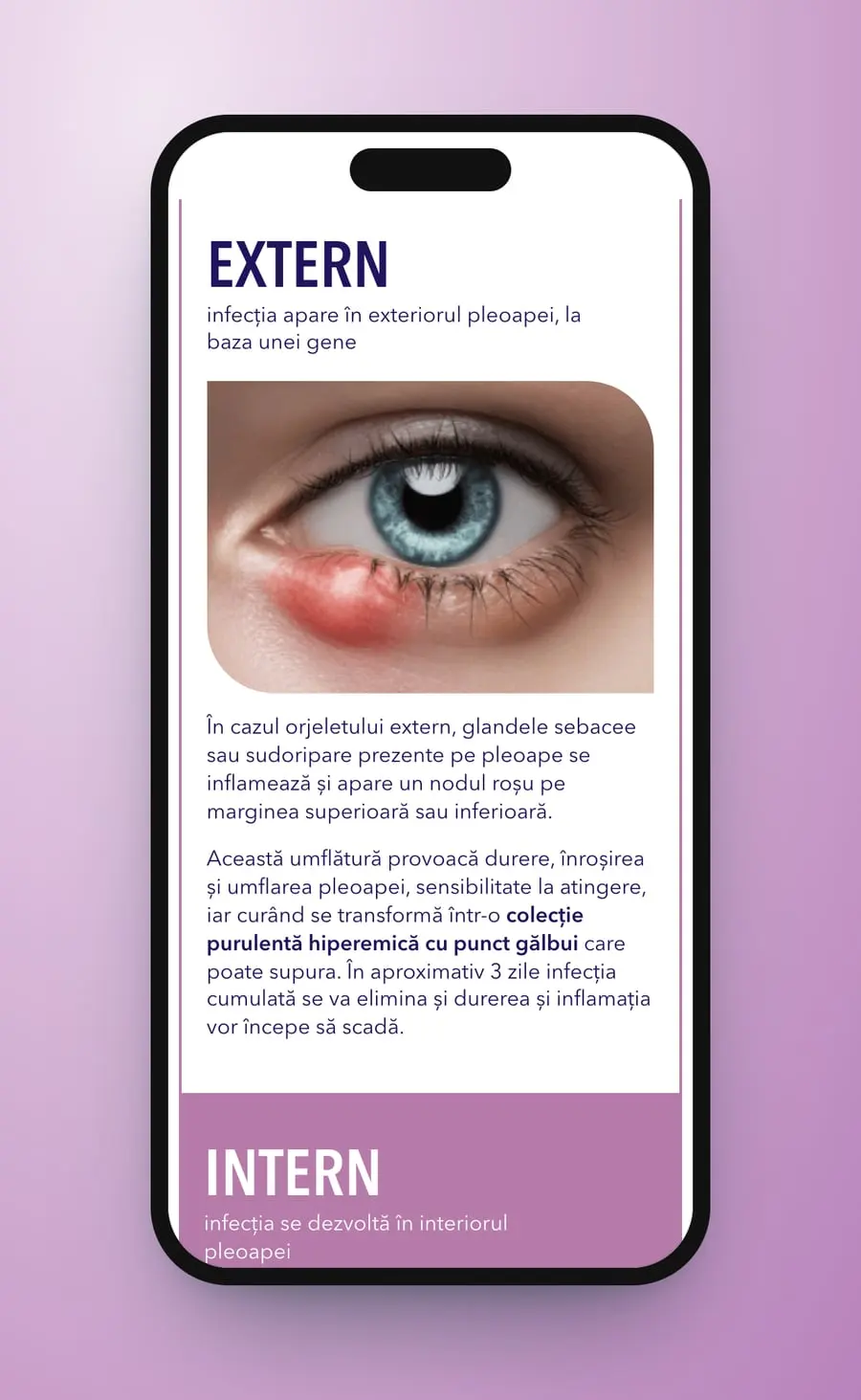
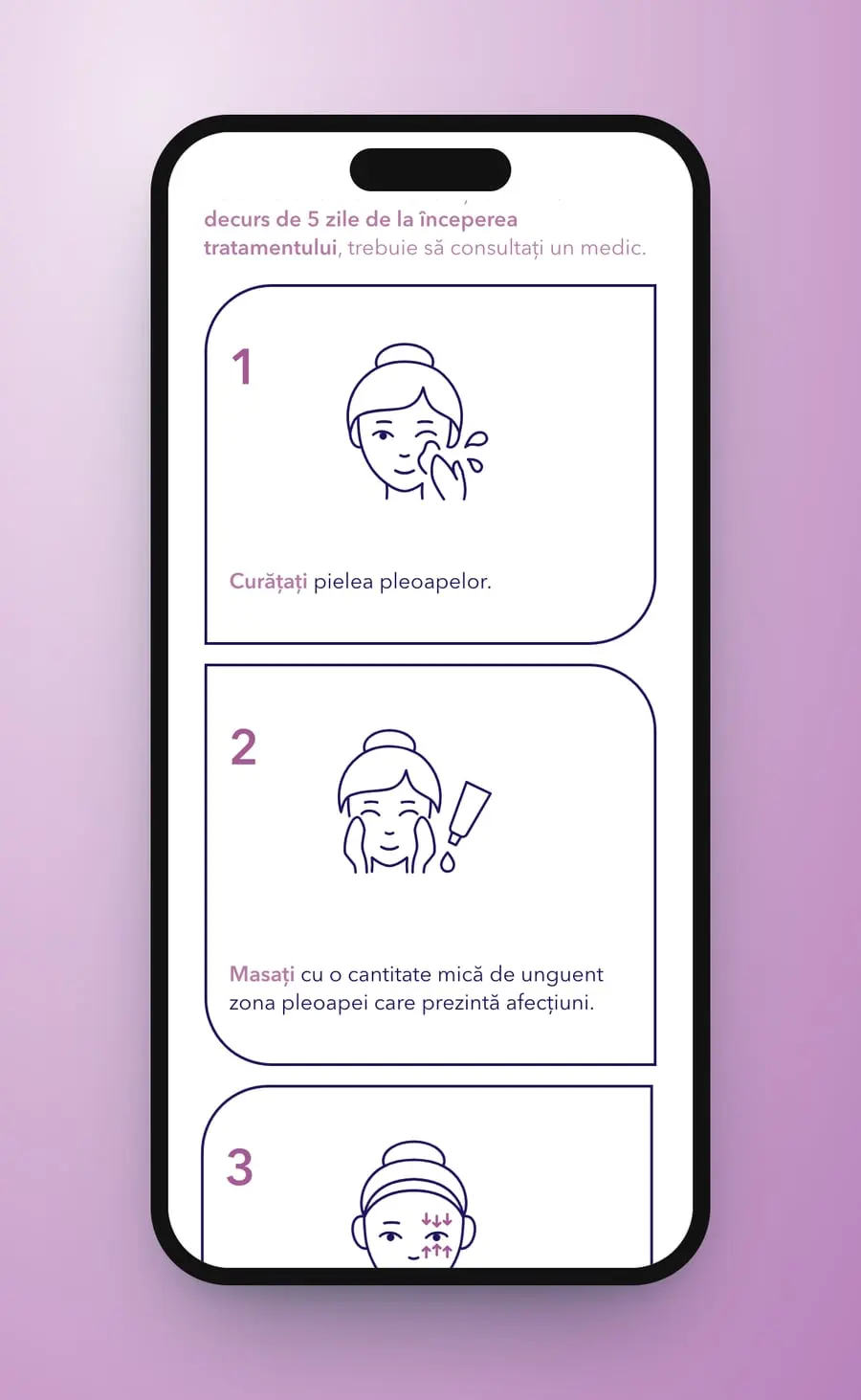
Two conditions explained first, then the tube: an eyelid ointment's page in rounded lilac tiles.
Medical Avenue
On the same street
 AltiusMedical
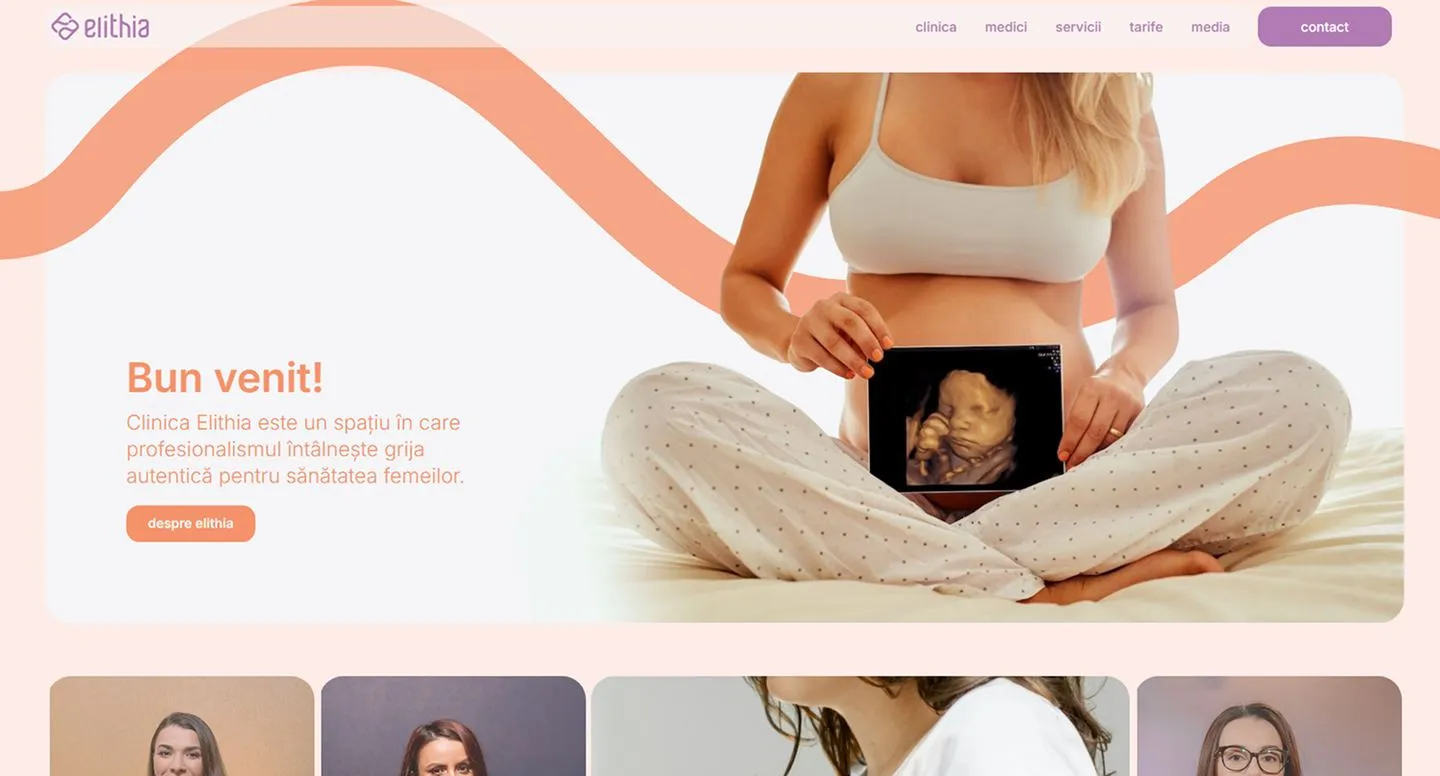 ElithiaMedical
 Clinica SanteClinic · Brand · Film
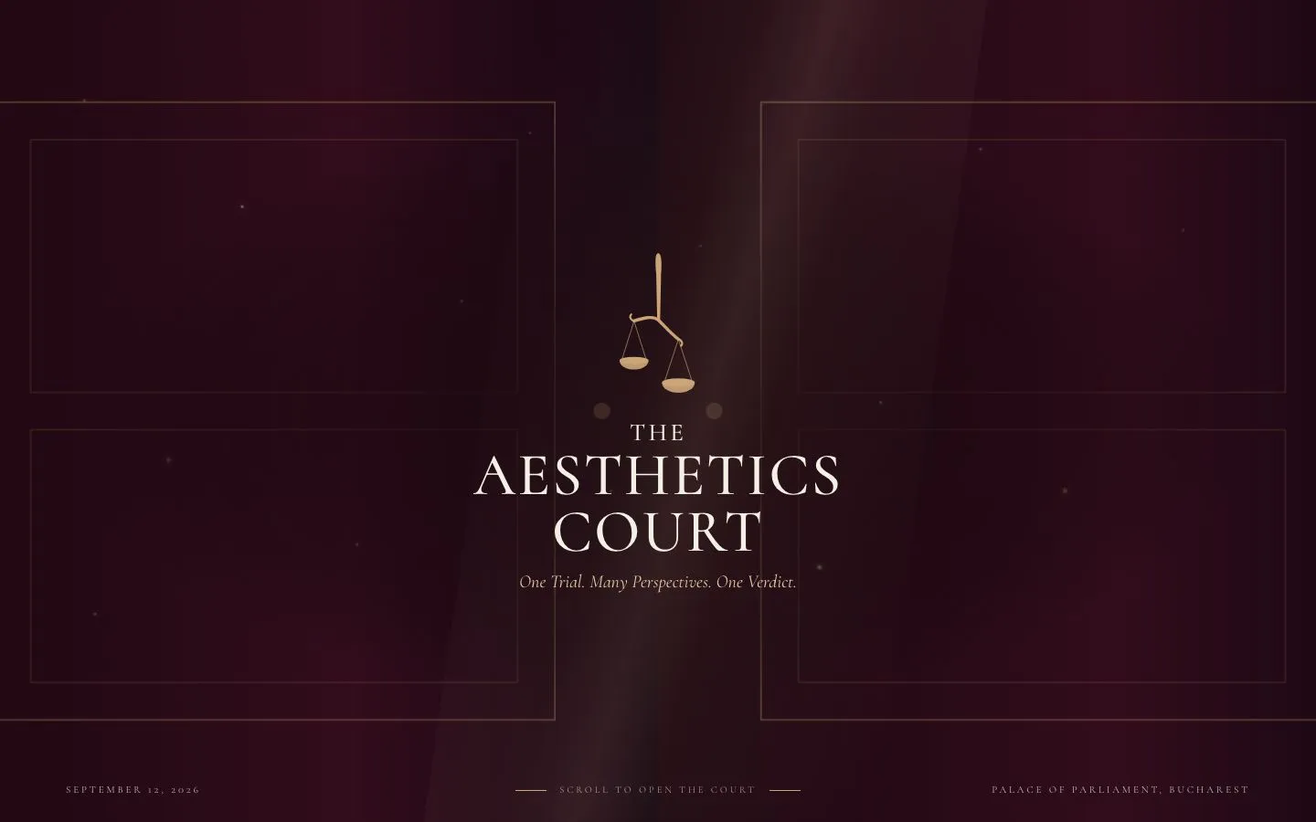 The Aesthetic CourtWebsite · UX · UI
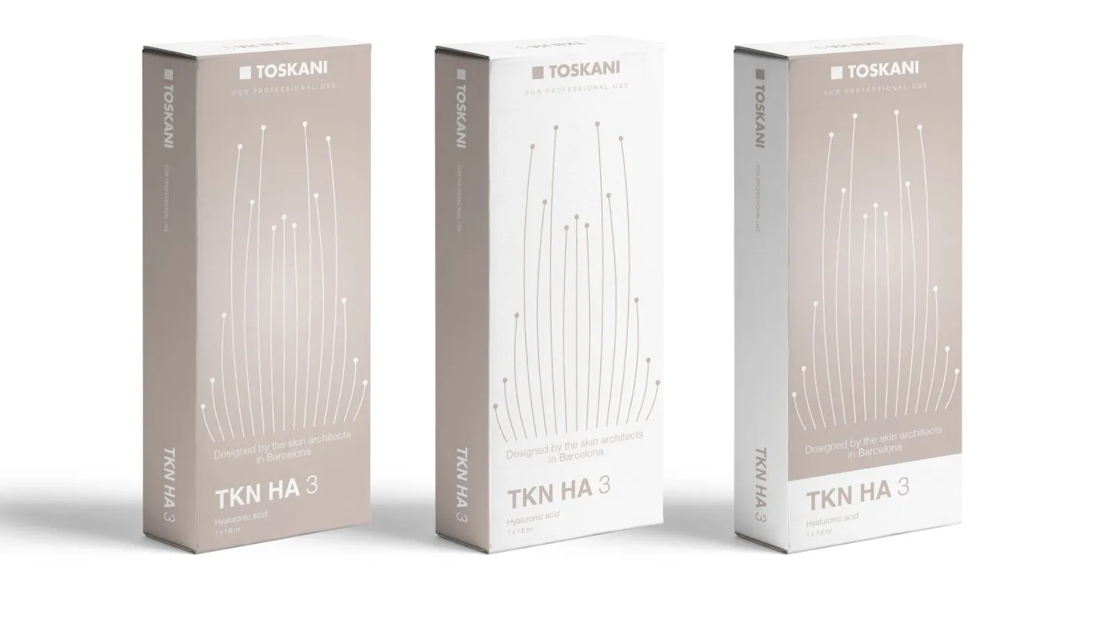 Toskani MEDBrand strategy · Packaging · Barcelona
Cromatic Air · Now boarding
Ready to fly, already?
Complete your boarding pass in a minute. We'll be in touch within a day.
Begin boarding