For five years, we've been shaping the face of Slow Coffee Festival. Not just a logo and a poster, but a postioning and a visual language that connects with people, not slides them.

For us, branding is more than design, it's meaning, a voice and a vibe made visible.

A way to turn values into graphics and graphics into something you actually feel.

The festival grew bigger and more ambitious every year. And so did it's looks.

After four years of building and learning, we’re entering a new chapter. At the heart of it all, we’ve returned to the essence:

SLOW

Brewing a Visual Language

For over eight years, Slow Coffee Festival has grown from a passionate gathering of specialty coffee lovers into Romania’s landmark coffee celebration.

Cromatic Studios has shaped the visual language and brand universe that reflects the festival: a place where coffee is culture, people are central, and every gesture matters.

Culture

Slow Living

At its heart, Slow Coffee Festival celebrates intentional living. In a world obsessed with speed and instant gratification, the festival invites visitors to pause, savor, and immerse themselves not only in their coffee, but also in the moments, conversations, and shared experiences around it.

Impact

Coffee Community

Specialty coffee is more than what’s in the cup, it’s about story, craft, ethics, and ecosystem.

The festival is the heartbeat of this community, connecting roasters, baristas, producers, and passionate coffee lovers.

It shifts the conversation: from “what coffee do you like?” to “why do you like it?” and from “what’s your favorite café?” to “who’s behind your favorite cup?”.

Voice & Feelings

Life as a Festival

The festival’s voice celebrates joy, curiosity, and presence. It encourages people to treat life like a festival — intentional, mindful, and memorable. Every interaction, every visual element, should reflect that energy.

The Visual Manifesto:
Hands as a Language

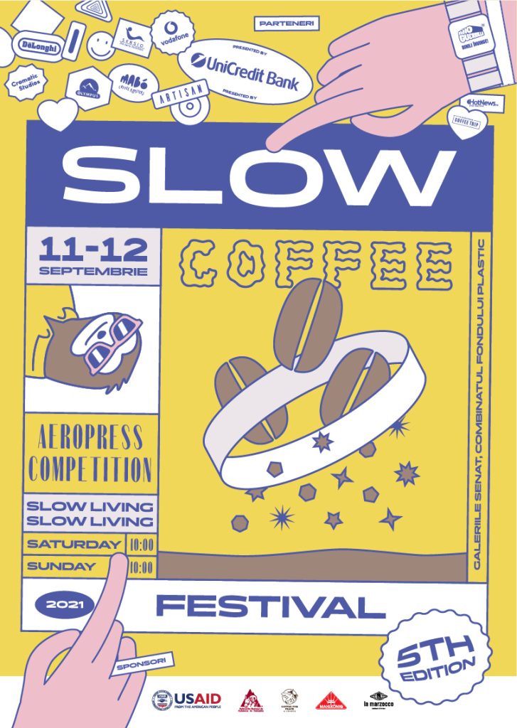
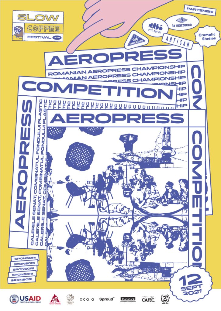
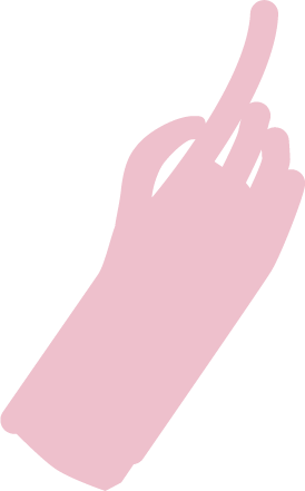
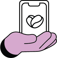
From this positioning, we distilled the visual identity down to its essence: hands. Illustrated in simple outlines, hands become the metaphor for craft, connection, and ritual. They press an Aeropress, pass a cup, roast coffee, or perform gestures that celebrate skill and attention.

Hands are versatile, they can tell stories, demonstrate craft, and convey emotion, all while keeping the festival’s slow and intentional energy at the center.

Hands are universal, human, and instantly recognizable, forming the heart of the festival’s visual identity.

Form a palette that speaks of slow mornings, shared conversations, and the ritual of brewing, these colors reflect the sensory world of coffee, community, and slowness.

Sage Bean

Calm, grounding, balance

Lavender Roast

Subtlety, craftsmanship, human touch

Golden Crema

Warmth, optimism, approachability

These colors are flexible, allowing for consistency across posters, digital content, merch, and spatial design, while remaining warm and inviting.

Bringing the brand to life gently animates atmosphere and memory with warm, welcoming color, tone, and movement.

Posters and banners that feel alive and intentional.

Merch that people want to wear beyond the festival.

Digital platforms that echo the slow, human energy.

Stage and venue design that immerses visitors in craft and ritual.

The system is sustainable, designed to grow with the festival and remain relevant for years, with only minor adjustments as the festival evolves.

cromaticstudios

What do you dream of?